• Welcome to The Cave of Dragonflies forums, where the smallest bugs live alongside the strongest dragons.

    Guests are not able to post messages or even read certain areas of the forums. Now, that's boring, don't you think? Registration, on the other hand, is simple, completely free of charge, and does not require you to give out any personal information at all. As soon as you register, you can take part in some of the happy fun things at the forums such as posting messages, voting in polls, sending private messages to people and being told that this is where we drink tea and eat cod.

    Of course I'm not forcing you to do anything if you don't want to, but seriously, what have you got to lose? Five seconds of your life?

Suggestions Orbital Bombardment

blazheirio889

Banned
Pronoun
she
...Ignore the title. That was the first thing that popped into my head.

Anyway, some of you may know that I consider myself an artist, and I can't believe I haven't made my own art thread yet. Zruh. In any case, I usually draw in a style halfway between cartoon and realism, and I specialize in birds, dragons, and wolves. Most of my stuff is traditional, with the random digital thrown in. Pencil crayons and markers are my weapons. *brandishes several sharpened pencil crayons*

As an aside, I'm currently preparing a portfolio for this art program I'm planning to enter in my high school. So critique is much needed, as well as some possible theme suggestions. Blazhy is severely lacking in creativity at the worst of times.

Stuff that I like to shove in people's faces (AKA stuff that I'm proud of at the moment):

Scarlet Ibis - the scarlet ibis is my favourite bird, so of course I had to draw it for my portfolio :0 Unfortunately the scanner likes to eat colours.

Colourful Dragon-Thing - My OC, Jaywing, in a kick-ass pose. Or at least I consider it a kick-ass pose. If there's one thing I suck at, it's poses.

Colourful Wolf-Thing - Shiranui from Okami, because that game is pure genius and needs moar fanartz.

Not-So Colourful Bird-Thing - A fanart of a person's OC. Don't steal it, or I'll poke you with aforementioned pencil crayons. Anyway, this was supposed to be a speedpaint, but it sorta got more... detailed than planned.

Another Another-Person's-OC - A friend of mine's character turned wolf. Scanned horribly; looks much better in real life :<

Another Dragon-Thing - Wow, I sure draw other people's OCs a lot, don't I. Anyway, an old piece, but I still like it.

For people who want to look at some of my other art, here is my dA.

Requests:
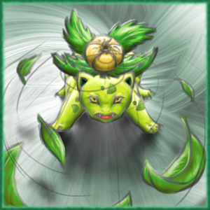
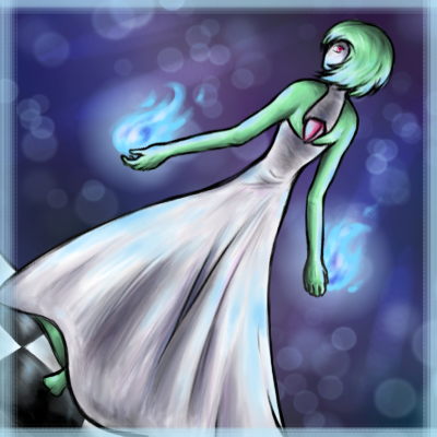
I'm taking requests for avatars, because those bite-sized images are just too fun to draw! Currently I only have two examples; hopefully that number will grow in the future. Only 2 slots will be open at a time due to a jam-packed schedule.

1. (open)
2. (open)

Pokemon_Avatars_by_blazheirio889.jpg


So yeah. Uhm. Critique, comments, and other stuff loved~
 
Last edited:
Skyward Spiral:
I like the shading most on this. And the background is well done, with how the colors fade into one another. The shading on the dragon's body is very smooth as well. The combination of blue and gray makes it look quite realistic. :) But I especially like the way you did the feathers, they look very... feathery. xD

White Sun Rising:
Ooh, I'm about to try that game out. X) The way the shading is dark on Shiranui's face makes it look very mystical. Although the outlines of the green fur (feathers?) look a little out-of-place compared to the outline of the fur. Unless that's metal armor, in which case it looks good. :3 But the body looks glowy, and his (or her) face is very well done overall.

Shooting Star:
Space. Night sky. I like the blend of colors in the background a lot. I also like the way the beak is drawn and the way it looks like it's attached to the face. The slightly sketchy outlines make it look feathery, and a lot like a bird. Although the outlines of the triangular feathers at the beginning of the tail look slightly odd to me. And, as on all the other ones, the shading is very nice on this drawing... it really shows the texture and everything. I was also going to say that the bend of the feathers towards us on its right wing looks a bit weird.

Fuchsia Flowers:
This one... is peaceful. The way the grass is drawn against the path in the background is great. :) And the wolf... his or her expression is quite nice, but that thing coming out of her head (a horn?) I'm not sure what it is. The details on the long fur on the tail and around the neck are very well done, especially as the fur on the head smooths out to the neck. And the shading on its body is wonderful. Quite stunning, honestly.

Gem of the Sky:
This one reminds me of a Marowak because of the mask on its face. Secretly, my sister loves bones, so she'll probably adore this one. I'm not sure about the yellow shading on the mask.. I don't have as much experience with drawing bones as my sister, though. (That is a bone, correct?) But the feathers on the mane are great, and I like the way you colored this dragon. Especially the eye, and the crack in the mask near the eye. The corner of the mouth looks odd, but that's probably just me and my lack of experience with dragons and such.

Long post over.~ So this is the wonder of... pencil crayons (though I've never heard of them...)
And, uh, now I am inspired. :3
 
Oh. Uhm. Pencil crayons are another word for colour pencils, heh. I've called them pencil crayons since I was little, and the habit's pretty hard to reverse.

White Sun Rising: Oh, the green stuff is just... stuff that spills out of the reflector. I'm not exactly sure what it is ^^;

Shooting Star: Up until recently I've been studying nothing but bird wing anatomy, and as such I suck pretty badly at all other parts of a bird OTL I'll be sure to pay special attention to the things you pointed out next time, though, especially the starting point of the tail, because I've noticed I suck especially badly there. Thanks~

Fuchsia Flowers: ...Did I spell fuchsia right?
Okay, anyway, yes that's a horn. The character was originally a goat, and I kind of wanted to put some goat-like aspect, so yeah.

Gem of the Sky: The yellow illumination is well... It's basically to show that for some reason the light source is yellow. It didn't show up very well in the other parts because I had already put layer upon layer of marker there, and I overdid it on the mask anyway... *shrug* And the stuff at the corner of the mouth is a sort of webbing thing that most dragons have. Erm... Now that you mention it it does look rather odd. Eh.

Thank you for the critique and comments :3 Thanks a lot, really. I hardly ever get critique on dA >.>
Also yay inspiration! *hands you several pencil crayons* Gogogo!
 
Do you mind giving me a reference picture, because I have no idea what a Burst Stream looks like?

And you won't mind if it's avatar-sized, right? Because that's all I'm offering as a request.
 
I had no idea that was what Blazheirio was. It (she?) is cool, in my opinion. :D The shading is done well, and I like its tail -- it reminds me of a Vibrava or a Flygon. The way you drew the long feathers on the wings makes them look a bit stiff, but maybe it's just because they're pointy. I also like the way you made them look attached to the wing; it gives it a feathery look. :)
 
It's an it, yes. Blazheirio's technically my mascot. I have a fursona, but she's something else entirely.

Uhh... Hm, now that you mention is, yes, its tail does look rather Flygon-y. I guess it was because my favourite Pokemon was Flygon at the time. And you probably don't know this, but Blazheirio is a mechanical dragon. It's supposed to look stiff xD

Thanks for the comment~
 
I don't have anything worthwhile to submit, per se, but I figured I'd show you guys some casual doodles. This is all stuff from my sketchbook.

6-legged thingy. For art homework. We had to create a mythical creature, and I randomly came up with this. Originally it was supposed to be bipedal, so the arms are lower than they should be (if it was actually like this the animal would tip over), but inspiration took over and yeah.
Serpentine dragon thingy. For art homework, same assignment. I wasn't quite happy with the first one, so I came up with this one. The wings would've been better if I actually drew them properly instead of half-assing them, but meh.
Character of mine. Felt like doing some colouring practice, so I quickly sketched up a portrait-ish thing of one of my characters. The scanner killed the colours, though. Oh, and that random streak - ignore it, one of my idiot friends accidentally put that there. Took forever to lighten/remove it.
Quick graffiti-style practice. Mainly for a school club I'm in called - you guessed it - UNITY. Once again, the scanner is a colour killer.
A sad, sad pop can. What? I had to crumple it so I could draw it for art homework. The scanner killed the contrast and lightened the shading. I need to get a new scanner soon.
 
The 6-legged dragon-type thing really stunned me when I saw it. It's... very good, to say the least. Despite the arms being a bit too low, as you said, the position and the way you drew the feet/hands is excellent. The elbow we can see kind of looks like it runs into the shoulder/hip of the next leg, though. The ears and tail look realistic in their positions, which I liked a lot. The expression and the position overall I really liked, though.

The serpent-dragon's legs look a bit small for its body, but sometimes that happens, like in Linoone. It makes it look like it would move quickly. And the back wings look a bit weird in perspective... overall, though, I like the design and fluffiness of this one.

Your character is shaded very nicely... almost like a wolf, which I like. The mane/hair... is just plain awesome, too. I think I can't shade like you can because I use the bad colored pencils and haven't sharpened my new, better ones yet. :P I like the eye, too. The color contrast on the underside of the neck makes it seem a little weird, although when I look at it, I like the contrast as well... the style of this drawing in general looks very mythical.

The "unity" one... what materials was it done with? It doesn't look like colored pencil, although I could be wrong. The twisting arrows are done well; I'm not really good at things that cross over each other. As well as is the perspective; the way the letters overlap gives it a lot of dimension and makes it look like the word is actually being said.

I actually kind of like the soda can; it looks like it's actually crumpled. The shading is great on this one, especially for me because I can't really draw wrinkles and the like.... it definitely looks almost real...
 
I don't have much to say in particular, but I like your stuff! \o/ Ahaaaa.
 
What James said. /o/


Also BLAZHYNATION WHEN WILL THAT HONCHKROW BE DONE /SADFACE

Still though, stop neglecting Blazhy. :c
 
:0 Actual comments!

As usual, Darksong, your comments are immensely helpful. :) Now that you mention it, the elbow really irks me... But ahhh, I can't be bothered to move the arm up. Thanks for pointing it out, though.
As for the serpent-dragon, it's a creature that doesn't land very often - spends most of its time in the air - so I thought I'd make the legs weak-looking in comparison, but I guess it didn't go off well, haha.
If it helps, I used Prismacolour colour pencils for that. And it really helps to sharpen your pencils - gets rid of a lot more grain than blunt ones.
And the UNITY thing was done with Copic markers~

And surskittyJames, Green, thanks :)

Aaaa Honchkrow aaaa! I'll see when I can bring my Prismas home to work on it, but I just have to finish the primary and secondary feathers. It's nearly done aaaa! *hides*
Also did you mean stop neglecting the Honchkrow, or stop neglecting the art thread? xP
 
Another Shiranui picture. Randomly drew it in class and coloured it over a long period of time during lunch, when we had free periods, etc. In other words it's quite old. The scanner destroyed the colour as usual (gotta get a new one aaa) and my friends and I were messing around on the back of the page (SHOOP DA WHOOP), so you can probably see random stuff here and there.

A bali myna. It's a critically endangered bird that... well, actually, that's just about all I know. :P But it's pretty.
Done in pen, though I made more mistakes than usual - you can probably see where I used white gel pen to correct my mistakes. Like how the bird turned out, but I'm not so fond of the branch.
 
You said you were working on shady things to make them look furry, and I think you did really well on the Shiranui one! The coloring is smooth and the muscular figure is also great. I only see that there might be a smudge on his neck, where the red stripe is, but it could be the shading.

The bird is very nice as well. :D I like pictures that show action... like this one. The bird is singing, and that made me happy. The wing seems to blend into the tail, the way the shading is. But the entire thing is great because it looks very... natural. :)
 
I'm terrible with updates, aren't I? OTL;;

Anyway, uh. Reshiram. This was done for a friend's birthday. Unfortunately when I was doing the background, Photoshop died on me about an hour in and I was really, really not in the mood to repeat that. So we have a random, 10-minute background instead. Also, once again, the scanner killed the colours and made Reshiram look a lot duller overall.

This really was a struggle to colour, because for some reason my paper was going t(-.-t) to me all the way through. I couldn't add more than two layers of marker before it started to rub off - as such, a lot of the darker shading is a bit uneven. I had to resort to colour pencils and regular pencil in some places.
 
Back
Top Bottom