• Welcome to The Cave of Dragonflies forums, where the smallest bugs live alongside the strongest dragons.

    Guests are not able to post messages or even read certain areas of the forums. Now, that's boring, don't you think? Registration, on the other hand, is simple, completely free of charge, and does not require you to give out any personal information at all. As soon as you register, you can take part in some of the happy fun things at the forums such as posting messages, voting in polls, sending private messages to people and being told that this is where we drink tea and eat cod.

    Of course I'm not forcing you to do anything if you don't want to, but seriously, what have you got to lose? Five seconds of your life?

Obsessive Scribblers: Reborn

It isn't the same without Dannichu, Kai, Sable, Spaekle, Kinova, Lett... list goes on.
Might as well at least /say/ I'm in.

...Albeit I haven't really drawn anything but ponies in weeks.
 
I'm around! Well, a bit. This club is always a lot of fun, so I'm glad it's back - just in time for the build up to ArtMo, too. :D

Following Crazy Linoone's lead: LET'S COMMENT

Spunky the Raichu - Haha, okay, the Jigglypuff made me smile. I'm guessing you didn't spend ages on it, though. :P Same goes for the Froslass, though the eyes are suitably... creepy...

Ice - woaahh, you've obviously been working hard since I last looked at your art because you can really see the improvement. I like that the pictures you posted have characters of all different body shapes and sizes (I particularly like the bloated-looking-ness of the snail guy) and that you're working on backgrounds at the same rate as your characters (practically everything I draw is still suspended in white space). I do agree with Linoone in that it's a bit odd how your backgrounds don't fade into focus with the subject of the picture, though - you've put the shadows they cast on the ground in, for example, but because the ground around them is just as blurred as the distant background it's throws of the depth perception in the picture. Also I would suggest practicing drawing hands in the position you want them in the picture seperately so that you can put them into the main picture and be satisfied without having to resort to blobby-hands (though the hands in the Ren picture do look good, especially her left one). Finally I would advise looking at clothes and the way they behave - again, the Ren picture looks alright but the clothes on the butterfly girl look unnaturally tight, particularly around the crotch area. Oh PS I do like the colouring style you've picked up, it's very clean and crisp and looks like it'd be good for comics.

Bayleafqueen - I know you said that you weren't fond of the third picture, but I think it's my favourite - colouring wise, you've made a good attempt at shading a bit and are aware that hair, skin, eyes etc. aren't one flat colour, which is good. The manga/anime influence has already beeen discussed so I won't go too far into that; what I would say is that it is not necessarily a bad thing as long as you emulate more complex drawings and combine it with looking at real people. That'll give you a good grounding in referencing real life to make the manga-esque style better... does that make sense? If you only use other drawings to reference from, your art will usually look a bit lacking in it's real-life-ness.

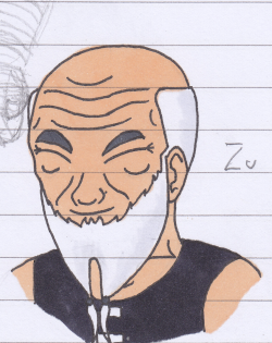
Pathos - that link is no longer working for me which is annoying because I remember being impressed when I looked at it before. :v As for the second picture, he really reminds me of a character you might find in a graphic novel; I think it must be to do with the thick lines around the edge and the finer detailing everywhere else. Also the use of shading to indicate clothing crumples rather than explicitly drawing them on is good. The only thing that looks a bit weird in that picture is that the guy has heavier sections of shade on the underside of his arms than on the skin shown through the tears in his jeans, which would be mostly covered up I think?

Daigonite - Umm the pictures. They are pretty. I love the colours (and the pose!) on the pheasant one, as well as the detail allowing each individual feather to stand out. The same goes for the detail on the raven, which is possibly more impressive for being done entirely in black and white. Now, let's see... I like the rain effect and the general composition of the 'Good-Bye, Dove' picture, but some of the lighting seems a bit off - for instance, the reflections of the rocks in the water seem to be more brightly lit than teh rocks themselves. Similarly there is light where - even on a bright moonlit night - it probably wouldn't be, such as on the inside of the coat around the legs, or directly underneath his mask. I'm also wondering where his other foot is? If it's behind his left leg then that gives the impression of either having just stepped forward onto the rock (not the impression I got from his mostly-folded arms) or that he's posing a bit.

Coloursfall - I generally stalk your art thread and enjoy your art so hopefully OS will force me to actually comment? I like your pooooonies (and lineart in general) and all the different dragons you've come out with are both inventive and interesting to examine for their differences. I have a soft spot for the chunkier, sort of boulder-horned ones (like the blue one in that second picture) but they're all pretty cool. A lot of your work kind of makes me think of graphic design (because it's always so clean and smooth, I don't know) and that really shows up in that map - it looks like it could easily become a poster or part of a book cover or something similar.

Everglider: listen to Linoone c:

Omskivar: drawing on paper is no less artzy than digital artziness! I am impressed with your little character-in-armour for taming the MONSTER GUINEA PIG, but am thinking his greatest achievement is wielding a sword as long as his body. This would probably be okay if the pair of them were aimed more towards the viewer, but moving to the side as they are the perspective doesn't come across as well. (I do like the idea, though - is he a tiny man, or is the guinea pig gigantic?)

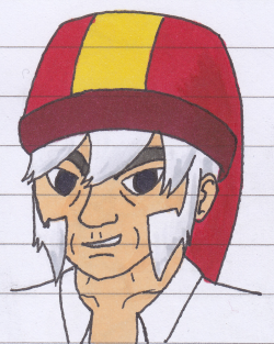
Crazy Linoone - oh god I need to get Black or White soon I didn't even realise that was a Pokemon I am so out of date. Sob. Oh, the drawing. I like the colours and the rumples on the clothes look very natural (I come to appreciate the weirdest things by the end of art critiques)... something off, hrm. The guy's forehead looks okay to me - it's roughly the right size when compared to the rest of the face, so that's fine. If you stretched it out, you'd have to lower the hairline as well, I think. Maybe it's the eye being in such close proximity to the sideburn? It does make that part of the face look a bit squashed. (I forgot the gloves. The gloves look good.)

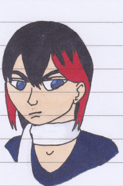
Zoraaaaa ponies are amazing. Though I do admit they seem to be a bit addictive artwise... maybe in a few other respects, too.
 
aaa such nice comments aaa

Here is the first pic I posted, since the link doesn't work anymore apparently :[

Linoone I think you are right and I tried to do more white in the eyes here. I think it works? This is an old sketch that I never finished until now because I didn't want to do lines ahaha. Ref used but I don't remember from where because like I mentioned, ooold.

Kinova you are riiight about the shading on the skin through the jeans. It was originally darker but I used a ps filter and it lightened it a bit. :[ Oh well.
 
I added a couple of links that were posted by CL on the first post. If anyone else knows of any good drawing resources, please post them and I'll add them to the list.

Pathos, I absolutely love the shading, chibi cuteness, and details that you put into it
 
Argh, my only reservation in joining is that I draw purely for fun (and occasionally boredom) and usually don't especially mind how my stuff comes out, and am a general failure as an artist because I don't push myself to improve. I'm also not very good at concrit on others' stuff, especially when it's way better than my own.
But I shall try :)

I do have one question, though - are we allowed to post things that aren't scribbles?
 
Crazy Linoone: I think what's bothering me about the picture is Archeops' eye being closed in a way that makes me not realize it's there. The mouth too; maybe put a small fang or something protruding? Otherwise I don't know. The picture is pretty fantastic anyway
 
Yeah, the hands in the Butterfly and Snail girl are lazy because I was on a deadline and I was running out of time >_>;
And GMG was wearing mittens, obviously. And I suck at backgrounds :D
I'll get better at them at some point though. I just wanted to avoid white space hell x.x
 
It isn't the same without Dannichu, Kai, Sable, Spaekle, Kinova, Lett...
You rang?
I'm glad that Frosty told me that there was another revival of the OS; It's been a long time since I've been on tCoD and I may have missed out on this if he hadn't. For those who don't know, I'm just an old member returning. For those who do, Hi guys! How's it going? XD
I've been looking at realism myself recently following Frosty's advice, and I think I'm doing okay. Most of what I've done are just sketches but I've lined and inked a few things here and there. So far I've been working on faces and busts, but I've done a little on anatomy and proportion as well. I've not put a lot on the interwebs at the moment, but here are some things that are.
tumblr_ltqbmb3mjo1r5rdfwo1_250.png
tumblr_ltqbmb3mjo1r5rdfwo2_250.png
tumblr_ltqbmb3mjo1r5rdfwo3_250.png

Some busts of some of my gijinka fellows, an Infernape, Weavile and shiny Emboar from left to right. Most of my art will be on my sketchblog or dA in the future.
I don't know how often I'll post here, though from what I've seen so far and experienced myself, I'd suggest that the new OSers take Frosty's advice.
 
Bayleafqween, you have just made my week! I am ecstatic to see OS back and thriving. I'm sure you'll do a better job at keeping this lovely group up and running than my lazy self did. If I can help with anything here, just give me a heads up.

Linoone and Kinova both did a lovely job critiquing, so I'm going to skip what's already been critiqued. However, if anyone who I've skipped wants me, specifically, to look at their art, I'll be glad to.

Dannichu, first off, that Pichu pumpkin is adorable. I love how you carved out layers to add depth and it really sticks out on its cheeks and the lightning bolts. The Pichu's neck markings are a tad uneven along with its ears. The picture is blurry so it's difficult make out some of the features. That monster cupcake looks delicious and as cute as a button. I love the tusks and ears on it. Oh my goodness, that robot K-9 plush looks wonderful, too. Plush usually looks better when turned inside out, so the seams are smooth looking, but given that robots are more angular, I think this turned out better. The metal wire on the ears is kind of unsightly, though. Also, as cute as the K-9 on the side is, I think embroidering might have been a better option. I'm really liking the paperchild, too; the clothing folds are amazing.

Kai, I can tell that you've improved loads. I love how your gijinkas are subtle with what Pokemon they are, rather than making it blatant by using ears or obvious accessories. On the Infernape gijinka, the eyes really stand out. Although, his eyebrow on our left (his right) looks uneven. I like the wrinkles on him, too. The Weavile gijinka looks wonderfully ticked. I think the pale skin was great choice, too. His mouth looks slanted as does the chin line, though. As for Zu, I'm loving all the wrinkles; they really give him character. However, the two check bone wrinkles might have been better to place a tad lower. Also in general, you should try different thickness with your lines to give a better sense of distance and maybe try for a higher contrast with your shading.

Bayleafqween, it's great to see you try out a more realistic style. You're getting the hang of it by testing out clothing folds, which help out with the realism. There's a bit of issue with symmetry in a few places, though. The arms and eyes are biggest offenders with this. The best advice I can give you is to try sketching people from either real life or photos; it's difficult, but it's helped me improve loads. Also look up human skeletons; they're great references to understand how the body moves. But you're on the right track!

Also, I've heard holding pictures up to mirror helps artists find flaws in their art. Does anyone do this?
 
Also, I've heard holding pictures up to mirror helps artists find flaws in their art. Does anyone do this?

I draw digitally and I flip my drawing back and forth as I draw. It really, really helps you find the flaws because your eye gets used to the way you're seeing the drawing. It's just a part of my drawing routine now.
 
The best advice I can give you is to try sketching people from either real life or photos; it's difficult, but it's helped me improve loads. Also look up human skeletons; they're great references to understand how the body moves. But you're on the right track!

This this this this so much

I'm sort of lucky because doors to my closet are full-sized mirrors, so I usually use myself as a ref when I draw. This means that I actually get out of my chair and pose when I run into problems drawing. It's super useful in getting anatomy down, especially when you're drawing weird poses. Even if there's no mirror, I find that just doing the pose you're drawing yourself, and then sort of studying where each body part is in relation to the others, really help.

Also also, super useful link for practicing drawing poses and stuff! This one has a SFW option (Only "Decent" Models), so for those who don't want to look at naked people for some reason, use this.
 
Since improvement's a big point here, I thought I might share some tricks and general advice that's really helped me artwise. They're nothing profound or anything, but hopefully they'll help someone out.

-The basic sketch is the most important piece of your art. It is crux of the entire piece and you should make sure you're happy with this part before moving on to the next step.

-Don't agonize over having perfect lines. Usually, the quicker the strokes the smoother the lines. It doesn't matter how scribbly or rough the sketch is, as long as /you/ can what it is.

-I had the problem of making my sketch marks too dark and thick. Given that you're working with paper, try using light, thin strokes. They're so much easier to erase and make it simplier to finalize the rough sketch.

-Experiment with different mediums, subjects, styles, and pallets. Every new thing you draw gives you how each element interacts with one another.

-Try drawing the same subject in different angles. It'll give you an idea how the figure works in three dimensions. Alternatively, you could try sculpting it out of clay or the like.

-Photo references are your best friend when it comes to drawing. It is nigh-high impossible to remember every single detail in a scence. Bonus points: drawing from real life.

-Every once in a while, just doodle for the sake of doodling. If you're not having fun, you're doing something wrong. :)
 
We've been learning digital painting techniques in Uni recently and I finally managed to paint something that didn't look awful oh my god o-o
Molluuuuuuscs o-o

@Bayleef; Better, but it's still very stylized. The anatomy on the arms and legs seem very off and disjointed, and the eyes should be a bit higher.
 
Wow, I didn't realise OS died whilst I was away :(

Got a picture I drew this mornin, will have to post that soon. Just need to scan and such.

EDIT: Picture of a random girl.

Some of the outlines and shadings didn't come out well, a downside to using pencil. Ah well, I still like it.
 
Last edited:
Back
Top Bottom