• Welcome to The Cave of Dragonflies forums, where the smallest bugs live alongside the strongest dragons.

    Guests are not able to post messages or even read certain areas of the forums. Now, that's boring, don't you think? Registration, on the other hand, is simple, completely free of charge, and does not require you to give out any personal information at all. As soon as you register, you can take part in some of the happy fun things at the forums such as posting messages, voting in polls, sending private messages to people and being told that this is where we drink tea and eat cod.

    Of course I'm not forcing you to do anything if you don't want to, but seriously, what have you got to lose? Five seconds of your life?

Random graphics and related things

Sandstone-Shadow

A chickadee in love with the sky
Pronoun
she/her
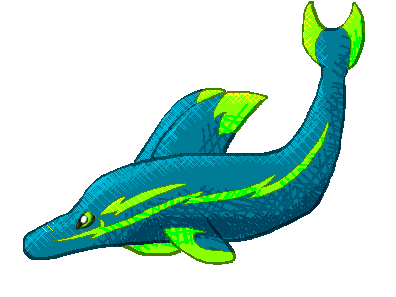
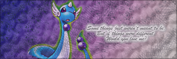
So I sometimes make graphics and banners and such. I don't make a lot of Pokémon graphics anymore, but I do have a few old banners that I still like.

Just to get this out of the way, the brushes I use in these graphics are from these three places.

Some new stuff:
epicadorablenessmini2.png

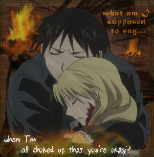
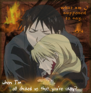
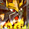
These are characters from Fullmetal Alchemist: Brotherhood. =3 The lyrics on there are from Script's song Breakeven. I like how this turned out, but I'm concerned that I went a little overboard on the brushes. Comments?

robbie.png

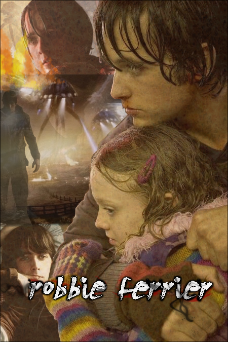
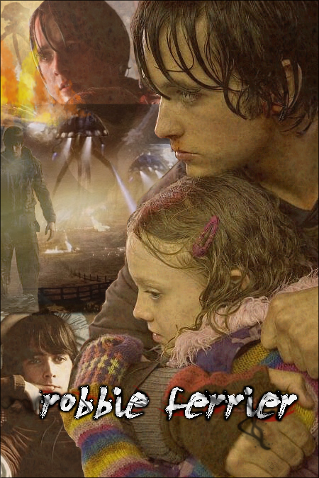
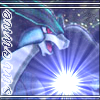
This is from the movie War of the Worlds. Originally I was going to add lyrics to it (from Rise Against's Savior) but I wasn't sure that they fit so I skipped it. I'm not sure about how I blended the pictures together on the left-hand side; I wanted there to be some kind of fiery explosion over there but I didn't find what I was looking for, so I tried to make my own fiery thing with brushes.

Comments would be greatly appreciated! I still have the editable files, so it would be very easy for me to change something if you have any feedback. =)
 
I think you should make friends with the Levels tool [sage nod] since the colours seem a bit faded. Or, well, if you're using GIMP I'd suggest Curves over Levels, but Levels work too and I know Photoshop has Levels somewhere in the menus.
 
I am using GIMP. *plays with Curves tool* Woah. Awesome, I will be playing with this in the future. =D Interesting, maybe I should check out some more of those tools. They've always kind of confused me so I never really used them.

epicadorablenessmini3.png


Any better?
 
Yeah. :3

Curves is awesome. Also, \o/ other people who use GIMP. You should definitely look around the menus more.
TOOLS I RECOMMEND:
- Curves (and occasionally Hue-Saturation) to fix colours so bits are more visible. I mostly fiddle with the Value channel so blacks and whites are more visible, but if you're messing with painted screencaps (I'm thinking old Pokémon, here, but there're a lot of things that look a bit faded) you probably need to adjust red and green channels, too. I don't usually find Hue-Saturation to be that useful, but occasionally it's handy if one particular colour is wonky.
- Selective Gaussian Blur! I usually set Blur Radius down to 2.0, but 5.0 works for a lot of things, too; fiddle with the Max Delta to make it look right. It makes JPEG artifacts less obvious, and doesn't make the whole image look blurry if you have the delta set low enough.
- Unsharp Mask! If you're scaling things up or down, this should be your best friend ever: it fixes blurriness. You'd think it'd be a sharpen mask that does that well, but no. Pull Radius down to 0.1 or so; I don't usually adjust the other options but you might find it works better differently.
- Posterize, to decrease the number of colours used in a given image. It's usually a bad idea to set it lower than 15 or so, but if it's at around 35-ish, you're very unlikely to notice a difference but it'll probably make the file a lot smaller. It's certainly simpler than trying to get an image to look okay as an indexed png.


And that is my GIMP tool advice for the day. [sage nod]


ETA: If you're using the Curves tool, it's usually a lot more useful on the logarithmic histogram instead of the linear histogram. It's the two little graphs on the Curves dialogue.
 
Oooh so I could do something like change this screenshot from Serebii.net on the left into a slightly less blurry and JPG'd screenshot which is on the right. =O

whiteforest.jpg
whiteforestimproved.jpg


Sweeeeet. Oh, this is cool. =D Thanks, surskitty!

I touched up Robbie then. This is so cool, I can do more with GIMP than make layers and play with opacity >D

robbie2.png
 
winddogevo.png

This is a random wind dog (even though it looks more like a moose upon further examination) Pokémon I've sketched a few times. Trying some different things here =)
 
*slight bump*

I made an avatar off of Mebukijika because I thought it looked awesome. =D The first one isn't transparent all the way through in places that it is in the second; I liked both of them so I saved both.

mebukijika.png
mebukijika2.png


I also have these things that I made. I made them for my mp3 player; I have music from the games and lacked album covers for the songs, so I tried to combine the cover boxes. I'm fairly satisfied with them, but if anyone has any suggestions for improvement on them, I'll attempt.

Red & Blue
Gold & Silver
Ruby & Sapphire

Gold and Silver turned out the best, I think, because I actually managed to find images that lined up exactly except for the Pokémon. I didn't have as much luck with RB/RS.
 
Last edited:
fmamusic.png


New avatar. The original image is from the cover of a Fullmetal Alchemist soundtrack. I'm not convinced of the word "music" though; it's too faded, not shiny enough, to match my tastes. But I can't figure out any other way to improve it. Anyone have any tips?
 
Last edited:
Finally, something new~

I seem to not have updated here in a very long time, probably because I haven't done anything in a very long time. =P So here's something that I just finished:

ampefin.png


This is a fakemon of mine - Ampefin, an electric/water dolphin Pokémon.

I'm not very satisfied with the eye. Any suggestions for making more realistic-looking eyes?

As a side note: what do you guys think of the shading style I tried on this and the moose thing a few posts earlier? I'm wondering if there's anything I can do to make it look a little neater, but I'm considering using more traditional shading next time.
 
suicune.png
entei.png


Some new avatars. I'm very, very pleased with how they turned out; I decided to experiment with some of the filters on GIMP, and this was the result. They turned out a lot brighter than my usual work, I think.
 
Bump~ I just finished exams, and what's the first thing I do? Revise an old banner. =D

The old banner:
different.png


The new banner:
different2.png


What do you think? I'm pleased with the results, but I'm always willing to try and make it better. Anyone have any suggestions?
 
The new one is much better.
The color doesn't fade as fast from right to left, and the words are much more legible.

And the glow is nice, as well.
 
Oh, thanks! I'm glad you like it. =D

The glow around Dragonair is actually from the card art; I cut it out of the image the first time but decided to leave it in this time. I thought the contrast would look nice.
 
Back
Top Bottom