

-
Welcome to The Cave of Dragonflies forums, where the smallest bugs live alongside the strongest dragons.
Guests are not able to post messages or even read certain areas of the forums. Now, that's boring, don't you think? Registration, on the other hand, is simple, completely free of charge, and does not require you to give out any personal information at all. As soon as you register, you can take part in some of the happy fun things at the forums such as posting messages, voting in polls, sending private messages to people and being told that this is where we drink tea and eat cod.
Of course I'm not forcing you to do anything if you don't want to, but seriously, what have you got to lose? Five seconds of your life?
You are using an out of date browser. It may not display this or other websites correctly.
You should upgrade or use an alternative browser.
You should upgrade or use an alternative browser.
Evil Sprite Contest
- Thread starter Dark Tyranitar
- Start date
- Status
- Not open for further replies.
Bluwiikoon
All is fair in love and war
- Pronoun
- he/him
Dark Tyranitar
Is it progress if a cannibal uses knife and fork?
Dark Tyranitar
Is it progress if a cannibal uses knife and fork?
Unless somebody really wants to join this sprite contest, it is now closed. In addition, I have decided to judge those that are finished with their sprites.
Also, please do not complain about my judging. I can be a bit of a harsh judge, and the only time I give a perfect score is when I doubt it could have been done much better.
As a general note: it would have been nice if more of you guys had gone to the effort of transparentizing them. It looks much better (note: if you see mine as non-transparent, then I don't know what to say to you. I have transparentized mine, and for me they appear transparent. I put this note because I have received several complaints about non-transparent sprites of mine).
iLike2EatPiez--Evil Wigglytuff

Originality: 4/5
Design: 3/5
Evilness: 6/10
Overall: 13/20
It has no mouth, which looks rather odd. The little curl on the top is very not exactly edited all that well. A couple of the claws look a bit awkward, and an eye has bad shading in a part. Other than that, the design is very good. I like the bloodstains (if that's what they are) on the fur, and the ear extensions. However, it seems like you could have done a better job on the recoloring (I think the secondary color is rather too light). The feet needed fairly desperately to be changed, and I think it would have been better if you had replaced the curl. All in all, though, good for a first try.
Tropiking--Evil Buizel

Originality: 5/5
Design: 4/5
Evilness: 7/10
Overall: 16/20
Very nice job overall on the sprite; there were just a few things that I wanted to point out. Firstly, the fins on the arms could have been attached better with a little bit of effort (and scratching). Secondly, the color. I know that purple doesn't seem like all that much of an evil color, but really, I think a purple/red color combo is the best way to go for an evil sprite. That was my major problem for evilness. Thirdly, (and this one is not very important, but...) the mouth and nose still look like a harmless little Buizel mouth and nose; quite a contrast from the rest of the body. Very good job overall, though. Congratulations. (By the way, where did you get the spikes for the collar? I'd possibly like to use them on future sprites.
Mewtwo: I'll hold off judging until you can figure out how to non-JPEG it or else you decide to leave it like that.
Wolftamer9--Evil Groudon

Originality: 2/5
Design: 2/5
Evilness: 4/10
Overall: 8/20
Personally, I think it may have been a mistake to choose Groudon; not enough to change. Also, in a lot of cases, what you did change made it just look more confusing; not really more evil. My major problem was with the teeth--never, ever make teeth large enough to fill an entire mouth--especially sharp ones. It looks silly rather than evil, and...just don't do it. Also, you shouldn't have used gray as the main color. Really, gray does not look evil. It looks faded. Use purple, or red if you have to as the main color, then the other one as secondary, and if there is a third color, you can use gray. Otherwise, no gray. The spikes on the side of the head are very difficult to see now; it would have been better to leave them alone. Really, Groudon looked more evil before changes. You left a lot of the body alone, but what you did change mostly detracted, rather than adding. The one exception was the spikes on the back. Well done with those, but it wasn't all that great of a sprite.
Caazper--Evil Aipom

Originality: 1/5
Design: 3/5
Evilness: 5/10
Overall: 9/20
My main problem with this one is that I've already done an Evil Aipom that looked quite a bit like this, and so it isn't very original. There are almost 500 Pokémon to choose from--no need to repeat. Also, Aipom is not an evil-looking Pokémon to start with, so you need to make many, many edits to make it look evil. On yours, I can only see two edits, both minor. The small blades you added on the end of the hand make it look like it has long fingernails, because you didn't bother deleting the little finger-things. Also, the ear extensions just make it look strange--they aren't sharp enough, for one thing. It would have been advisable to change the eyes and mouth at least a bit, and the tuft of fur on the head is certainly NOT evil. Good effort, but it isn't the greatest sprite I've seen.
Flora and Ashes--Evil Torchic

Originality: 3/5
Design: 3/5
Evilness: 4/10
Overall: 10/20
Hmm. On the plus side, you used a good palette, and both of the edits you made were beneficial. The minus is that you only made two edits. It would have been better if you had made the beak more dangerous-looking, made the claws a bit longer...and so on. Also, it would have been much better if you didn't add a pedestal--that just makes the sprite itself harder to see. However, it's reminiscent of my first two evils, so I kept a couple of points on. It isn't really an epicfail, there are just a few things to be improved. Also, the choice of Pokémon is very important with evils, and Pokémon like Torchic don't translate very well into evilness.
Zulo--Evil Charizard

Originality: 3/5
Design: 5/5
Evilness: 8/10
Overall: 16/20
Nice job on the overall sprite, and good job with knowing what to add to make it evil. However, it looks like a couple of ideas were taken directly from my sprites, which got you a few points marked down. That was the main problem that I had with your sprite; a lot looks like what I would do if I was making an evil Charizard. Excellent for a first try.
Note to those who are not done yet: It may be beneficial for you to read my critiques of those who finished.
Also, please do not complain about my judging. I can be a bit of a harsh judge, and the only time I give a perfect score is when I doubt it could have been done much better.
As a general note: it would have been nice if more of you guys had gone to the effort of transparentizing them. It looks much better (note: if you see mine as non-transparent, then I don't know what to say to you. I have transparentized mine, and for me they appear transparent. I put this note because I have received several complaints about non-transparent sprites of mine).
iLike2EatPiez--Evil Wigglytuff
Originality: 4/5
Design: 3/5
Evilness: 6/10
Overall: 13/20
It has no mouth, which looks rather odd. The little curl on the top is very not exactly edited all that well. A couple of the claws look a bit awkward, and an eye has bad shading in a part. Other than that, the design is very good. I like the bloodstains (if that's what they are) on the fur, and the ear extensions. However, it seems like you could have done a better job on the recoloring (I think the secondary color is rather too light). The feet needed fairly desperately to be changed, and I think it would have been better if you had replaced the curl. All in all, though, good for a first try.
Tropiking--Evil Buizel
Originality: 5/5
Design: 4/5
Evilness: 7/10
Overall: 16/20
Very nice job overall on the sprite; there were just a few things that I wanted to point out. Firstly, the fins on the arms could have been attached better with a little bit of effort (and scratching). Secondly, the color. I know that purple doesn't seem like all that much of an evil color, but really, I think a purple/red color combo is the best way to go for an evil sprite. That was my major problem for evilness. Thirdly, (and this one is not very important, but...) the mouth and nose still look like a harmless little Buizel mouth and nose; quite a contrast from the rest of the body. Very good job overall, though. Congratulations. (By the way, where did you get the spikes for the collar? I'd possibly like to use them on future sprites.
Mewtwo: I'll hold off judging until you can figure out how to non-JPEG it or else you decide to leave it like that.
Wolftamer9--Evil Groudon
Originality: 2/5
Design: 2/5
Evilness: 4/10
Overall: 8/20
Personally, I think it may have been a mistake to choose Groudon; not enough to change. Also, in a lot of cases, what you did change made it just look more confusing; not really more evil. My major problem was with the teeth--never, ever make teeth large enough to fill an entire mouth--especially sharp ones. It looks silly rather than evil, and...just don't do it. Also, you shouldn't have used gray as the main color. Really, gray does not look evil. It looks faded. Use purple, or red if you have to as the main color, then the other one as secondary, and if there is a third color, you can use gray. Otherwise, no gray. The spikes on the side of the head are very difficult to see now; it would have been better to leave them alone. Really, Groudon looked more evil before changes. You left a lot of the body alone, but what you did change mostly detracted, rather than adding. The one exception was the spikes on the back. Well done with those, but it wasn't all that great of a sprite.
Caazper--Evil Aipom
Originality: 1/5
Design: 3/5
Evilness: 5/10
Overall: 9/20
My main problem with this one is that I've already done an Evil Aipom that looked quite a bit like this, and so it isn't very original. There are almost 500 Pokémon to choose from--no need to repeat. Also, Aipom is not an evil-looking Pokémon to start with, so you need to make many, many edits to make it look evil. On yours, I can only see two edits, both minor. The small blades you added on the end of the hand make it look like it has long fingernails, because you didn't bother deleting the little finger-things. Also, the ear extensions just make it look strange--they aren't sharp enough, for one thing. It would have been advisable to change the eyes and mouth at least a bit, and the tuft of fur on the head is certainly NOT evil. Good effort, but it isn't the greatest sprite I've seen.
Flora and Ashes--Evil Torchic
Originality: 3/5
Design: 3/5
Evilness: 4/10
Overall: 10/20
Hmm. On the plus side, you used a good palette, and both of the edits you made were beneficial. The minus is that you only made two edits. It would have been better if you had made the beak more dangerous-looking, made the claws a bit longer...and so on. Also, it would have been much better if you didn't add a pedestal--that just makes the sprite itself harder to see. However, it's reminiscent of my first two evils, so I kept a couple of points on. It isn't really an epicfail, there are just a few things to be improved. Also, the choice of Pokémon is very important with evils, and Pokémon like Torchic don't translate very well into evilness.
Zulo--Evil Charizard
Originality: 3/5
Design: 5/5
Evilness: 8/10
Overall: 16/20
Nice job on the overall sprite, and good job with knowing what to add to make it evil. However, it looks like a couple of ideas were taken directly from my sprites, which got you a few points marked down. That was the main problem that I had with your sprite; a lot looks like what I would do if I was making an evil Charizard. Excellent for a first try.
Note to those who are not done yet: It may be beneficial for you to read my critiques of those who finished.
Last edited:
Dark Tyranitar
Is it progress if a cannibal uses knife and fork?
Flora
local hellion
- Pronoun
- they/he/it/neos
Dark Tyranitar said:Mewtwo: I'll hold off judging until you can figure out how to non-JPEG it or else you decide to leave it like that.
Bluwiikoon
All is fair in love and war
- Pronoun
- he/him
Dark Tyranitar
Is it progress if a cannibal uses knife and fork?
Is it too late to enter my Evil Meganium?
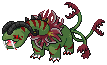
I feel like more could've been done with it, and I was also rushing a bit, but I guess I'm pretty happy with this sprite. :D;
First of all, no, it isn't too late; I was just judging the first batch. Secondly, wow. That is an amazing sprite.

- Status
- Not open for further replies.