• Welcome to The Cave of Dragonflies forums, where the smallest bugs live alongside the strongest dragons.

    Guests are not able to post messages or even read certain areas of the forums. Now, that's boring, don't you think? Registration, on the other hand, is simple, completely free of charge, and does not require you to give out any personal information at all. As soon as you register, you can take part in some of the happy fun things at the forums such as posting messages, voting in polls, sending private messages to people and being told that this is where we drink tea and eat cod.

    Of course I'm not forcing you to do anything if you don't want to, but seriously, what have you got to lose? Five seconds of your life?

The Spriter's Showcase!

Status
Not open for further replies.
@ Kai:Clothes. The army clothing seems like it's just painted on. And Slowking should have an angry expression, IMO.

@ ChocoDialga: Chocolate isn't alive so edit the eyes with a darker brown, and the protruding stuff too like the shieldything on the front. Also the markings. Make it look like you wanna bite it.

@ Fire-type Lapras: The head flame needs work on where it comes from, and the volcano on its back needs more definition on the cracks. It looks like a tube rather than earth.

@ Elric: The metal arm needs a bit of work, especially the outlines on the inside; too dark. Outlining the insides of a sprite needs to be lighter than the main outline.

@ Ancia: the shell seems halfway. Otherwise it's fine.

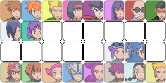
Anyway, crits for my trainer card in my sig? Mostly custom, even the Pokemon.
 
I've been reading the posts here, and I have a suggestion. It should be a rule that whenever you post for construcive criticism or whatnot, you should have to give some to someone else. I've seen too many sprites that have gone un-CC'ed. (What a weird word...)

@Grimdour- That looks like it took awhile! The odd one out though is the Persian. It should have a stance relatively like the others, instead of it's face. As far as quality goes though, it looks perfect. Also, I don't like the guys expression
The Persian was more of a revamp of the old Pinball sprites, really.

GymLeaders.png

A relatively small project I'm working on. Still WIP as you guys can see. Any suggestions on making the others?
 
Looks good, but what suggestions do you think we should give you? To make their faces? I don't think that would be very helpful.

I say, keep up the good work!

Here's one for someone else to rate-

Vulpixredevamp96236.bmp


My first revamp and devamp.

CC?
 
The devamp is fine, but there's some weird stuff going on with the revamp. The tails and 'hair' look odd, as the outlines don't really compliment eachother (eg. there's a huge lump of orange outline at the base of the tail) You also need to change the shading on revamps. A revamp is not a recolour. As for the body. Well, it's hard to explain... it's just... boring. There isn't enough contrast between the base colour and the shading colour, so it looks really bland and almost 2-d and cartoony. Almost all of the outlines are black, huge no-no. You have an extreme case of the dots, as you haven't edited the outline much, and you've even made the eyes orange by accident.

All in all, I can sum this up by telling you this:
A Revamp is not a recolour.
 
OK I'll try to fix it, and edit this post with it.


EDIT: Here it is!

Vulpixredevamp94415.bmp
 
Last edited:
You should try to fix the proportions while looking at RS/FL Vulpix instead of DP Vulpix because the pose is easier to work with, especially with the tails.

I think that the last Kanto gym leader person, however his name's spelt, should have eyes. Lt. Surge's hair shading doesn't make any sense, so I think you should remove it.
rawr.png
 
That's a really good fusion! Although, what's with the pink? And that tail... is it scratch? You could have bent it a little more out. I really like the head though. I can barely tell which pokemon you used! In a good sense.
 
That's a really good fusion! Although, what's with the pink? And that tail... is it scratch? You could have bent it a little more out. I really like the head though. I can barely tell which pokemon you used! In a good sense.

No, it's supposed to me a mix of alternate color Mareep, Luxray, Electrike, and Joteon.

It's not good that you can't tell which Pokemon, since Luxray is pretty obvious, I think.

rawrnu6.png

rawr2zc7.png

Edited a few things.
 
Last edited:
Well, yeah, besides luxray.

The rhydon scratch looks good, almost good enough to be an actual nintendo sprite. You colored all of the outlines black though. Some should be a dark grey.

EDIT: Can someone rate my fire re-type?

dragoneevee7012665883-iaza.png
 
Last edited:
The tail looks too much like Ponyta's. Maybe you should get rid of it and replace it with Eevee's tail. You could give that fire too if you like.

I made another edit on my sprite:
rawren4.png

rawr2by3.png

Which is better?
 
Last edited:
Well, I guess you could consider it an edited fuse of eevee and ponyta.

I like the pink one better, but try it with a soft yellow.
 
Give me a DIFFICULT and I mean DIFFICULT splice to do! I need to train mah fusioning skills.
 
I was actually thinking only two pokémon, but I did request for a difficult splice sooo... *Opens Paint*
 
Well, While Bakuphoon works on his splicing skills, I'd like some scratching criticism, preferably on the shading. I worked for quite a while on this.
picture.php

Any LOZ fan who doesn't know what that is deserves to be shot.
 
Well, While Bakuphoon works on his splicing skills, I'd like some scratching criticism, preferably on the shading. I worked for quite a while on this.
picture.php

Any LOZ fan who doesn't know what that is deserves to be shot.
herherherherherherherherherherherherherherherherherherherherherherherherherherherherherherherherherherherherherherherherherherherherherherherherherherherherherherherherherherherherherherherherherherherherherherherherherherherherherherherherherherherher

*Ahem* Well, I'm not a LOZ fan, I actually don't know what LOZ is :? But anyway, I like it. I like the simpleness of it, just a question before I go on with the CC: What is it supposed to be?

Now then, there's not much to critizm, but I'll try my best :)

I don't know what style you were trying to use, DP, RSE or just your own style, I don't know either if you were trying to do it pokémon styleish, but if you did:

You overshaded the pointy thing, not good. You should leave out the lightest shade on it. The lightest shade of blue on the main thing is a little wiggly n' stuff, but I still like it. The outlines doesn't have any black in them, and I can't see the light source, which I find kinda irritating. I also don't like the darkest blue shades placing. You should make it not be so close to the other shades.

Now, if you didn't do it Pokémon style:

I like the metallic look on the pointy thing, but I still think the lightest shade of blue on the main thing is wiggly. I like the colours and the dots on it, and the shading, but you should still colour the outlines a bit more :3

That's all. Thank you for reading my CC.
 
Status
Not open for further replies.
Back
Top Bottom