

-
Welcome to The Cave of Dragonflies forums, where the smallest bugs live alongside the strongest dragons.
Guests are not able to post messages or even read certain areas of the forums. Now, that's boring, don't you think? Registration, on the other hand, is simple, completely free of charge, and does not require you to give out any personal information at all. As soon as you register, you can take part in some of the happy fun things at the forums such as posting messages, voting in polls, sending private messages to people and being told that this is where we drink tea and eat cod.
Of course I'm not forcing you to do anything if you don't want to, but seriously, what have you got to lose? Five seconds of your life?
You are using an out of date browser. It may not display this or other websites correctly.
You should upgrade or use an alternative browser.
You should upgrade or use an alternative browser.
The Spriter's Showcase!
- Thread starter Valerunner
- Start date
- Status
- Not open for further replies.
Raven Kouryuu
Girl of Knowledge and Shadow

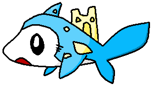
My new fakemon Jakallit
C+C please!
It's a good concept, but they're awfully small. I think even normal Shaymin is larger sprite-wise. They also look a little uneven, with one side rounder than the other. The shading seems okay, though it's hard to judge when the sprite is so small.
Karkat Vantas
Virile God-Snake Tower of Masculinity


Tiffano
New member
On the back of its necks, are those strips? ;o The right forepaw (our left) seems a little awkward, it appears to be twisted backwards.The left forepaw (our right) is a bit bulky up top.C+C for my first scratch fakemon?

Just parts that bother me ;o
Lugia
I'm Falkner. Hear me roar. um...roar?
It looks a bit off in proportions, and usually you would need to fix the shading on revamps.
ugh i need help with this C+C please!
how can it be off in proportions, if you're gonna call THAT off, how about you tell it to the one who originally MADE the sprite T_T
Aisling
Super Moderator
how can it be off in proportions, if you're gonna call THAT off, how about you tell it to the one who originally MADE the sprite T_T
Just because it was made that way back when sprites could only be like 65 pixels wide and tall doesn't mean it actually looks good :/ I mean look at the GRBY sprites and compare them to the latest DS sprites. There's more with them that looks wrong than just the limit on colors.
If you want a specific example, look at your Tyranitar's toes. Why does one foot have one giant toe and the other have three regular toes?
What you need to do is what we call "scratch editing". In layman's terms, changing the outline. There's a lot, lot more to revamping than just changing the colors. You have to fix the shading and the outline and make it look like an up-to-date sprite that looks like it was ripped straight from one of the games, it's so gosh-darn authentic looking.
Dragon
disaster pigeon
- Pronoun
- she
Diglett ralts
More of an edit than a splice
Don't recolour the outline, fully. Leave the black pixels in.
Uh yeah nothing else useful to say here. :r

Karkat Vantas
Virile God-Snake Tower of Masculinity
Medical Meccanica
Banned


Starly
New member
It's painfully clear that you just copy-pasted Brock's eye there.
Also, what's with the arm to our right? It's stretched at a ridiculously short angle
Um I did not edit anything, it came that way from a cool trainer, I just made him a cosplayer and colored his hair and eye
Blastoise Fortooate
Geographical!

Lucas₇₅₅
Screw the rules, I have green hair!
- Pronoun
- he
Wow, very nice. Something bothers me about the Latias one, though: I think it's how the ear-things seem sort of disconnected, making the head look bare. Also, they seem too skimpy on the head compared to the Latios ones. Also, the area behind its left eye looks too bright against the eye itself.

Okay, I need some crits on this. I made it as an avatar for a certain banned member. Thanks.
Okay, I need some crits on this. I made it as an avatar for a certain banned member. Thanks.

Darksong
Back in action!
C+C please
gardevior family as grass
I love the way you did this. It looks great, but the front of Gardevoir's "hairdo" blends in to what you can see with the back. As some of us had said before, you should keep some of the outlines black where black needs to be used so that we can have more perspective to see what's in front of what.
Lucas775: That made me laugh. :) Two things I can see that could be fixed: the first thing is that when I first looked, I thought Kakashi's eye was a bit too wide. And it also doesn't look like he's holding the book much, but that could probably be because you can't see his thumb from this angle.
Lucas₇₅₅
Screw the rules, I have green hair!
- Pronoun
- he
Lucas775: That made me laugh. :) Two things I can see that could be fixed: the first thing is that when I first looked, I thought Kakashi's eye was a bit too wide. And it also doesn't look like he's holding the book much, but that could probably be because you can't see his thumb from this angle.
Yeah, if you could see it, his thumb would be parallel to the middle finger on the other side of the book.
Although I do see what you mean with the eye. How does this look?

Last edited:
Starly
New member
Good but it needs some black lines on Kakashi, cause it just looks offYeah, if you could see it, his thumb would be parallel to the middle finger on the other side of the book.
Although I do see what you mean with the eye. How does this look?


Fixed baby Skarmory, as in the colors C+C please!
- Status
- Not open for further replies.