

-
Welcome to The Cave of Dragonflies forums, where the smallest bugs live alongside the strongest dragons.
Guests are not able to post messages or even read certain areas of the forums. Now, that's boring, don't you think? Registration, on the other hand, is simple, completely free of charge, and does not require you to give out any personal information at all. As soon as you register, you can take part in some of the happy fun things at the forums such as posting messages, voting in polls, sending private messages to people and being told that this is where we drink tea and eat cod.
Of course I'm not forcing you to do anything if you don't want to, but seriously, what have you got to lose? Five seconds of your life?
You are using an out of date browser. It may not display this or other websites correctly.
You should upgrade or use an alternative browser.
You should upgrade or use an alternative browser.
Suggestions My scratch sprites
- Thread starter wolftamer9
- Start date

wolftamer9
So if anybody asks you, you belong to Man on Earth

wolftamer9
So if anybody asks you, you belong to Man on Earth


wolftamer9
So if anybody asks you, you belong to Man on Earth


wolftamer9
So if anybody asks you, you belong to Man on Earth
wolftamer9
So if anybody asks you, you belong to Man on Earth

Karkat Vantas
Virile God-Snake Tower of Masculinity
grass starters! they're apple tree scorpions.

 - still at a loss for names.
There's very little contrast between the browns here, making it look a it difficult to determine shading.
The tail-branches don't look all that much like tree branches (especially on the second one); they're a bit too curvy.
wolftamer9
So if anybody asks you, you belong to Man on Earth
wolftamer9
So if anybody asks you, you belong to Man on Earth

Nope
hopefully back??
- Pronoun
- any
Wow, you've improved a lot since you first joined this place, really. ;o
But I can see you have some problems with contrast between shades and colours on your fakemon. I suggest stealing palletes from existing pokemon until you have a better idea of how it works, as I can see that your splices tend to look better colour-wise than the scratches where you have chosen the colours yourself. :)
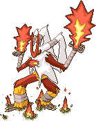
Also, I really like that Blaziken, although that flame spouting out from it's chest is a little awkward. Maybe replace it with a spike, like on Lucario, or remove it fully? The other flames also look fake. Like plastic or something, because it looks like you've shaded them. Study the flames on Typhlosion or Charizard, and try to imitate them, if only a little. Like removing the outlines of the yellow part and make it flow better, and copy the colouring a little. Other than that, I really, really love it. The pose is awesome, the shading is awesome. And those small eruptions on the ground really adds to the feeling. Great job! :D
But I can see you have some problems with contrast between shades and colours on your fakemon. I suggest stealing palletes from existing pokemon until you have a better idea of how it works, as I can see that your splices tend to look better colour-wise than the scratches where you have chosen the colours yourself. :)
Also, I really like that Blaziken, although that flame spouting out from it's chest is a little awkward. Maybe replace it with a spike, like on Lucario, or remove it fully? The other flames also look fake. Like plastic or something, because it looks like you've shaded them. Study the flames on Typhlosion or Charizard, and try to imitate them, if only a little. Like removing the outlines of the yellow part and make it flow better, and copy the colouring a little. Other than that, I really, really love it. The pose is awesome, the shading is awesome. And those small eruptions on the ground really adds to the feeling. Great job! :D
wolftamer9
So if anybody asks you, you belong to Man on Earth


wolftamer9
So if anybody asks you, you belong to Man on Earth

wolftamer9
So if anybody asks you, you belong to Man on Earth


wolftamer9
So if anybody asks you, you belong to Man on Earth
Eeveetoo's head looks a bit out of place compared to the rest of its body; maybe consider toning it a bit more towards the color of the body?
Also, IMO antick and gorflee need more shading.
I based it on the original dp eevee sprite, but maybe the shading should have been more independently shaded.
and personally I think the parasites are shaded enough.
anyway,


yeah, sort of like remakes of those old badly made grass types.


