• Welcome to The Cave of Dragonflies forums, where the smallest bugs live alongside the strongest dragons.

    Guests are not able to post messages or even read certain areas of the forums. Now, that's boring, don't you think? Registration, on the other hand, is simple, completely free of charge, and does not require you to give out any personal information at all. As soon as you register, you can take part in some of the happy fun things at the forums such as posting messages, voting in polls, sending private messages to people and being told that this is where we drink tea and eat cod.

    Of course I'm not forcing you to do anything if you don't want to, but seriously, what have you got to lose? Five seconds of your life?

Igloos and Dumbbells!

Chewy the Crispy Crunch

Crunch, not Crotch
Hi there! I'm Crunch, though that name was taken, so I had to name myself Chewy the Crispy Crunch. :unsure: I own the website Igloos and Dumbbells. It's run by me and another guy named Apex. It has a Cbox that doesn't work in IE for some weird reason, and pages about a region I made, Krento. There's also things about the Games (or, well, only FR/LG for now) and a sorta-parody of MapleStory, called OakStory. Enjoy!
 
The splash is a bit oversized. Try to make it so that it doesn't have a scrollbar, even on a 600x800 screen. Also, the layout is messed up. The affiliates bar is on the left side, and it moves when you scroll, so it usually covers up the navigation menu. When you run the mouse over things on the navigation bar, they move from left-align to right-align. The banner is also a bit oversized.

Another note: I've seen people here who can't take criticism maturely, so note that this is just criticism, not a personal thing.
 
I was amused by the option to basically put in whatever the heck you wanted on OakStory.
I didn't like the format of it, though. Pop-up windows? No thanks! Can't you have individual pages to it, with forms to fill in there? I'm almost positive you could code that. It might be hard, but golly, you can do it! (Possibly.)
Some of the pages are actually amusing and show a lot of personality, but some simply get on my nerves.
It seems like you put some time into that site and that you have fun running it, so that's great. Just try to be a little bit more mature sometimes.
 
Thanks for the criticism.

Is the little left-to-right-align thing on the navigation bar annoying? If it's annoying, I'll take it out.

The affiliates thingy works in all the browsers except IE. I'm not sure why; it should work. I put the affiliates in a div outside of my all div, but in IE, it still shoves it in there.

I'll change the Cbox, too. But I'm just not sure where it should go. If it goes on its own separate page, it might be a bit annoying to just go there and back all the time.

And I agree with you, Lucas755, the splash is a bit oversized. I'll shrink it down.
 
Is the little left-to-right-align thing on the navigation bar annoying? If it's annoying, I'll take it out.
Yes, but you could get a similar effect by just adding one or two spaces before the word on a mouse-over.

The affiliates thingy works in all the browsers except IE. I'm not sure why; it should work. I put the affiliates in a div outside of my all div, but in IE, it still shoves it in there.
I'm using Firefox.
 
Yes, but you could get a similar effect by just adding one or two spaces before the word on a mouse-over.


I'm using Firefox.

Good idea! I'll just add like a little indent thingy. And about the Firefox thingy, is it because of your resolution? If the resolution's 800x600, it won't work as well.
 
I think for OakStory you should have a new page after every battle, or at least more than you do now. It's easier to navigate and know when you've won. Just a suggestion.
 
It's okay, but the one thing I noticed abut OakStory is the whole scripted window-thing. I don't have scripted windows allowed (for whatever reason), so I end up getting stuck and having to end-task my browser (which shuts down every internet window I have open).

It could just be my browser (yeah, I use IE7), but I'm not sure.
 
You need some more content, and that affie bar that slides down is really annoying, It's hard to click one of the page links on the side with that thing in the way.
 
Yeah, it doesn't work on IE for some weird reason. Help? *goes to post in HTML/CSS Help section thingy*

EDIT: Okay, now we have a new style; Steel Legends. Apex (the other guy that works on our site) made it. Go check it out!
 
Last edited:
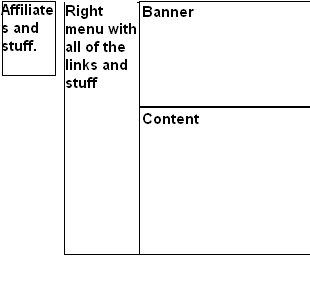
For some reason, when the site was still on Hiatus, and I was able to view it is production, the affiliate thing was stuck in the upper right corner, then there was a space, then the right menu and the rest of your content. I'll try and make something to show you, but then all of a sudden it covered the right menu. I don't know what happened, but it changed.

thing.jpg
 
Well, in IE, the affies bar covers the leftmenu even though I specifically told the code not to, but in Firefox/Opera/Netscape etc. it works fine; aligns it self way to the left of the screen.

EDIT: Okay! I will make OakStory less annoying and alerty. I'm going to follow you guys' advice and make it have forms, which you can fill in, then, uh, you get the idea.

EDIT (2): Ayame, try this page. It's the beta version of what you wanted. Is that what you meant?
 
Last edited:
With Oakstory with attacking, it makes no difference what you type. I know it'd be REALLY hard to code it differently for each word but you could figure something.

But Oakstory is still fun fun fun~
 
Back
Top Bottom