-
Welcome to The Cave of Dragonflies forums, where the smallest bugs live alongside the strongest dragons.
Guests are not able to post messages or even read certain areas of the forums. Now, that's boring, don't you think? Registration, on the other hand, is simple, completely free of charge, and does not require you to give out any personal information at all. As soon as you register, you can take part in some of the happy fun things at the forums such as posting messages, voting in polls, sending private messages to people and being told that this is where we drink tea and eat cod.
Of course I'm not forcing you to do anything if you don't want to, but seriously, what have you got to lose? Five seconds of your life?
You are using an out of date browser. It may not display this or other websites correctly.
You should upgrade or use an alternative browser.
You should upgrade or use an alternative browser.
Suggestions Die Kunstfabrik
- Thread starter goldenquagsire
- Start date
Dannichu
Tragically unbeyachted.
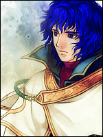
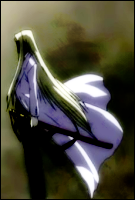
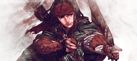
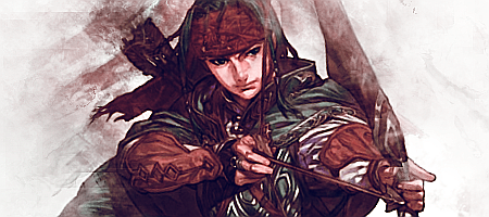
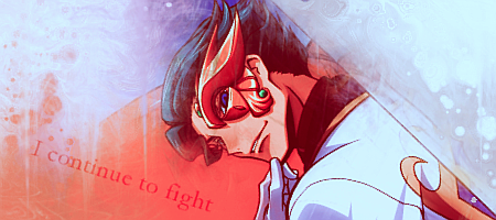
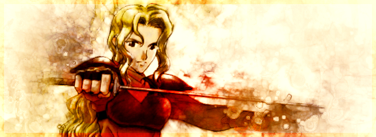
They're looovely. I especially like how you pick the perfect effect/texture for the background to go with the style of the picture, especially on the ones with Near, the female knight, the Doctor and, uh, the guy who looks like Harry Potter crossed with Kratos from ToS. X3
And the little golden Quaqsire one made me smile.
And the little golden Quaqsire one made me smile.
goldenquagsire
Rubber dinghy rapids, bro!
Thanks for the comments. :3
I think I'll reinstate goldenquagsire the avatar, since it's so popular (and because Alec is boring).
Edit: Actually I won't, since the avatar size limit seems to have mysteriously shrunk. D:
Eh? Which one's that? O_oMy favorite is the Edward Scissorhands,
Fiora. :Dthe female knight
Lezard. :Dthe guy who looks like Harry Potter crossed with Kratos from ToS.
I think I'll reinstate goldenquagsire the avatar, since it's so popular (and because Alec is boring).
Edit: Actually I won't, since the avatar size limit seems to have mysteriously shrunk. D:
goldenquagsire
Rubber dinghy rapids, bro!
goldenquagsire
Rubber dinghy rapids, bro!
goldenquagsire
Rubber dinghy rapids, bro!
goldenquagsire
Rubber dinghy rapids, bro!
goldenquagsire
Rubber dinghy rapids, bro!
goldenquagsire
Rubber dinghy rapids, bro!
goldenquagsire
Rubber dinghy rapids, bro!
goldenquagsire
Rubber dinghy rapids, bro!
goldenquagsire
Rubber dinghy rapids, bro!
goldenquagsire
Rubber dinghy rapids, bro!
Dannichu
Tragically unbeyachted.
Ooh, I really like the one with (god I don't know any of these people!) the woman in red with the blonde curly hair. The watercolour-ness of the whole picture looks great.
And Luso looks excellent; the colour of the background and the swirly effects work really well with his ridiculous weapon and outfit.
I admit I don't like the Ashnard one as much as the others, because your swirly, abstract backgrounds are better than (what I assume is) a blurred version of the original background.
(See? This is why I shouldn't comment here. I don't know any of the technical terms for digital art (I still thing 'dodge' sounds hilarious) and I sound like a moron D: Awesome stuff, though~)


