• Welcome to The Cave of Dragonflies forums, where the smallest bugs live alongside the strongest dragons.

    Guests are not able to post messages or even read certain areas of the forums. Now, that's boring, don't you think? Registration, on the other hand, is simple, completely free of charge, and does not require you to give out any personal information at all. As soon as you register, you can take part in some of the happy fun things at the forums such as posting messages, voting in polls, sending private messages to people and being told that this is where we drink tea and eat cod.

    Of course I'm not forcing you to do anything if you don't want to, but seriously, what have you got to lose? Five seconds of your life?

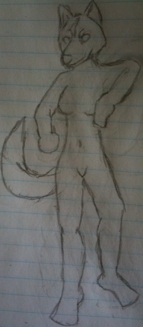
Help with pose and chest of drawing

Icalasari

YAY! NEW AVATAR! :D
Luna_Rough_Work_by_Shadowater.jpg


This is Luna

Luna is feeling a little rough right now

Lame puns aside, as you can tell, the arm is a little awkward. I've never done a fighting stance before, so I'm having a few issues with showing her being tense without the arm looking like if she has a major birth defect =/ I also don't have access to someone who can pose for me. Hell, I can't even pose to get a general idea of how to alter the limbs, since I lack things such as a reliable place to put my camera, so that I can take a time delayed picture and study it

Also, the chest is off. And every time I try to fix it, the hips decide to become messed up. Any help?

If there are other issues with the rough draft, feel free to tell me. It could be that some things are off because of an issue with another part
 
Try widening her stance.

Also, her chest look okay to me, just try to make both breasts the same size, maybe draw the left outline of the right (our right, not hers) breast. Just a hint of it, so you know it's there.
 
It's hard to tell what she's doing here, for one; it looks kind of like she's trying to balance on one foot in a weird pose.

There is this website, http://www.posemaniacs.com, that has lots of 3d-rendered models of humans in various poses - you could use that as a guide. Overall there are things you can do to make a person's stance look more confrontational: spacing out their legs, lowering their head, making them sort of... lean forward?, and so on. In the case of this character the tail should probably be held out to balance the figure more.

The main problem with the breasts is that they look a bit lopsided. The only advice I can really give there is to use a reference, which could be either extremely easy or rather difficult depending on whether you have rules on what you can look at online. :v Failing that, I did find this anime-ey tutorial that may suit your purposes just fine.

Proportion-wise, her shoulders should probably be wider; right now it looks like her body wouldn't be able to support her neck and head.
 
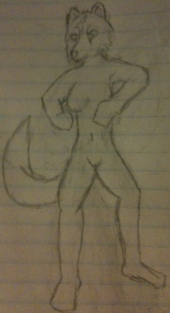
Ok, I did some the fixes suggested

Meep.png


I think it looks better, but I would still like some help to make sure I didn't mess up anything

I also did try widening the shoulders a little, but it is a little hard. Most guides I have read show the hips being wider than the shoulders on women, not to mention that the head is pretty large for wolves anyways, so =/

And I took a look at that site. It didn't seem to have any fighting poses for women

*sighs* I wish there was a site that had a flash tool that allowed one to change the pose of a model, with something to indicate if you have an impossible pose (e.g. a joint is green if the pose is comfortable, yellow if it would put some strain, indicating that it better be for more of a mid action pose, and red if it is, "What the hell, man!? The human body does NOT bend like that!")
 
Well I can't call myself an expert, but I have drawn quite a few fighting poses.

First thing is, a person is usually a bit lower when they're in a fighting stance. So less of the neck would be shown, and the shoulders would be placed a bit higher up, and the feet would be spread and braced slightly. Easiest way is to read up a shonen manga or something if you need help with that.

Secondly, looking at your own arm is an excellent way to see how your pose would look naturally. Just go to your bathroom or somethin, get into the pose you want your character to be in, and stare at yourself like that for a few minutes until you think you've got it down.

Well that's just my two cents.
 
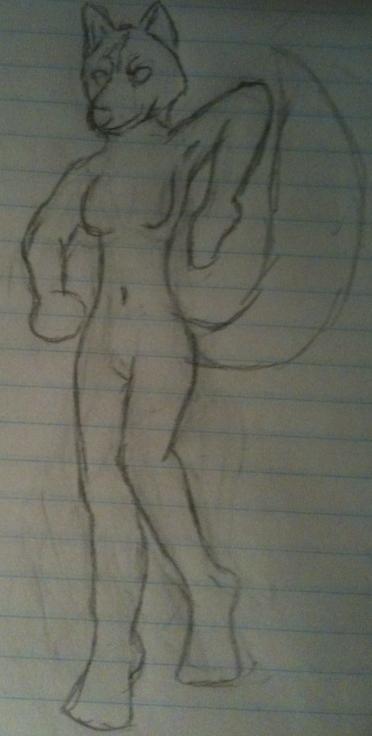
This better?

photo-4.png


I want the pose and general shape to be as good as possible before I start on the good draft

Changes in this iteration:

-Bent the legs more so she looks more ready to brace
-Checked myself in a mirror and got my arms to a comfy, but still ready, state, and drew from that
-Shrunk the muzzle
-Shrunk the ears
-Added very light shading to help show the positioning of her right breast better
-Detailed the tufts of fur around the head so I could better see how it would look on her

The reason for shortening her muzzle and shrinking her ears is due to her being a Wolf anthro. I figured that her muzzle and ears would be smaller than a pure bred Wolf
 
I don't think you'd want her shoulder raised like that unless her forearm is also raised, as if she's throwing a punch. It wouldn't be angled down like that. Her hips are also twisting awkwardly given the way she's facing. Try putting her left leg forward instead.
 
Also, to make the pose dynamic, making the hips and shoulders slanted may help.

o/-\ (look at that sideways- o is head, / shoulder, \ hips...)

That's about all I can say, since my other suggestions would be to have her in a different pose instead... D: And I can't word them right either.
 
Better, but, I think you lost all of your 'women's hips are wider than their shoulders'. Maybe check that your legs are proportional to your arms?
 
Back
Top Bottom