-
Welcome to The Cave of Dragonflies forums, where the smallest bugs live alongside the strongest dragons.
Guests are not able to post messages or even read certain areas of the forums. Now, that's boring, don't you think? Registration, on the other hand, is simple, completely free of charge, and does not require you to give out any personal information at all. As soon as you register, you can take part in some of the happy fun things at the forums such as posting messages, voting in polls, sending private messages to people and being told that this is where we drink tea and eat cod.
Of course I'm not forcing you to do anything if you don't want to, but seriously, what have you got to lose? Five seconds of your life?
You are using an out of date browser. It may not display this or other websites correctly.
You should upgrade or use an alternative browser.
You should upgrade or use an alternative browser.
Suggestions My scratch sprites
- Thread starter wolftamer9
- Start date
wolftamer9
So if anybody asks you, you belong to Man on Earth
eeveeskitty
...
- Pronoun
- they
wolftamer9
So if anybody asks you, you belong to Man on Earth
Ice tiger
Has claimed your vital regions.
sorry, I made it forewards before I got the answer. but now you see why I don't take requests.
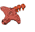
Lol! But it's supposed to have two of those horns. But it is a bit better now :D
eeveeskitty
...
- Pronoun
- they
wolftamer9
So if anybody asks you, you belong to Man on Earth
wolftamer9
So if anybody asks you, you belong to Man on Earth
wolftamer9
So if anybody asks you, you belong to Man on Earth
Andalite191
Heh... pants...
wolftamer9
So if anybody asks you, you belong to Man on Earth
wolftamer9
So if anybody asks you, you belong to Man on Earth
wolftamer9
So if anybody asks you, you belong to Man on Earth
wolftamer9
So if anybody asks you, you belong to Man on Earth
Andalite191
Heh... pants...
wolftamer9
So if anybody asks you, you belong to Man on Earth
As mentioned previously, the lines on some of them (Not your new ones) are blocky and thick. They need to be nice and smooth.
Cyspar's probably my favorite, because it reminds me of something I saw on youtube a while ago. I'd give a link but I lost the exact URL when I cleared my laptop's viewing history. :p
Cyspar's probably my favorite, because it reminds me of something I saw on youtube a while ago. I'd give a link but I lost the exact URL when I cleared my laptop's viewing history. :p


