

-
Welcome to The Cave of Dragonflies forums, where the smallest bugs live alongside the strongest dragons.
Guests are not able to post messages or even read certain areas of the forums. Now, that's boring, don't you think? Registration, on the other hand, is simple, completely free of charge, and does not require you to give out any personal information at all. As soon as you register, you can take part in some of the happy fun things at the forums such as posting messages, voting in polls, sending private messages to people and being told that this is where we drink tea and eat cod.
Of course I'm not forcing you to do anything if you don't want to, but seriously, what have you got to lose? Five seconds of your life?
You are using an out of date browser. It may not display this or other websites correctly.
You should upgrade or use an alternative browser.
You should upgrade or use an alternative browser.
A La Mode ~ A Pixel Art Contest
- Thread starter Ivy Newton
- Start date
Ivy Newton
kg*m/s^2
- Pronoun
- she
Ivy Newton
kg*m/s^2
- Pronoun
- she
Ivy Newton
kg*m/s^2
- Pronoun
- she
Ivy Newton
kg*m/s^2
- Pronoun
- she
Ivy Newton
kg*m/s^2
- Pronoun
- she
Ivy Newton
kg*m/s^2
- Pronoun
- she
OMG I'M ALIVE!!!
JUDGING TIME!!!
Shyguy- the Pokemon ~ Darkrai

Quality: 9/10
Creativity: 8.5/10
Adherence to Theme: 8/10
Very nice, and soooo cute! Nice shading, though the black does seem a tad light... and you might have gone a tad bit overboard on the dithering (that's what it's called, right?). I definitely think 'Darkrai' (or perhaps Darkrai's baby XD) when I see it though. Just one thing... one of the major things about Chibi is that the main features are retained... a flowy tail and flowy arms seem to be missing.
Overall: 25.5/30
Lucas755 ~ Pachirisu

Quality: 7/10
Creativity: 6/10
Adherence to Theme: 6/10
Not bad... the scratching is pretty nice and I like the pose. However... the shading doesn't seem to follow the contours of the body too well, and the eyes could use a tad bit more detail, I'd say. The head seems oddly attached. I feel you could have done a bit more to it to make it chibi/different from the normal pachirisu. Chibi isn't just a bigger head.
Overall: 19/30
Dragon ~ Salamence
Quality: 5.5/10
Creativity: 7.5/10
Adherence to Theme: 8/10
It seems very shakily scratched, rather blocky in fact. And the shading is just kinda there, it doesn't really pop or anything. I like the pose though, I've found that pose is hard to pull off, and yet you did. It's pretty nicely chibi-fied too, though I feel the wings could be larger. One of the points of chibi is showing off the main features of it.
Overall: 21/30
RainbowRayquaza ~ Rattata

Quality: 9/10
Creativity: 7.5/10
Adherence to Theme: 7/10
Very cute, and I love the pose! The shading is well done, though the white area seems a tad bit too light. It's not very chibi-fied at first glance, though now that I look at it more closely, it's pretty good. The proportions are far too normal, but the eyes are nice, and you did a good job with sorta making the teeth more evident.
Overall: 23.5/30
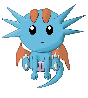
Zulo ~ Tentacool

Quality: 7/10
Creativity: 8/10
Adherence to Theme: 8/10
Very nice shading, really makes the skirt-thingamajigger seem ruffly, and I like how it's all wavy on the head. The little highlight accent on the jewel is a nice little detail. Isn't it some sort of rule that you aren't supposed to use black except for outlines, though? And I can't really figure out how the tentacles are supposed to be attached. And the fake eye thingys seem off, aren't they supposed to be a lot bigger? Though I suppose that could be attributed to artistic license.
Overall: 23/30
Ruffledfeathers ~ Aipom

Quality: 4/10
Creativity: 5/10
Adherence to Theme: 6/10
Shaky, and very blocky scratching. The shading isn't consistent, by your apparent light source far more of my right side should be shaded. And the patches of black outlines stand out far too much. It reminds me of a poorly made toy. It seems like Aipom, an energetic Pokemon, shouldn't be sitting down. A more energetic pose would have been better. The eyes are nice though, however it seems too fat, and the tail is too thick. Nice hand, though. I feel like the mouth should be more emphasized.
Overall: 15/30
And the winners are:
1. Shyguy- the Pokemon
2. RainbowRayquaza
3. Zulo
Check back soon for your trophies! And to the people who didn't win, don't feel bad, I'll have a participation ribbon for you guys~
Mewtwo, sorry but it's too late. I'll still critique it if you want, but no ribbon for you.
The new contest will be up very soon.
EDIT: And the new contest is... Paper Crafts! See the first post for more information.
JUDGING TIME!!!
Shyguy- the Pokemon ~ Darkrai
Quality: 9/10
Creativity: 8.5/10
Adherence to Theme: 8/10
Very nice, and soooo cute! Nice shading, though the black does seem a tad light... and you might have gone a tad bit overboard on the dithering (that's what it's called, right?). I definitely think 'Darkrai' (or perhaps Darkrai's baby XD) when I see it though. Just one thing... one of the major things about Chibi is that the main features are retained... a flowy tail and flowy arms seem to be missing.
Overall: 25.5/30
Lucas755 ~ Pachirisu
Quality: 7/10
Creativity: 6/10
Adherence to Theme: 6/10
Not bad... the scratching is pretty nice and I like the pose. However... the shading doesn't seem to follow the contours of the body too well, and the eyes could use a tad bit more detail, I'd say. The head seems oddly attached. I feel you could have done a bit more to it to make it chibi/different from the normal pachirisu. Chibi isn't just a bigger head.
Overall: 19/30
Dragon ~ Salamence
Quality: 5.5/10
Creativity: 7.5/10
Adherence to Theme: 8/10
It seems very shakily scratched, rather blocky in fact. And the shading is just kinda there, it doesn't really pop or anything. I like the pose though, I've found that pose is hard to pull off, and yet you did. It's pretty nicely chibi-fied too, though I feel the wings could be larger. One of the points of chibi is showing off the main features of it.
Overall: 21/30
RainbowRayquaza ~ Rattata
Quality: 9/10
Creativity: 7.5/10
Adherence to Theme: 7/10
Very cute, and I love the pose! The shading is well done, though the white area seems a tad bit too light. It's not very chibi-fied at first glance, though now that I look at it more closely, it's pretty good. The proportions are far too normal, but the eyes are nice, and you did a good job with sorta making the teeth more evident.
Overall: 23.5/30
Zulo ~ Tentacool
Quality: 7/10
Creativity: 8/10
Adherence to Theme: 8/10
Very nice shading, really makes the skirt-thingamajigger seem ruffly, and I like how it's all wavy on the head. The little highlight accent on the jewel is a nice little detail. Isn't it some sort of rule that you aren't supposed to use black except for outlines, though? And I can't really figure out how the tentacles are supposed to be attached. And the fake eye thingys seem off, aren't they supposed to be a lot bigger? Though I suppose that could be attributed to artistic license.
Overall: 23/30
Ruffledfeathers ~ Aipom
Quality: 4/10
Creativity: 5/10
Adherence to Theme: 6/10
Shaky, and very blocky scratching. The shading isn't consistent, by your apparent light source far more of my right side should be shaded. And the patches of black outlines stand out far too much. It reminds me of a poorly made toy. It seems like Aipom, an energetic Pokemon, shouldn't be sitting down. A more energetic pose would have been better. The eyes are nice though, however it seems too fat, and the tail is too thick. Nice hand, though. I feel like the mouth should be more emphasized.
Overall: 15/30
And the winners are:
1. Shyguy- the Pokemon
2. RainbowRayquaza
3. Zulo
Check back soon for your trophies! And to the people who didn't win, don't feel bad, I'll have a participation ribbon for you guys~
Mewtwo, sorry but it's too late. I'll still critique it if you want, but no ribbon for you.
The new contest will be up very soon.
EDIT: And the new contest is... Paper Crafts! See the first post for more information.
Last edited:
Ivy Newton
kg*m/s^2
- Pronoun
- she
Jewel Espeon
is your favorite espeon.
Ivy Newton
kg*m/s^2
- Pronoun
- she