• Welcome to The Cave of Dragonflies forums, where the smallest bugs live alongside the strongest dragons.

    Guests are not able to post messages or even read certain areas of the forums. Now, that's boring, don't you think? Registration, on the other hand, is simple, completely free of charge, and does not require you to give out any personal information at all. As soon as you register, you can take part in some of the happy fun things at the forums such as posting messages, voting in polls, sending private messages to people and being told that this is where we drink tea and eat cod.

    Of course I'm not forcing you to do anything if you don't want to, but seriously, what have you got to lose? Five seconds of your life?

Messed up Fonts

Pikachu

Kelp is good! Yum yum!
Pronoun
he
I need your input.
I have been working on my site: Pikachu's Plaza.
Go there and then head to the style switcher. Switch the style to Marowak's Death. Now look at the headers. Does the font look like the image below?
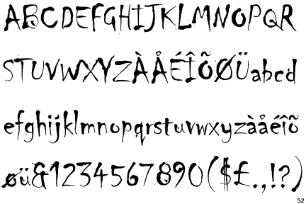
Chiller.gif

Voice your input by posting a comment. Thanks.
 
I feel like I need to tell you this: Special Pikachu style is honestly hideous. But! You can fix this easily by picking a much softer color of yellow for the content, and getting rid of that ugly image on the columns and replacing it with a solid color (perhaps a pastel pink?)
 
Umm the Pikachu and Palkia are sooo bad.
1. to much images. (THINK ABOUT THE DIAL UP PEOPLES)
2. You can hardly tell the links on both.
I have one question. What is that font you use for your avatar?
 
I meant the Pikachu one, sorry.

EDIT: Also, it kind of pisses me off when links change from being not bold to bold when you hover over them. Maybe this is a personal thing, but I really hate to see it on sites.
 
I'm thinking about getting rid of the Palkia and Pikachu styles and just keeping the Marowak style, as it seems it is the best out of all.
And I'll just base all the other styles off of the Marowak.
 
Back
Top Bottom