• Welcome to The Cave of Dragonflies forums, where the smallest bugs live alongside the strongest dragons.

    Guests are not able to post messages or even read certain areas of the forums. Now, that's boring, don't you think? Registration, on the other hand, is simple, completely free of charge, and does not require you to give out any personal information at all. As soon as you register, you can take part in some of the happy fun things at the forums such as posting messages, voting in polls, sending private messages to people and being told that this is where we drink tea and eat cod.

    Of course I'm not forcing you to do anything if you don't want to, but seriously, what have you got to lose? Five seconds of your life?

Suggestions My Drawings. :B

Flare

The Chosen One
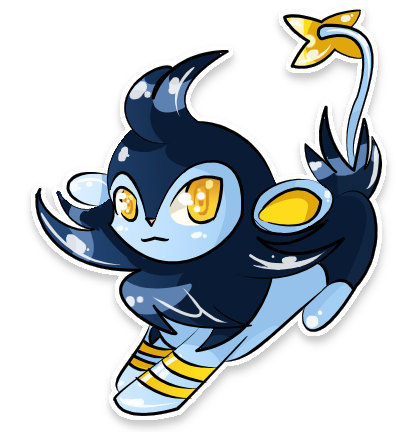
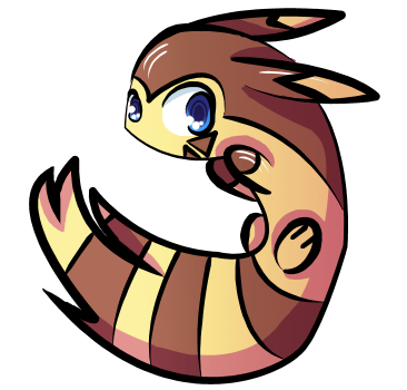
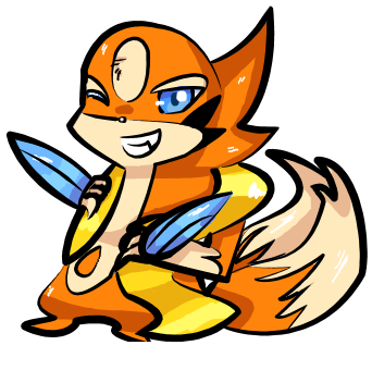
Yes, I draw. I tend to draw 800*800px pictures. I feel like there's more room. Anyway, here are some things that I drew. I would appreciate critiques since I get showered with compliments. You can look at more pictures at my dA account.

The images might be a bit big, so I'm putting links to the big ones.
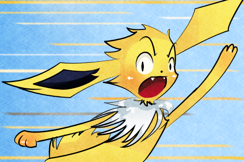
jooolt_by_flarefugikage-d4jtgjl.png

luxio_by_flarefugikage-d4d2m4p.png

furret_by_flarefugikage-d4cc8fz.png

floatz_by_flarefugikage-d4b2xtu.png

And here are a few more. [X][X](Bad scanner is bad. V_V)[X][X] [X](Huge image is huge.)
 
These are very good. the coloring especially is great. Of course, you asked for criticism, so here goes.

Most of these seem to be quite loose anatomy-wise. This is alright to a degree but, for example, your jolteon up there at the top? Its arms don't really connect with the torso well. The luxio, while fantastically adorable, had pointy front paws but round, tiny back legs. Also, while varying the thickness of the lines looks very good, in some places it's too much, like on the jolteon's right ear and the top of its ruff.

Very good stuff, though.
 
These are awesome and I love your drawing style! :3
If you want critique, though, maybe try rounding off a few of the longer edges, because there are some little corners that don't really belong.
 
The arms on the Jolteon are disproportioned (meaning if you put them straight down, they'd be at a different level), but other than that, beautiful artwork. :)
 
Back
Top Bottom