• Welcome to The Cave of Dragonflies forums, where the smallest bugs live alongside the strongest dragons.

    Guests are not able to post messages or even read certain areas of the forums. Now, that's boring, don't you think? Registration, on the other hand, is simple, completely free of charge, and does not require you to give out any personal information at all. As soon as you register, you can take part in some of the happy fun things at the forums such as posting messages, voting in polls, sending private messages to people and being told that this is where we drink tea and eat cod.

    Of course I'm not forcing you to do anything if you don't want to, but seriously, what have you got to lose? Five seconds of your life?

Suggestions /spritefail - Ninjabait's Sprite Thread

Ninjabait

ROCKET HIPPO! FIGHTING BAD GUYS! CAUSING DAMAGES!
I've been spriting for quite a while now, and over time, I've had six other sprite threads on one other forum. And plan one more on a different forum, but right now, I'm going to dump put one here for you're viewing and critiquing pleasure.

Now, I absolutely suck at introductions, so I'm just going to leave the rest of this post for teh sprites and a snazzy ending.

Splices
Scyzorcross1548561859-iaza-2.png
Shenchleonble.gif
The100.png
Mystic__Lileep_Mothim_S__Rayquaza_A.png
Mage__Alakazam___Absol___Mighteyena.png
Glacier__Glaceon_Scizor_Regice_Glis.png
Furry__Vigoroth___Azurill_347969038.png
ElectricMunchlax__Pikachu_Elekid_Mu.png
Canadian_Cactus__Cacturne___Arti-1.png
Shabsol__Shinx_Absol_7142558938-iaz.png
GraveyardSpecterMarowakDusknoirDusc.png
BugzapAbomasnowElectivireYanmega.png
AbomasnowasFire-SteelType-1.png
YellowSplice-1.png
MeadowFrame1.png
MeadowFrame2.png
DarkXmasOrangeBodyBlueFeatures.png

FroslassRetypedasaGrass-PoisonBello.png
Poison-DarkNumelForAnimationsFra-2.png
Poison-DarkNumelForAnimationsFra-1.png
VilplumeFemaleRetypedasIce-GrassTyp.png
NidorinoasanSteel-IceType-1.png
HeatranRetype-Fire-GroundHippowdon-.png

Otaku-1.png
leafeonfan1200_favorites_splice2-2.png
Profesco1-1.png
Profesco2-1.png
Profesco3-1.png
Profesco4-1.png
Profesco5-1.png
Profesco6-1.png
Yonowaru.png
Favorite_1__Luxio___Glaceon___Misdr.png

Fake Game Stuff =O
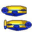
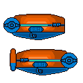
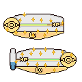
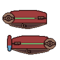
HP Bars, will Update with a Pallet soon!
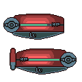
CustomHPBar-3.png
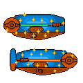
CustomHPBarShiny-2.png

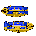
The Standard Ones, the Shiny ones are a little different.
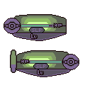
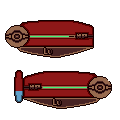
CustomHPBarSleep.png
CustomHPBarSleepShiny.png
CustomHPBarPoison.png
CustomHPBarPoisonShint.png
CustomHPBarParalyze.png
CustomHPBarParalyzeShiny.png
CustomHPBarFreeze.png
CustomHPBarFreezeShiny.png
CustomHPBarBurn.png
CustomHPBarBurnShiny.png

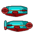
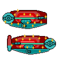
Ones for status, shiny status ones included too! =O
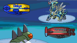
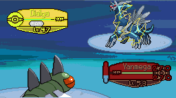
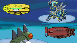
CustomHPBarExample-3.png

An example battle.
Reposes of current Pokemon (Organized M1-M2-F1-F2, whereas Male is M, Frame 1 is 1, F is Female, and Frame 2 is 2):
Dialga.png
Arceus1Normal.png
Azelf1.png
Azelf2.png
Mepsrit2.png
Mesprit1.png
Manaphy1.png
Manaphy2.png

Moltres1Normal.png
Articuno1Normal.png
Zapdos1Normal.png

Regice1Normal.png
Regirock1Normal.png

Cleffa1.png
Clefairy1.png
Clefable1.png
Gyarados1F.png
Gyarados1M.png
Dragonair1.png
Rhyhorn1F.png
Rhyhorn1M.png
Rhyperior1F.png
Rhyperior1M.png
Leafeon1.png

Heracross1F.png
Heracross1M.png
Meganium1M.png
Meganium1F.png
Gliscor1.png

Absol2.png
Absol1.png
Roselia1F.png
Roselia1M.png

Buizel1.png
Carnivine1.png
Floatzel1.png
Kricketune1F.png
Kricketune1M.png

Scratches, HGSS Cleanups, 'n Edits
Slugisteel-Minty.png
Slugisteel-1.png
(EDITS)
th_DiglettScratch.png
SnagretSpriteWIP.png
SnagretSpriteBKGRD.png
(SCRATCHES)
PikachuHGSSCleanup-M.png
PikachuHGSSCleanup-F.png
HGSSChikoritaCleanUp-1.png
(HGSS)
LatiasDevamp-1.png
(Devamps and Revamps)
Contest Entries
GTS+ Contest Entries
Blissky.png
Icetrode.png
ThunderCowMagnezoneGrumpigMiltan-1.png
- Yet to be Judged
Fire-RockRetypeGiratina-4.png
-First Place
SPPF WSC Entries
31.gif
-Finalist (W31)
WSC30-BannerofHeartGoldandSoulSiver.png
-Didn't do diddly (W30)
32-FuturisticLinoone.png
-Finalist (W32)
ContestEntry-MarillMarillFrame1G-1.png
-Not a Finalist (W29)
332-Lapras-Fire-1.png
331-Dragonair-Fire-1.png
-Finalist (W33)

TCoD WSC Entries:
Banner4.png
(Week 1)
*I know that you're supposed to enter three separate images, I just combined it for you guys. Please don't give criticism on this until the contest is over.

So, that's basically it.

Really, all that's left is for you, the viewer/lurker to give criticism on the sprites (and two banners) you see before you.

And as you can tell, I suck at closing to.
 
Last edited:
Oh yes! You're that... guy, from SPPF. I'm not a member there, but I do keep an eye on the WSC.

...You've got some prety decent skill there, I think, but there's a few things you could do to improve. First off, scratch moar. Your only scratch is... well, lackluster, but you show such skill in your edits and mixes and typechanges that surely you'd be able to do a good-quality scratch if you put your mind to it. Or if that's too big an undertaking, start with mostly scratch and move up from there. Also, I guess it's the habit to abuse streaks (colored outlines) in WSC entries, yes? They make a mediocre sprite instantly look very sleek. Well, I'd advise against it-- it's a cheap trick, for one, and for another I'm not a fan of the double-layering you do where the outer layer is darker than the inner one. It's confusing. ._.

Also you might want to fix the pagestretch by pressing enter every once and a while between your splices/reposes.

All in all, above average skill, but start to push your boundaries a little maybe. ;D

Happy to know that people are referring to my gender correctly. =D

I want to scratch more, and luckily I work quickly, but I just can't figure out what to scratch, I'm constantly stuck between multiple ideas, and I can never decide what to do.

It is my second scratch, so I didn't expect it to be that great. At least it made lackluster.

I'd be able to make a pretty good scratch if I practiced more, I set my mind to making that scratch, worked for three and a half hours, and it's still not that great. D=

I've only really done it twice for contests, and twice otherwise, and only to spruce it up if it's kind of boring, I don't really need to do it, it's just like icing kind of, to make it look interesting.

*fixes*

Got it, but, how do you recommend I do that? My Time/Space Altering Device is still charging after it's last use.
 
You could always start multiple scratches; I always have more than one sprite in progress at a time, though maybe that just works for me. Who knows, you could try.

Or, I could give you a suggestion for a scratch sprite, such as this: how about a scratch Nidoqueen, either as a grass type or jungle-themed? (I don't know if there's really a difference, but if you can see a difference, go for either. xD;) That's just a suggestion, anyway; you don't have to, and if it inspires something else, go for it. =3

Not much of a multitasker, computer wise.

And also, the problem is that I can't decide what to scratch, not that I don't have any ideas.

Also, can someone give critiques on the sprites already here? I WANNA IMPROVE! D=
 
There's really not a lot to crit. Your splices are very good, although some of the outlines seem like they have too much black on them (for example, the different colored Scizor mixes and the Scyther/Heracross mix.

The outlines on your scratch sprite are pretty shaky; if you wanted to fix up that sprite a little, try smoothing out the outlines. Unless you were looking for a certain effect, I'd remove the dithering, as well; non-dithered shading looks much more professional and it also looks smoother.
 
LatiasDevamp.png


First devamp, what do you guys think?

Scyzorcross1548561859-iaza-1.png


I took you're advice and removed some of the black on the splice. I also recolored the inside of the claws.

Profesco1-1.png
Profesco2-1.png
Profesco3-1.png
Profesco4-1.png
Profesco5-1.png
Profesco6-1.png

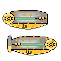
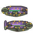
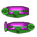
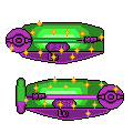
Preyezogon, v2.

Believed to be a Rotom that developed extreme mutations, it can now possess empty shells of metal, however, unlike regular Rotom, the plasma sollidifies, pausing a cushy support against physical attacks. Depending on the color of the plasma, the type and moves of the Pokemon change.

All colored areas have fuly colored outlines, removed a little more black, and made the hardened plasma as a new surface, casting shadows.

So, um, yeah.
 
The devamp looks really shaky around the edges, especially the head. Yes, back then, the outlines were bad, but they didn't shake around the edges. The head should be rounder.

Herascyzor or whatever has extremely little Heracross. I dunno what you would put in, but right now, it's mostly Scizor and some Scyther.

Preyezogon is a recoloured Scizor with Flygon wings. It's fine. Not much to say.

Hope I helped~

Preyezogon also has Rotom's eyes, and Sablye's diamonds. ;D

LatiasDevamp-1.png


Removed a little bit of the shakiness (or made it worse), and changed the left side of the body, also added a line between the grey (or purple) and the red.

Scyzorcross1548561859-iaza-2.png


Changed the color scheme. Not much else I could really do. =/
 
Um... kinda dark, flat, and ugly, to tell you the truth. Make them a bit brighter, so you can see them, and maybe more cool looking. Like 3-D?
 
How do you suggest I make them more 3-D? =/

CustomHPBarShiny.png


First off, I made a Shiny.

CustomHPBar-1.png


I made them a little brighter, so they stand out more.

CustomHPBarExample-1.png


I also updated the example.
 
But still.. brown doesn't make sense. White, green maybe? Maybe shade them in a way that would make them stick out at you?
 
Changed the styles of them.
CustomHPBarShiny-2.png

The New Shiny One.
CustomHPBarSleep.png
CustomHPBarSleepShiny.png

The HP Bar of a Pokemon that has fallen asleep. Shiny Included!
CustomHPBar-3.png

The New Regular One.

CustomHPBarPoison.png
CustomHPBarPoisonShint.png

The HP Bar of a Poisoned Pokemon
CustomHPBarParalyze.png
CustomHPBarParalyzeShiny.png

And a Paralyzed one.
CustomHPBarFreeze.png
CustomHPBarFreezeShiny.png

Also a freeze.
CustomHPBarBurn.png
CustomHPBarBurnShiny.png

A Burn one as well.

CustomHPBarExample-3.png

Updated example.

Edit:

Also, another scratch:

th_DiglettScratch.png
 
Last edited:
Back
Top Bottom