• Welcome to The Cave of Dragonflies forums, where the smallest bugs live alongside the strongest dragons.

    Guests are not able to post messages or even read certain areas of the forums. Now, that's boring, don't you think? Registration, on the other hand, is simple, completely free of charge, and does not require you to give out any personal information at all. As soon as you register, you can take part in some of the happy fun things at the forums such as posting messages, voting in polls, sending private messages to people and being told that this is where we drink tea and eat cod.

    Of course I'm not forcing you to do anything if you don't want to, but seriously, what have you got to lose? Five seconds of your life?

Ymo's art-thread (Heavy images(?))

I don't mind. :o

Here is a small attempt to regain art-will.
Battleofepicproportions.jpg

Tentaclerapemonster vs pedobear I mean, Politically-Correct-Battle between two perfectly normal and innocent pokemon.

And...
Buddies.jpg

Sleeping by the river. A battle between Wynaut and Krabby would be pretty no-contest, since Wynaut would just reflect Krabby and win.

Also you might notice my attempts at backgrounds instead of having them in a void.

Edit:
Also, made three fakemon to reflect the shameful lack of non-rocktypes in ancient pokemon. What about bacteria?
Bacteriafakes.jpg

They might not be as... Imaginative as real pokemon...
 
Last edited:
Still no progress. <<'

I have five million essays to write and can't get any of them done.

Have some cherubi instead.
Cherubi.jpg

If you think into it, Cherubi is sort of creepy... Siamese twins with the dominant twin slowly eating the other one... D:!!
 
Still no progress. <<'
I have five million essays to write and can't get any of them done.

it's fine - I'd rather wait until you feel up to it and get a better drawing then rush you into it now

EDIT: If you'd rather, you could always colour this for me instead:
MewGengar.jpg

I'd like a smooth colour of that drawing (for the oekaki) as much as a new logo - I really do love that image, and tbh you did say ages back that you'd get back to it eventually. I'll understand if you don't feel like colouring it, but I'd love it if you could... :)
 
Last edited:
I could color it with flat colors/a bit of a shading too, and fix it so that it has a transparent background.

Also, I could get to it right away (coloring is a bit less annoying/tiring than inking)
 
yes please go for that - just try to make it look as nice as possible, as it would go front and center of an art-orientated site :P no pressure lol
 
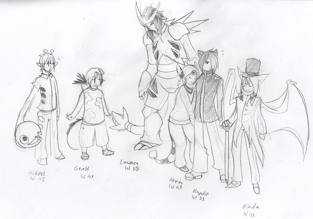
New artsy fartsy:
The image is so large that I'll post a link instead.
http://fc00.deviantart.net/fs70/f/2010/107/2/8/Gijinkablast_by_umbbe.jpg
If deviantart changes the address, here is the link to the deviation:
http://umbbe.deviantart.com/art/Gijinkablast-161081190

As is said in the comments, dragonair, mudkip and Eusine were drawn by my friend. :3

The colors indicate time: Scizor was first, then blue, then purple on the right, then black and purple on the left, and finally green.

And I must say: probopass is awesome above awesome.

Edit: Also, finished coloring a pic I drew yesterday:
20pokemoncolorskopio.png
 
Last edited:
Probopass has a mysterious charm indeed~ M'thanks. And now, new art:
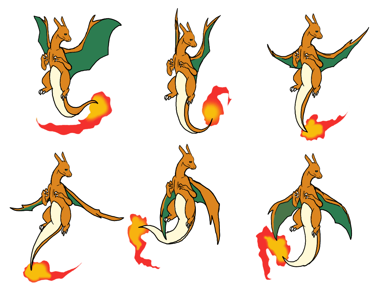
flying-char2.gif

I can has animashuns too! The white part of the tail was the black lineart around the tail before. Apparently transparency doesn't like the idea of lineless fire.
 
Been sick lately, had a bad ear infection that made my left ear practically deaf... Cough, fever, snifflyness, art block...
Im going to school tomorrow. Let's hope this is over now.

Have a ditto in the meanwhile:
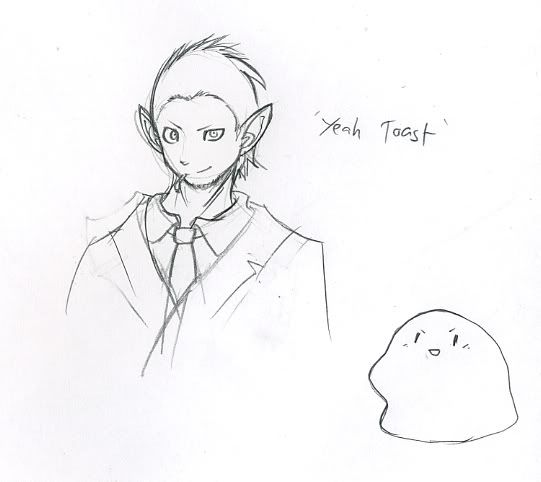
Yeahtoast.jpg

The idea came from a pic of ditto with the spy's disguise. (aka paper-oval strapped to face with a doodle of a person/class/pokemon on it)
Made me think that ditto would be the perfect spy, and therefore Yeah Toast was born.
(Name comes from my GPX-ditto, which is a pair with my friend's 'French Toast'. I suggested the name because I was watching the 'team fortress - yeah toast' video on youtube and it was very influential. So this design made a nice little circle in a way.)

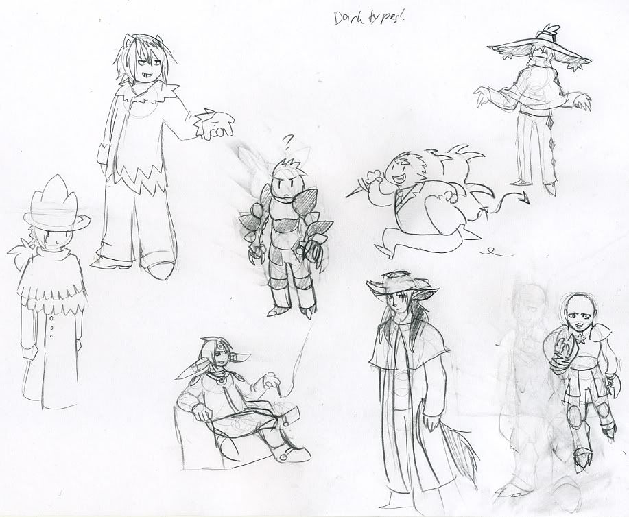
Edit: Also, some random dark types inspired by Yeah Toast spying around -> mafia -> dark types.
Darktypes.jpg

Not all umbreon are thin and bish. (but you could argue that it's still 'bishie' in a sense, since my skills at drawing humans are limited to what I find somewhat attractive. I can't draw greasy filthy mob-bosses, at least not yet.
 
Last edited:
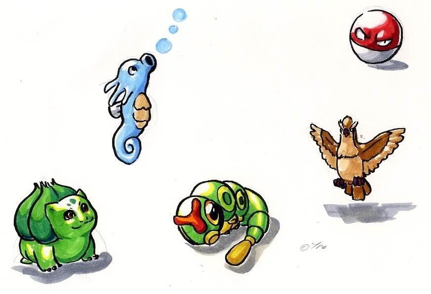
Some marker tests:
Markerypokes.jpg

My friend had said that they might go bad with time, so I decided to finally get off my butt and test my copics.
It's a good thing they don't, since they cost a pretty penny.

I think this is pretty good too - esp voltorb. (I drew it first, because I just love Voltorb's red color~)
 
Just passing through here, but your art looks really nice so I feel like I need to. I love the variety of Pokémon you draw and the interesting poses you give them while keeping your own style in the mix. That montage of Pokédoodles just so well drawn that I can't help but be a bit jealous. I particularly like the Xatu and her pose, though her eye markings seem a bit off. The Cherrim has very nicely drawn lineart that feels bubbly. The Magcargo made me giggle a bit. Charmeleon is super-actiony, which is great.

Those marker doodles look nice as well. The coloring has a bold feel to it that you don't really see elsewhere.
 
I don't know what else to say save thanks. ;W,
(I guess I was trying for a bit more realistic eye-markings for the xatu. No go.)

I have been playing Heart gold for a while now, and it was time for a portrait of my team.
Heartgoldteam.jpg

Who DOESN't have an ampharos? It's just so... Accessible.
 
again with your gjinka, it's the natural emotion that impresses me - I completely forget that tyranitar man is a bit ridiculous when he's so predictably awkward from his size :)
 
Markers! :D

Yes, Copic markers are amazing. I don't know if it's a style or what, but the marker doodles seem like they're cell-shaded. Normally that wouldn't be such an issue, but Copics are amazing for blending. I'd suggest laying down the colours like you are now, but quickly so the ink can't dry completely before you're done, and then taking the base colour and stroking over the shadows several times to blend it. Gives it a very smooth, dynamic feel. It takes practice, though, of course.

But if you like it how it is - cellshaded and all (and I admit, it gives a very bold feel to it) - then feel free to ignore these past paragraphs. :P

But on a whole, your drawings are excellent. The lines are very straight and sure, and your anatomy is pretty good, too. In particular, I love that Tyranitar gijinka's expression.
 
Thankies firechao - He is a bit awkward because he couldn't fit on the paper straight up... :P

Blazheirio899:
I never understood how you can blend with them- Im somewhat slow with the markers, so by the time I fumble another color from there, the first layer is already dry. D: Then I try to repair my horrorful mistakes by stroking with the colorless one, but it never helps... Much...

Thanks for the tip, tho! I'll try out the blending, too.
 
That's probably the reason. It gets harder to blend after you let it try - it's still very possible. Oh, yes, and what paper do you use your markers on? I use paper that's specially designed for Copics, which probably aids in the blending process, but if it's printer paper or something like that, it's understandably harder to blend.

I only recommend using the colourless blender when you're trying to blend a colour into the white of the paper. Think of the colourless blender as... a diluter, if you will. It makes the colours lighter and bleeds them together, but then you've got this streak of lighter colour where the two colours meet, which looks pretty bad. :P So, using the same colours is always your best bet - in my experience, that is.
 
Im using a brand which reads 'Schoellershammer'. It's specifically designed for markers, because normal printer-paper apparently drains the markers dry. (Also, I remember testing the markers on normal paper- they didn't stick and tended to bleed. Though, they stayed wet for a longer time.)

Ah, now I understand what the blender is for~ You can mostly see the failures of me using blender from the Voltorb's red mixing into the white.

Edit:
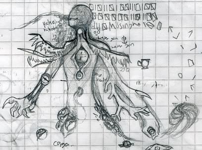
Also, have a missingno-gijinka. Because Missingno is the Grail from hell.
Missingno.jpg

I don't even know.
 
Last edited:
Back
Top Bottom