• Welcome to The Cave of Dragonflies forums, where the smallest bugs live alongside the strongest dragons.

    Guests are not able to post messages or even read certain areas of the forums. Now, that's boring, don't you think? Registration, on the other hand, is simple, completely free of charge, and does not require you to give out any personal information at all. As soon as you register, you can take part in some of the happy fun things at the forums such as posting messages, voting in polls, sending private messages to people and being told that this is where we drink tea and eat cod.

    Of course I'm not forcing you to do anything if you don't want to, but seriously, what have you got to lose? Five seconds of your life?

A few fakemon

Even though I've only made a few more, I've still been working on all the sprites, mainly just editing a bit here and there. Started making back sprites but don't feel they are good enough to post yet.

Here's the complete fire starter line and icons for the grass starters.
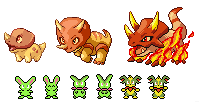
firestartgrassicon.png

Fire starters: I may edit the middle one so he is shorter, his sprite looks kind of huge compared to the others. I am not sure I like the flame paws on the final one, maybe only the front ones should have flames? Or no flames at all? They seem kind of... there, but most fire Pokemon have flames on their bodies with the exception of the Vulpix line, Houndour line, and a few others. They look a little like Ground types but remain pure Fire.
Grass icons: I was having great difficulty in making the icons look like 3rd/4th gen, with the semi bird's eye view. So I decided to make them similar to how they looked in 1st/2nd gen, but with each individual species having its own icon. For those wondering about the weird colors: in 3rd gen, there are 3 pallets for these icons consisting of 15 colors each. That is why, for example, Bulbasaur has a bright green icon despite it actually being a more bluish-green.
 
SPOOOAAD
I think he might be my favorite.

Looking at your evolution lines, I don't know whether I'd choose the Fire-type or Water-type. The Water-type is cuter but the Fire-type evolution line looks awesome. In my opinion you should keep the flames on the final evo.
 
Definetly the best scratch spriter I've ever seen. Finally a update!

I love the last evo for fire! It's nice. The 2nd one probably should be shorter and they all look pretty much like a ground-fire type, which wouldn't be too bad either. The legs on the third one look fine to me with the flames but if you do feel like you should remove the back flames than you can but you should change the type to fire/ground then. On the note of the 2nd one , it should have more fire characteristics taking that they usually do unless your making it part ground type. I personally think you should change the type to part ground. It just fits.

The icons are not that great however. Not that I'm saying I could do better but just they're not right. Well the idea of the 1st and 2nd gen icons is just not right. One you would have to de-vamp the icons which is wrong, so just try again with the 3rd and 4th gen icons. Tip is too imagine your making your fakemon a sprite for a mystery dungeon game facing the right, then simplify that and make it smaller, tilt it down just a little and there you go! Your icon! Sounds harder than looks though, but hey, your an amazing spriter so I'm sure you could.

Come with the next update soon!:grin:
 
Last edited:
To be fair, I'm primarily a traditional artist, spriting is secondary. I'm glad that you guys feel I'm competent at it, heh.

About Pokemon resembling certain types; Charizard and Gyarados look like Dragon types, and Vibrava looks like a Bug, but they're not. I have so many dual types, I want to keep the starters fairly basic.

Yeah, the tiny icons do kind of suck, but they're so much easier to make. Whereas I struggled to make them look 3rd gen, the "crappier" ones only take minutes to make at the most. With over a hundred icons to make, I'd really rather take an easier way out, especially since the regular sprites already have a lot of effort put into them. This may change, we'll see.

waterstarters2.png

Water starters. I think these guys are my favorite so far. Despite the bulky appearance, they have a great Speed stat.
 
8D I wanna get one and name it Shamu~
Yes, I have finally decided that the water starters are my favorite. Although, unlike the other two, the final evo has no visible blowhole, it seems. Did you do this on porpoise :D? *shot*
 
8D I wanna get one and name it Shamu~
Yes, I have finally decided that the water starters are my favorite. Although, unlike the other two, the final evo has no visible blowhole, it seems. Did you do this on porpoise :D? *shot*

Wow. You just read my mind! Although, the Shamu show down in Orlando sucks now. |:-(

Well charizard should be in fact, a dragon type with salamance, but if he was, than he wouldn't be a starter now would he? Plus dragon type didn't come out till 3rd gen (?) so. Then again, like magnemite evo line got changed to a dual type in the 2nd gen cuz they came out with steel type so why not Gyrados? Apparently he's one of the neglected pokemon, like Tauros. Vibrava is just one pokemon that is just one that looks to belong in too many categories. I understand that you want to keep it plain and simple considering that there are, quite a few dual types you have there but in every region there's at least one dual type starter, if not all the way dual.

Meh, sorry if I was rude about the icons. It does take alot of effort but it would be nice.

The water line is the best! Though I can't say i'm not very partial to the fire types. It is going to be a hard decision.
 
Even though I've only made a few more, I've still been working on all the sprites, mainly just editing a bit here and there. Started making back sprites but don't feel they are good enough to post yet.

Here's the complete fire starter line and icons for the grass starters.
firestartgrassicon.png


*Alakazam grabs the awesome fire starters and teleports away while nobody notices*

My precious...
 
Well charizard should be in fact, a dragon type with salamance, but if he was, than he wouldn't be a starter now would he? Plus dragon type didn't come out till 3rd gen (?) so.
Actually Dragon has been programmed into the games since the very first games, Red/Green, came out in Japan in 1996. The only types that have not been in since day one are Dark and Steel, which were both introduced in Gen II (Gold/Silver).

I understand that you want to keep it plain and simple considering that there are, quite a few dual types you have there but in every region there's at least one dual type starter, if not all the way dual.
May I remind you of Meganium, Typhlosion, and Feraligatr?
 
Although, the Shamu show down in Orlando sucks now. |:-(

I wouldn't know, I only went to the Shamu shows at San Diego. Those were actually pretty cool, though.

Well charizard should be in fact, a dragon type with salamance, but if he was, than he wouldn't be a starter now would he?

I was confused with that when I was younger(heck, he looked like one to me), but I never really realized why he wasn't one until you mentioned that. My I'm-feeling-so-smrt-today stroke has come to a stop momentarily.
 
waterstarters2.png

Water starters. I think these guys are my favorite so far. Despite the bulky appearance, they have a great Speed stat.

I'm not exactly sure which type of dolphin you used for the design, but I'm assuming it's an orca for the last one, or bottle-nose dolphin for the first two.

The first one's very cute, though its head seems like it's more separate than it should be. I know real life atanomy doesn't apply as much in Pokémon, but fish, and marine mammals usually have stream-lined shapes. So possibly make the back of the head a bit more smoothed out, and more connected looking. Sorry if that doesn't make much sense. The first one's right (our left) flipper seems like it's stiff, because the pixels go up in a diagonal line. If it would be possible for make the flipper slightly rounded at the top, I think it'd do wonders. The shadin on the snout is very nice. It doesn't seem like the back of it should have a highlight. The eye is nicely done.

My biggest complaint on this one would be that it seems like the marking are unsymmertical. The hand flippers seem like one is completely white on th underside and the top of the end of the flipper is tipped white. The other one looks like it has a thumb, while the other doesn't. The tailfin seems like the right white marking is longer than the other one. The pose is very cute. The markings seem original, too.
 
What's wrong with them?

The first one is great, but the last two just look sort of two-dimensional for some reason. The second one looks like it just needs a bit of editing. It only looks a bit two-dimensional, and I'm not really sure why it has feet. That's pretty much all I can criticize for that one. But the third one just plain bugs me. Its back arm comes up at a very odd angle, and the dorsal fin is oddly placed too. Something about the way its head is attached is weird, but I can't put my finger on it. Its pose is also odd...altogether its upper body is just very strange-looking. And once again, if it's a whale, I don't know why it has feet, unless it's amphibious. (Is it?)

This is pretty much the most detailed criticism I've ever done, so I don't really know how it's going to come across, but if I sound like a rotten person, just know I'm trying to be constructive. :sweatdrop:
 
This isn't so much criticism on the sprite as much as on the design (overall the sprites look very nice; I'll probably have more time to crit later), but the third water evolution seems too cute to be the third evolution.
 
Hum, kind of stumped now. I like feedback but just feeling really clueless about the water starters now. So they should not have legs at all? The second one does have a thumb on the closer flipper I guess it's just hard to see. Sorry.
 
I really like the middle dolphin evolution! The pose is A+.

Orca guy's head/neck position looks like it'd be a little painful for him though. :V
 
Actually Dragon has been programmed into the games since the very first games, Red/Green, came out in Japan in 1996. The only types that have not been in since day one are Dark and Steel, which were both introduced in Gen II (Gold/Silver).


May I remind you of Meganium, Typhlosion, and Feraligatr?

Oops! That's right but I said almost, did I not? I knew that I was missing info, thanks for clearing that up.

I wouldn't know, I only went to the Shamu shows at San Diego. Those were actually pretty cool, though.


I was confused with that when I was younger(heck, he looked like one to me), but I never really realized why he wasn't one until you mentioned that. My I'm-feeling-so-smart-today stroke has come to a stop momentarily.

Everyone goes through times when they stop and think back on old thoughts that they've never understood and discover the reason.

San-Diego huh, I know a friend who's from there. The shamu shows used to have a better story/trick layout than they do now in my opinion. Just not enough tricks now. But the tricks they do have are pretty cool!


This isn't so much criticism on the sprite as much as on the design (overall the sprites look very nice; I'll probably have more time to crit later), but the third water evolution seems too cute to be the third evolution.

Nonsense! What about Megnanium?

Hum, kind of stumped now. I like feedback but just feeling really clueless about the water starters now.

Haha! :grin: Well, you can't please everyone and now your confused about everything and you don't know where to start, just tweak what the reviews you thought were right, said.

I really like the middle dolphin evolution! The pose is A+.

Orca guy's head/neck position looks like it'd be a little painful for him though. :V

So are Xenomorph's (The Alien) but you don't see it crying acid goo? I mean, his head must weigh a ton!

Wow, that's alot of quotes.
 
Back
Top Bottom