-
Welcome to The Cave of Dragonflies forums, where the smallest bugs live alongside the strongest dragons.
Guests are not able to post messages or even read certain areas of the forums. Now, that's boring, don't you think? Registration, on the other hand, is simple, completely free of charge, and does not require you to give out any personal information at all. As soon as you register, you can take part in some of the happy fun things at the forums such as posting messages, voting in polls, sending private messages to people and being told that this is where we drink tea and eat cod.
Of course I'm not forcing you to do anything if you don't want to, but seriously, what have you got to lose? Five seconds of your life?
You are using an out of date browser. It may not display this or other websites correctly.
You should upgrade or use an alternative browser.
You should upgrade or use an alternative browser.
Art... Thread?
- Thread starter Mhaladie
- Start date
Arylett Charnoa
For those who come after.
- Pronoun
- --
I love the guy's expression in that picture. It's just... so aloof and uninterested. It's awesome.
The Twilight picture is also nice, I particularly like the way you did the hair of both girls, it's quite realistic. However, there's still the problem of their shirts, they don't have folds and it's a bit flat. Also, the left girl's figure is sort of... disproportionate. I can't really explain it, but it looks a bit odd. However, the right girl's is pretty good!
The Twilight picture is also nice, I particularly like the way you did the hair of both girls, it's quite realistic. However, there's still the problem of their shirts, they don't have folds and it's a bit flat. Also, the left girl's figure is sort of... disproportionate. I can't really explain it, but it looks a bit odd. However, the right girl's is pretty good!
Thanks, and maybe I'll draw more of Lilianna and Katrina. For spur-of-the-moment creations, I like them quite a bit. :3
Because I love Avenue Q and this part of this song fits Hobo!Phoenix perfectly:
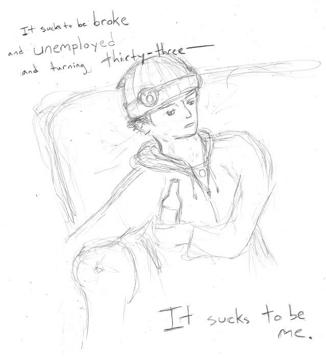
Kinda off but it took like 10 minutes. See, this is why I never finish my sketches. They take 10 minutes, and then to color them it takes like an hour. -_-
Avenue Q <33~
Dannichu
Tragically unbeyachted.
Avenue Q <33~
:DDD
And seriously; yaay~ That line fits extremely well and Nick looks so awesomely "it sucks to be me"-ish there and woah I'm being really incoherent, sorry about that.
You should ink/colour him :D
Mhaladie
like electricity
Thaaaaaanks~ Those characters are nooooot from Twilight, though, they're just random. :3
Thanks, Arylett, I'm glad the hair's good, and I know what you mean about the disproportionate-ness as well as the clothes being flat, but I was being kind of lazy and it seems that weird and disproportionate is becoming my style which is bad, I ought to fix that.
...DON'T YOU JUST LOVE AVENUE Q??
God, I have to stop doing these stupid sketches, but they're so mindless. I've going to try to color a bunch of stuff (including the HoboPhoenix one, of course~), but, uh. I've been working on coloring the Cell Block Tango one and damn, I need to find a less crappy way to color. It looks alright when I'm done, usually, but it takes ages and ages and ages. Aaaaaa
Anyway, after reading the Ace Attorney fan club thread, I felt the need to draw Edgeworth singing We Are One... because he'd be voiced by Cam Clarke right, right. I thought it'd be most fitting if he was singing with young!Franny, so:
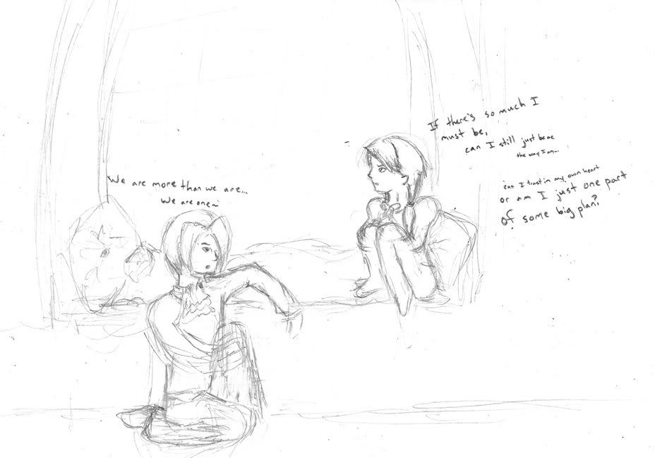
Sorry about all this PW fanart and the dumb sketches. D:
PS. Both of them are pretty messed up (especially Edgeworth) because the poses are stupid but it's ok.
Thanks, Arylett, I'm glad the hair's good, and I know what you mean about the disproportionate-ness as well as the clothes being flat, but I was being kind of lazy and it seems that weird and disproportionate is becoming my style which is bad, I ought to fix that.
...DON'T YOU JUST LOVE AVENUE Q??
God, I have to stop doing these stupid sketches, but they're so mindless. I've going to try to color a bunch of stuff (including the HoboPhoenix one, of course~), but, uh. I've been working on coloring the Cell Block Tango one and damn, I need to find a less crappy way to color. It looks alright when I'm done, usually, but it takes ages and ages and ages. Aaaaaa
Anyway, after reading the Ace Attorney fan club thread, I felt the need to draw Edgeworth singing We Are One... because he'd be voiced by Cam Clarke right, right. I thought it'd be most fitting if he was singing with young!Franny, so:

Sorry about all this PW fanart and the dumb sketches. D:
PS. Both of them are pretty messed up (especially Edgeworth) because the poses are stupid but it's ok.
Mhaladie
like electricity
Been on a drawing spree lately. I watched Dr. Horrible's Sing-Along Blog recently (thanks to Butterfree's signature, actually) and I loved it, so I had to cross it over with Phoenix Wright of course.
Ema Horrible:
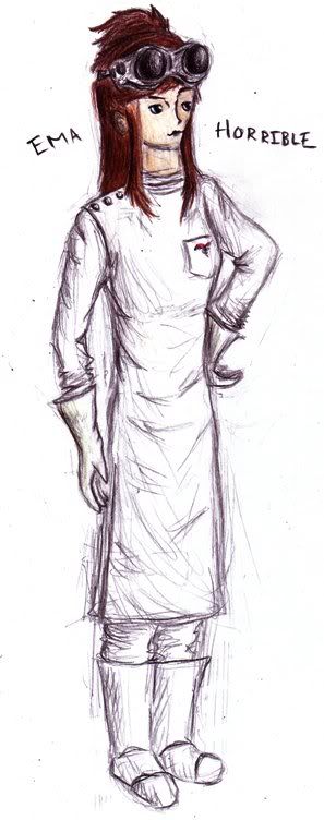
Her head is so out of proportion and I'm awful at shading white but oh well~ I think I'll draw another one with her ARCH NEMESIS Captain [Klavier] Hammer, too. Wheeeeee~
...I think I have a problem.
If you haven't seen it, go watch it now.
Ema Horrible:

Her head is so out of proportion and I'm awful at shading white but oh well~ I think I'll draw another one with her ARCH NEMESIS Captain [Klavier] Hammer, too. Wheeeeee~
...I think I have a problem.
If you haven't seen it, go watch it now.
Arylett Charnoa
For those who come after.
- Pronoun
- --
Dannichu
Tragically unbeyachted.
Eee, evil scientist Ema, I love it :D
Like Arylett said, the folds in the clothing looks really great, and I love the colouring on her hair, too. Her anatomy is god, too; I'm jealous of your hand-drawing, and her arms are much more... rigid than those you normally draw. Which is a good thing.
And who can resist crazy LKII/PW/general Cam Clarke-ish crossing over of things? I sure can't <3 Little Fran and Edgey look too cute for words here; I adore Fran's ponytail.
Mhaladie
like electricity
Of course I drew her too skinny, I always draw people too skinny. Meh. The lack of curves is kind of due to the outfit though, I guess? And I agree that it looks better when I'm not lazy and put folds in the clothes.
I love the little Fran I draw~
Anyway, thanks, guys. :3
I only have another stupid PW sketch, I'm sorry:
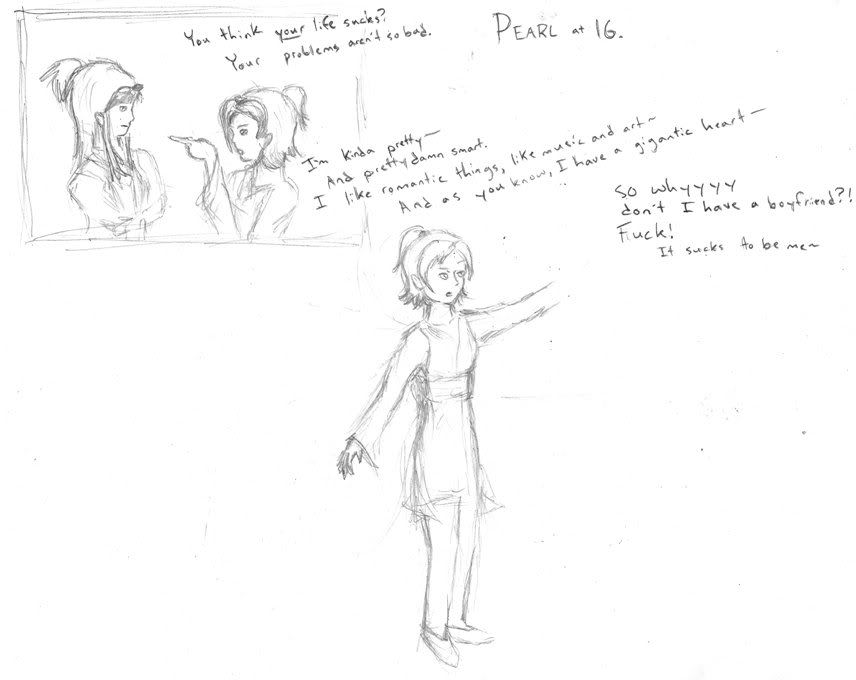
I have so many problems with this, though. I need to fiddle with my AJ-era Pearl design, because she didn't come out right here, and the picture of her where she's just standing there and singing is laughably disproportionate. I think it might be ok if her head was 25% smaller or she was taller and less skinny but oh well~
It's that Avenue Q song again.
I love the little Fran I draw~
Anyway, thanks, guys. :3
I only have another stupid PW sketch, I'm sorry:

I have so many problems with this, though. I need to fiddle with my AJ-era Pearl design, because she didn't come out right here, and the picture of her where she's just standing there and singing is laughably disproportionate. I think it might be ok if her head was 25% smaller or she was taller and less skinny but oh well~
It's that Avenue Q song again.
Dannichu
Tragically unbeyachted.
Pearl swearing like that is a hilarious mental image, it must be said. X3
I like your older-Pearl design. It's great fun to draw kids as older than they are. Your is much better than my attempt (which I can't find right now, but be assured that it sucks).
And crossing over musicals with PW will never, ever get old.
I like your older-Pearl design. It's great fun to draw kids as older than they are. Your is much better than my attempt (which I can't find right now, but be assured that it sucks).
And crossing over musicals with PW will never, ever get old.
Mhaladie
like electricity
Ew, sorry to the people who might possibly be interested in looking at this thread, but I've been away at school and my schedule is all bizarre and I simply have not gotten a chance to come on here at all. Plus, the only scanner is in my friend's room and I haven't even been drawing very much anyway so you know. Maybe I'll try to get the few things I've drawn up by, say, tomorrow or the day after?
Yeah yeah pretty much I'm just bumping this thread, please forgive me I swear I'll have stuff up very soon.
Yeah yeah pretty much I'm just bumping this thread, please forgive me I swear I'll have stuff up very soon.
Mhaladie
like electricity
*REVIVE*
...Yeah, so I meant to update this after I made that post, and then I... didn't. I have a couple of new things, but unfortunately a lot of them still aren't scanned, and some of them are not with me at the moment. (That is, they're at school and I won't be back there for a few weeks.)
I do have one thing scanned, though. I was practicing watercolors.
Franzy von Karma:
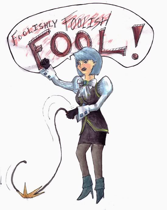
I pretty much am awful at faces, and I'm new at using watercolors, so.. D:
I was trying to develop a quicker/more cartoonish style of drawing people here, I think.
I think her body turned out ok, it's mostly her face and head that are not so amazing. I have to work on that. :P
(The lineart is better than the colored version, I think.)
...Yeah, so I meant to update this after I made that post, and then I... didn't. I have a couple of new things, but unfortunately a lot of them still aren't scanned, and some of them are not with me at the moment. (That is, they're at school and I won't be back there for a few weeks.)
I do have one thing scanned, though. I was practicing watercolors.
Franzy von Karma:

I pretty much am awful at faces, and I'm new at using watercolors, so.. D:
I was trying to develop a quicker/more cartoonish style of drawing people here, I think.
I think her body turned out ok, it's mostly her face and head that are not so amazing. I have to work on that. :P
(The lineart is better than the colored version, I think.)
Last edited:
Mhaladie
like electricity
Why thank you. :3
I think I will do some more stuff with watercolors, it comes out really pretty once you're good. Which, uh, I'm not yet, but practice practice practice right? And I have this new thing:
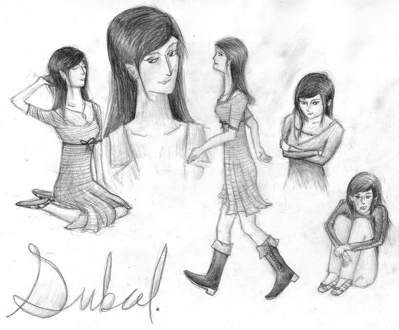
There are definitely a whole bunch of little mistakes, but overall I think I am fairly pleased..? Her neck is supposed to be very long and she's supposed to be disproportionately thin, and the one in the lower righthand corner is her dressing up as someone else, which is why she's so.. deranged, there.
Also I have this stupid cartoon. From a discussion with a friend about tildes and programming. (I know NOTHING about programming.)
I think I will do some more stuff with watercolors, it comes out really pretty once you're good. Which, uh, I'm not yet, but practice practice practice right? And I have this new thing:

There are definitely a whole bunch of little mistakes, but overall I think I am fairly pleased..? Her neck is supposed to be very long and she's supposed to be disproportionately thin, and the one in the lower righthand corner is her dressing up as someone else, which is why she's so.. deranged, there.
Also I have this stupid cartoon. From a discussion with a friend about tildes and programming. (I know NOTHING about programming.)
Dannichu
Tragically unbeyachted.
Eee, I love the face on the one where she's looking up; her eyes, nose and mouth are all very good. The hands are also pretty good, especially in the one where she's kneeling, and her right hand on the one where she's walking. The clothing details on her dress on the walking one are also cool, and I want her boots <3
Nice shading, too, especially on the hair.
Nice shading, too, especially on the hair.
Mhaladie
like electricity
hey guys remember me
Thanks, Danni-from-a-long-time-ago~ <3
I took a class in watercolors last semester, and so I have a bunch of things from that:
Sea/lakescape: This's my favorite one I did.
Potatoes: I thought the bird was a nice touch.
Window
Garden of Connections: I really like the idea for this one, which was based on how I tend to... like to connect basically every subject I learn about or think about, and so the garden'd have all these different subject-plants, that I'd tie strings between. Not an especially great execution, though, I think I didn't plan it out very well, and the colors are very eh. I'll probably try something like this again sometime.
House: This one got cut off, because my scanner's too small. Basically, this is the center of the picture. I kind of like this one, although I messed up the perspective on the house and the tree looks really... disjointed from the rest of the picture. It's... ok.
Non-objective: Ok, not really non-objective, but that was the assignment. It's just abstract, but I can see what it is pretty clearly. I actually quite like this one.
Dead dragon: I was challenged by another person in my class to "do something violent".
Mhaladie
like electricity
Mhaladie
like electricity
Is it ok that I keep posting in this thing even though people don't comment and I just post a whole bunch of times in a row? Awesome.
I've colored most of Raikou, but she's not quiiite done yet. Soon, perhaps.
But I am doing something called Artslam on LJ, where you draw a picture a day from a set of characters you have or a concept you have. Here's my first post. Details about the world and characters are there.
And just to be redundant, I'll put the pictures here, too.
Lionel:
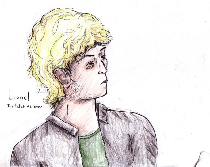
His eyes are like that because he works at night and he's tired all the time. Aww.
Lilianna:
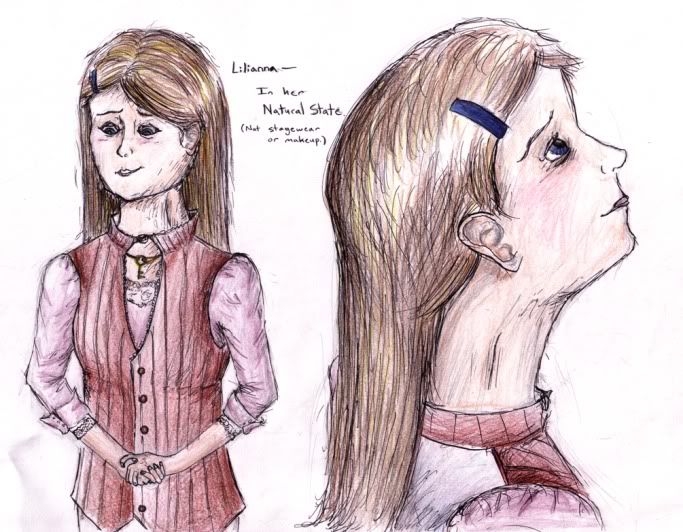
(She looks far more deranged in this picture than she's supposed to, even if she is crazy. Also her hands are too small. Uh.)
For both; messy coloring is messy.
I've colored most of Raikou, but she's not quiiite done yet. Soon, perhaps.
But I am doing something called Artslam on LJ, where you draw a picture a day from a set of characters you have or a concept you have. Here's my first post. Details about the world and characters are there.
And just to be redundant, I'll put the pictures here, too.
Lionel:

His eyes are like that because he works at night and he's tired all the time. Aww.
Lilianna:

(She looks far more deranged in this picture than she's supposed to, even if she is crazy. Also her hands are too small. Uh.)
For both; messy coloring is messy.

