• Welcome to The Cave of Dragonflies forums, where the smallest bugs live alongside the strongest dragons.

    Guests are not able to post messages or even read certain areas of the forums. Now, that's boring, don't you think? Registration, on the other hand, is simple, completely free of charge, and does not require you to give out any personal information at all. As soon as you register, you can take part in some of the happy fun things at the forums such as posting messages, voting in polls, sending private messages to people and being told that this is where we drink tea and eat cod.

    Of course I'm not forcing you to do anything if you don't want to, but seriously, what have you got to lose? Five seconds of your life?

Suggestions Mohacimim

kyeugh

onion witch
Pronoun
she/her
I have posted way too many art threads. However! With my current breakthrough in artistic ability (say that three times fast) I have decided to construct a new one. Most of these will be on my deviantART, by the way, so drop by and take a look.

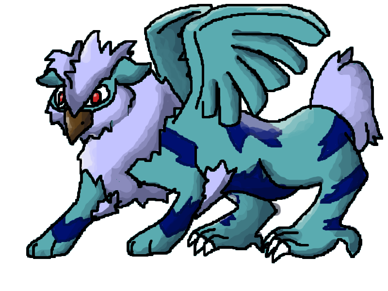
Firstly, a Fakémon concept I made. It took a long time, and it was my first attempt using my brand new Wacom, so don't judge too much.
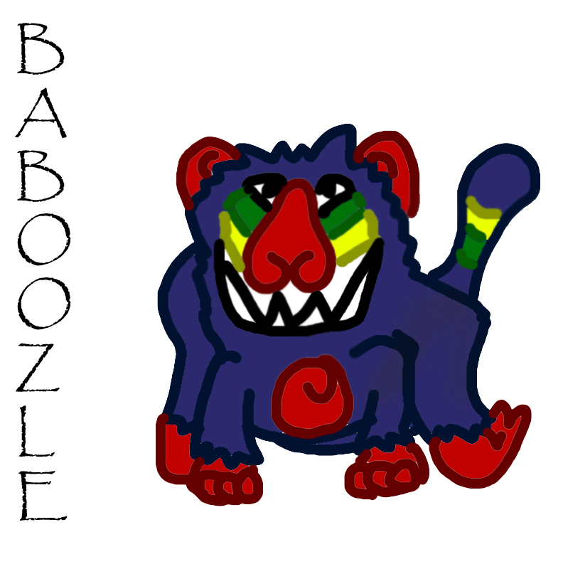
tablet_exercise_one__baboozle_by_mohacastle-d5y591z.png

More to come. Suggestions, please?
 
Shade, and look at anatomy because otherwise your drawings will look unnatural. For example its right (our left) leg and its left (our right) hand looks strange. And it's Fakemon, not Fakémon.
 
Yeah, I probably need to do the basic sketch before I do the drawing. Rest assured, my hand drawing was much better.

I didn't shade because it was an exercise, but if you could find a shading guide I would be grateful.
 
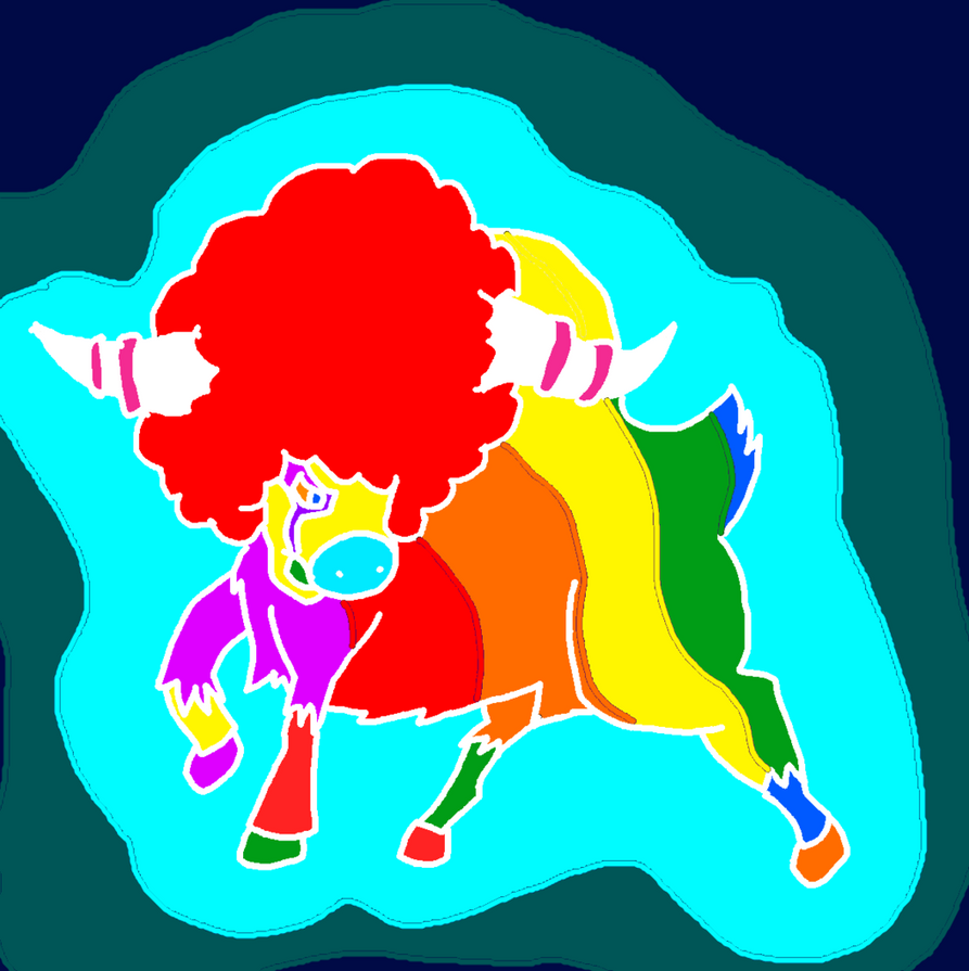
eye_piercing_bouffalant_by_mohacastle-d5zd1ww.png

I call this style of art Spontaneous. I tried to replace stuff with their compliments or otherwise very bright colors. Behold.
 
That looks super cool!! I love it! I looovvveee abstract art, so naturally, I love all of the bright colors and such! And the Pokemon looks great! Haha, sorry this isn't much help to you, is it. But stil, I think that looks spectacular! :D
 
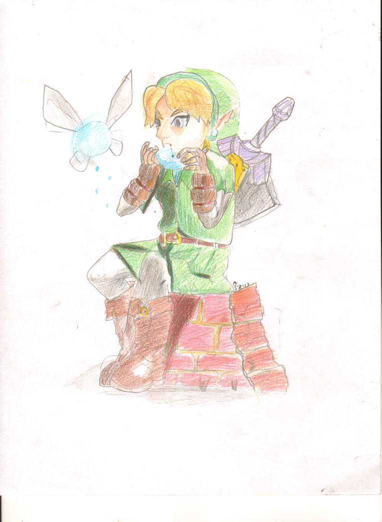
__musica_saeculorum___by_mohacastle-d67ftp6.jpg

I also wrote an accompanying poem for it:
Clad in the tone of nature,
and the spirit of nature by his side,
holder of three jewels and hero of time,
play your enchanting lyric,
and save us with the legend sword
 
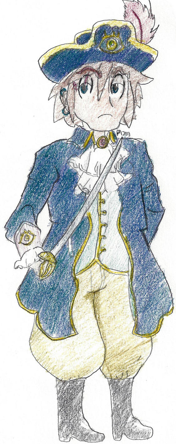
This thing. For a story I'm writing. I drew it so when I describe him, I can do it more accurately because I have a reference. His name is familiar.
captain_qvalador_skylar_by_mohacastle-d6l98dz.jpg
 
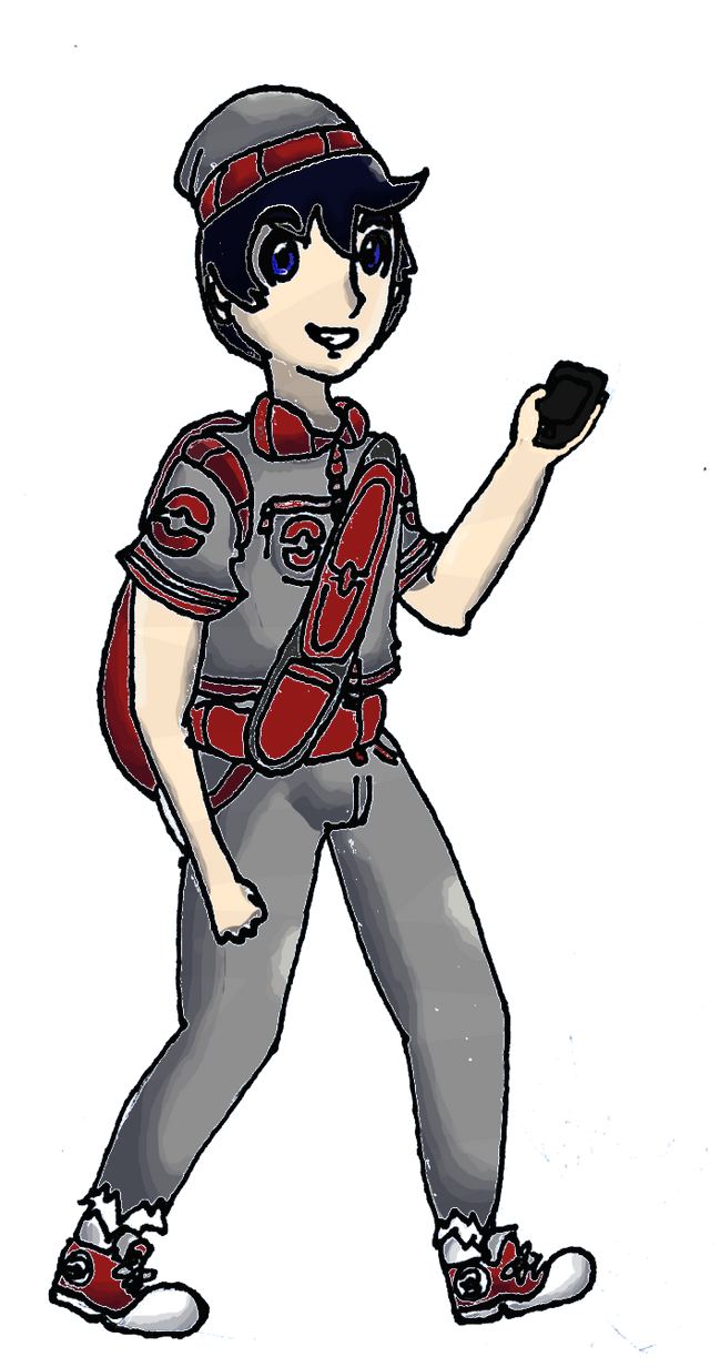
male_hero_by_mohacastle-d6pldrj.png
Critique would be nice for this one, actually, other than the weird white lines over the contours-- unless you have a solution. I have no clue how to fix that.
 
male_hero_by_mohacastle-d6pldrj.png
Critique would be nice for this one, actually, other than the weird white lines over the contours-- unless you have a solution. I have no clue how to fix that.


Did you colour this in with GIMP? If you did, use the Grow Selection tool to make whatever area you selected have a bigger range (or smaller range, also depends on how much you grow/shrink it) which gets rid of the white lines. This worked for me.
 
Did you colour this in with GIMP? If you did, use the Grow Selection tool to make whatever area you selected have a bigger range (or smaller range, also depends on how much you grow/shrink it) which gets rid of the white lines. This worked for me.
It doesn't for me, I think. Maybe I'm doing it wrong, but when I try, it only changes the size of the selection border, not the selection itself. Maybe I was in the wrong layer, though. I'll try again tomorrow, thanks for reminding me.
 
What I would do is recolor it by hand, not using a selection tool, though that would mean redoing the entire thing.

Aside from that, blurring it and using the smudge tool might help.
 
Aside from that, blurring it and using the smudge tool might help.
I don't want to sound like a douche, but don't ever use blurring or the smudge tool for things like this.


To me, it looks like you're using the magic wand on the areas that you want to colour. The problem is that your lineart is done with a relatively soft brush i.e. there is antialiasing, and that's why the magic wand leaves those edges.

Instead of using the selection tool, it's better to make a layer under the lineart and paint the solid colours there by hand. It may take a bit longer, but that way you won't get those super-nasty edges or empty spots where the magic wand couldn't reach.
 
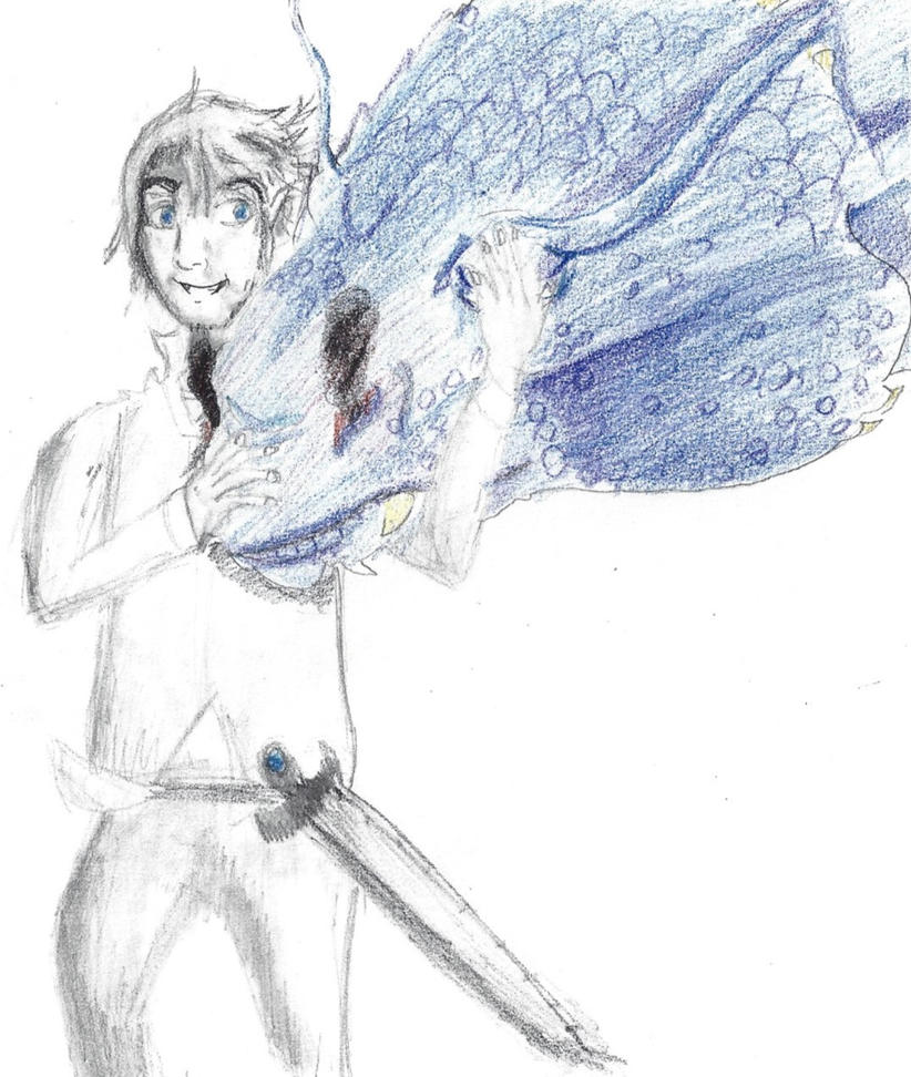
vinr_alfakyn_un_alfrs_skulblaka_by_mohacastle-d6s96mj.jpg

I know the clothes/limbs for that one are funky, I might get around to fixing it later.

arcanincacuno_by_mohacastle-d6rj582.png

Did it for my brother. I actually don't want critique on that one, because I know it's complete and utter shit, but I thought I would put it up here because why not.

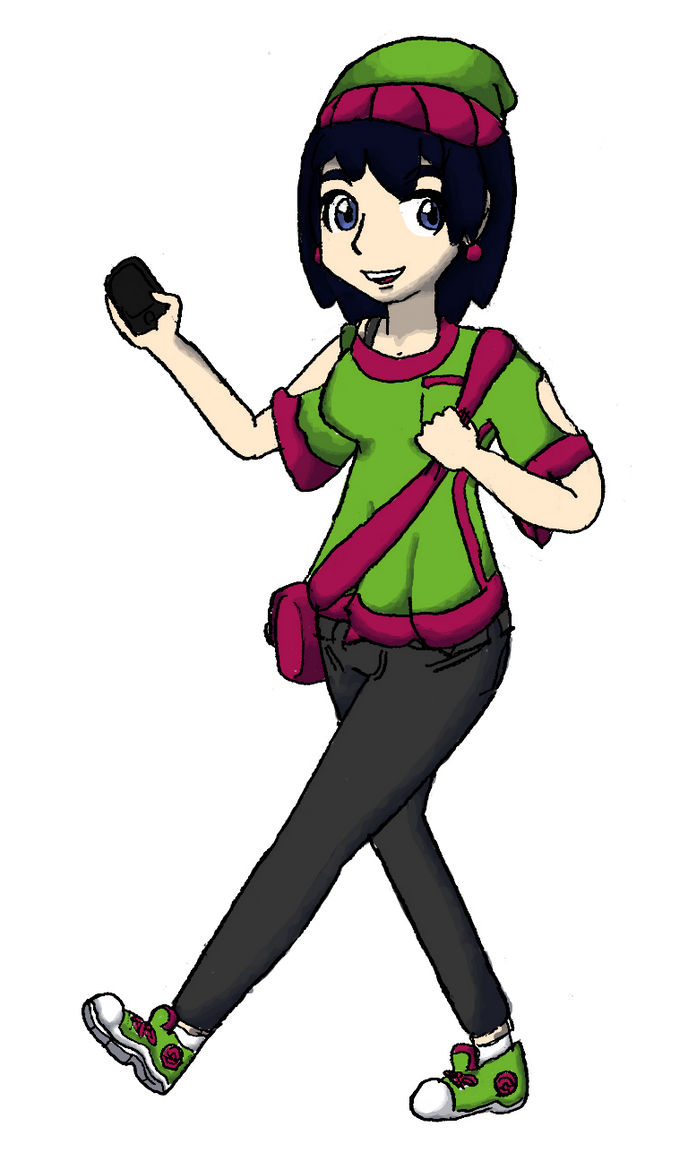
female_hero_by_mohacastle-d6rb1zt.png

I fixed the weird liney things, but I know there's still beaucoup de problèmes, so yeah. If you can point them out, that'd be great.
 
The female hero looks pretty good, but to me it seems that the neck is too small for the head, the left leg looks bigger/thicker than the right and the eyes look pretty different.
 
The female hero looks pretty good, but to me it seems that the neck is too small for the head, the left leg looks bigger/thicker than the right and the eyes look pretty different.
I'll work on it, thanks! My proportion has always been terrible, it's pretty evident in everything I draw.

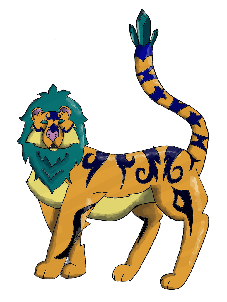
In other news, I drew this... thing. It's pretty much my favorite animal. It's like a lion and a tiger mixed... bred for its skills in magic. I'm sorry guys, it had to be done. But yeha, it's actually the one of the version mascots for the fan game thingeh that I'm doing. I'm aware that it's name is terrible.
mongrowl_by_mohacastle-d6t598k.png
 
Last edited:
I'll work on it, thanks! My proportion has always been terrible, it's pretty evident in everything I draw.

In other news, I drew this... thing. It's pretty much my favorite animal. It's like a lion and a tiger mixed... bred for its skills in magic. I'm sorry guys, it had to be done. But yeha, it's actually the one of the version mascots for the fan game thingeh that I'm doing. I'm aware that it's name is terrible.
mongrowl_by_mohacastle-d6t598k.png

You're doing the same thing that a lot of new shaders do here, which is to have the shadows and highlights just skirt around the edges. This is the most evident on the tail, and the rightmost leg (our right). See how the shadow and highlight go right up against the lines? Try having really big areas of shadow! Also, you know how people always draw apples with a shine in one corner of the apple? Shines go like that a lot on spherey shapes. Your background legs have bigger shadow areas! They look nice. So do the crystals. The crystals are a good example of how big your shadow areas should be (thought not necessarily that dark all the way through the shadow on every body part). They're split into parts, which makes that easier to think about. You could try splitting other parts of the body into parts like that with guidelines.

Here's a sample so you can see what I mean:

bigshading.png


Also, this always sounds pretty vague, but think about your light source. See how you have equal amounts of shine and shadow on each foreground leg? One leg is farther away from the light, though. And the back-foreground leg could block some light. Plus, see how the light is on the far right of each leg? But, on the back where the stripes are, there's also a shine from the top. If there's a light above the Mongrowl, there should be top-light in other places, too, like the mane and tail, which have side-light instead. Or if the light is between the tail and head, then top-light back and side-light mane would be right; but then the tail should have highlights on the left. Even expert artists struggle with light source, but just try to keep it in mind.

The lineart is pretty good! I like how much variation there is in the mane and in the markings, and you had a good idea with trying to add depth to the mane by making more mane-squiggles under its chin. I also like how the shadows on the face go around its muzzle, so that the muzzle looks like it sticks out. Nice fur lines on the tummy/chest and front legs, too.
 
Alright, thanks! I might go back and change it in a bit, when I don't have anything else to draw; at the moment, I've got a lot to do, though!

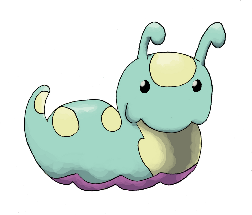
I tried to make the shading a bit better in this one. There's more, I think, although the drawing was fairly small and thus it was kind of difficult to put a lot in. It gave me a hard time again, and I had to hand-color everything (it didn't do it for Mongrowl, for whatever reason). So, here it is.

sapwing_by_mohacastle-d6u4rwe.png

It's actually the Grass-Type Starter for my region, so there are three more to come! Hopefully you guys like it.

As always, criticism is requested.
 
Aww, that's a really cute design! I really like how the claws are like roots! There's a few things that are tad uneven, though. Like the right leg is noticeably skinner the right leg. Also the head a bit bigger on the right side than the left. Still an absolutely adorable design, though!
 
Thank you! I didn't notice either of the things you pointed out (and never would have until someone did!), so thank you! I'll make sure to clean that up.

I haven't posted in quite a while... I've got three new things to put up, so here we go.

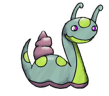
lochro_by_mohacastle-d6y660l.png
This is the Water-Starter! It's my favorite of the starters. I mean, c'mon. That beats Sapwing by probably a hundred points.

whelchro_by_mohacastle-d6y6awi.png
And now Whelchro, the next form of Lochro. So it isn't as cute, I'll give it that, but honestly I think it's a little bit less... awkward than a lot of other first stages in starter history. I'm looking at you, Pignite and Quilladin.

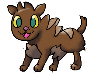
tazman_by_mohacastle-d6y6dkg.png
Okay, this is my favorite thing I've ever done. I know it's a bit rough around the edges thanks to kind of sloppy lineart, but I'll clean that up later. It's just... I want to hug it.

Suggestions would be good, as always.
 
Last edited:
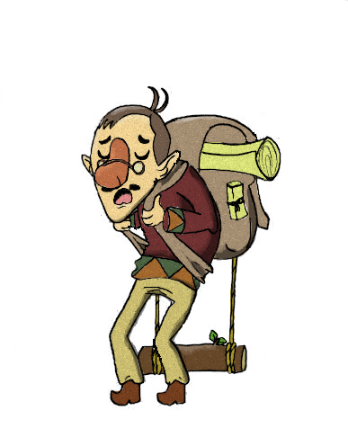
Mr. Bentu, an OC. He's really uxorious despite having a really terrible wife who treats him like garbage. He doesn't really know how to put his foot down, and it often means he has to give up his food to quell his wife's insatiable appetite.
mr__bentu_by_mohacastle-d75lb6o.png
 
Back
Top Bottom