• Welcome to The Cave of Dragonflies forums, where the smallest bugs live alongside the strongest dragons.

    Guests are not able to post messages or even read certain areas of the forums. Now, that's boring, don't you think? Registration, on the other hand, is simple, completely free of charge, and does not require you to give out any personal information at all. As soon as you register, you can take part in some of the happy fun things at the forums such as posting messages, voting in polls, sending private messages to people and being told that this is where we drink tea and eat cod.

    Of course I'm not forcing you to do anything if you don't want to, but seriously, what have you got to lose? Five seconds of your life?

My somewhat-okay (I hope) Spritework

Still, no need to reiterate it. Once is enough.

I hope I fixed the Armoraith.
w6xv82.jpg


I couldn't think what to do for the Gargraith, so I left it.
As I said, the over-dithering in Mirroraith is intentional.

I must say, I never thought I'd see you of all people giving me a positive comment. Or calling me 'bro'. Have you gotten over your hatred of me?
 
So I decided to try less shades on an old pixel-over.
3311wg2.jpg

I hate it.

And I also made this.
259kar6.jpg

That tail was the hardest part and I am still not satisfied with it >x

EDIT: Forgot this
k9c9hw.jpg
 
Last edited:
If you're willing to take my word for it, that Hippowdon is one of the best of your pixel-overs, if not the best. The only thing I'd suggest is to colour the outlines some more.
 
Mrenh. I don't like it. Also I was using only the amount of colors that existed in the sprite.

Look, things.
wrkkko.jpg
s5fzb5.jpg
29lz6ad.jpg


Bluh the claws on the last one @.@
 
CONCRIT TRAIN COMING IN

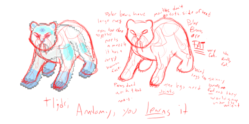
polarbearshowdotheywork.png


Yeah, that basically sums it up...not meaning to seem harsh but the picture shows what needs to be worked on and how it's corrected.
 
While not meaning to seem lazy, I, uh, am. So I'll go with saying that it's a Pokémon and so doesn't need to be perfectly accurate. Why yes I know it's the lazy way out; I'm not changing it so DON'T NAG ME ABOUT IT I WILL NOT RESPOND. I MIGHT FIX IT SOMEDAY BUT AM IN TOO MUCH PAIN TODAY.
Also, most of that is impossible to read.
 
"Mouths don't go to the side of the head"
"Polar bears have large ears."
"Eyes too close together, needs a muzzle. It has a very human face."
"Paws don't work that way."
"The legs need joints"
"Hind legs too skinny, bears are fat and they would snap under the weight."
"Polar bears are FAT. Very fat. Like really fat."


...Millahandwriting is messy xP
 
I know. I'm just lazy and excusing it with 'well it's a Pokémon and so anatomical inaccuracies are excusable'. I may well fix it someday though.
 
...Millahandwriting is messy xP

...To give credit where credit is due, the redline was actually done by Big Red Cherry Bomb. Milla just posted it for her.

And to you, Beta: This isn't nagging, it's constructive criticism. Even if you don't plan to fix this particular sprite, keeping things like anatomy in mind will make your future sprites look better. If you plan to keep spriting at all, you're going to have to get used to it, because just having people tell you it's good and nothing else will get you nowhere.

And yes, I know you say "Well it's a pokemon so anatomy doesn't matter." Actually it does. Pokemon are heavily stylized, yes, but they still have the animal's base characteristics and build, and it pays to pay attention to that. Plus, there's a difference between stylizing an animal and just having it look really off. I hate to say this, but I can't imagine your polar bear in motion. It's very stiff and kind of awkward looking.

Again, this isn't nagging, it's advice. You're free to reject it, but if you do you can expect to never improve.
 
I wasn't saying that was nagging, I was asking people not to nag me about it in the future. Also, remember the three or so times I said that I'll probably get round to improving it sometime soon? Yeah.
 
Hey, I railed on your color usage earlier (and so have some other people), but my own explanation was kind of crappy so...

Purple Kecleon made this excellent color tutorial that might help you out. I'm not trying to nag or tell you to redo everything, but I learned a lot from it myself so this should at least help you understand what we're getting at.
 
Back
Top Bottom