• Welcome to The Cave of Dragonflies forums, where the smallest bugs live alongside the strongest dragons.

    Guests are not able to post messages or even read certain areas of the forums. Now, that's boring, don't you think? Registration, on the other hand, is simple, completely free of charge, and does not require you to give out any personal information at all. As soon as you register, you can take part in some of the happy fun things at the forums such as posting messages, voting in polls, sending private messages to people and being told that this is where we drink tea and eat cod.

    Of course I'm not forcing you to do anything if you don't want to, but seriously, what have you got to lose? Five seconds of your life?

The Spriter's Showcase!

Status
Not open for further replies.
soueon.png


uh. Any hints of how to make this look more ghosty and less... ugly? Especially the ears?
Go for "alternating" colors.

Make the highlight one color and make the outline color something else. Gold-Blue, maybe?
 
Could somebody give me critique on the Evil Pidgeot in my signature? I'm looking for ways to improve my evil sprites.
 
I'll try a Mewtwo one :) Then maybe a mew.

EDIT:
Mewtwo.png


And using Shadow Ball:
MewtwoShadowBall.png

:D
 
Last edited:
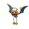
halloweendrifloon.png


Very out-of-season, I know, but oh well.

The wings are angled differently to the face- perhaps you should have put that pattern at an angle like Drifloon usually are! But I like how you did the pattern, so maybe you could just fix the wingalings instead. (: Not sure if it'd work though.

Could somebody give me critique on the Evil Pidgeot in my signature? I'm looking for ways to improve my evil sprites.
picture.php

Hm! So it does look pretty evil- I like the shades of red and purple you have picked out. There are a few major points I'll pick on--
The shading. The crest is dark at the top? Huh? It looks really odd, compared to how bright that wing is! However, you might want to change the wing, because when evil characters are drawn/animated they often end up having less highlights, or have the tops darkened and the highlights coming from underneath!
The wings are tattered, poor Pidgeot doesn't look like it could fly, which is pretty awkward in the position it's in. That's kind of okay- what bothers me about the wings is that the one furthest from the front looks significantly longer than the one at the front, which is kinda.. strange.
The claws look smudgy! But with a bit of an edit they could look... bloody, or something sinister like that, I think.
The tail looks... hm, I think the feather (or whatever) at the bottom is too long, it makes the tail look like it's positioned lower than it should be.

...that's a lot of critique, but please don't be discouraged XD It's a pretty original idea, and with a bit of work you could have a very nice technique going.

I'll try a Mewtwo one :) Then maybe a mew.

EDIT:
Mewtwo.png


And using Shadow Ball:
MewtwoShadowBall.png

:D

Ooh, they're not too bad, but I think you should be a bit more careful with the anatomy... in general it looks too... round. The tail seems a bit odd, too thick immediately to the right of Mewtwo's left leg, and the arms look... like wire. They're all rounded and bendy instead of having a definite elbow (: also, the head looks like a tennis ball, kinda XD and the eyes are teensy... a mouth may have been good.
I like the shadow ball... nifty.
 
Is that a complete scratch? Anyways, to make the pants better, put a little more contrast between the shades. As for the shoes, well, it's because they are pointed awkwardly. The legs are actually shapen perfectly, and that is often the hardest part! Good job!

And Zephyrous Castform, that's awesome!
 
Anyone willing to help critique a few of my sprites? Two Re-Types and two Splices:

FireGroundCubone-1.png

^Fire/Ground Cubone

FlyingRaichu-1.png

^Flying Raichu

Luxbull.png

^Luxray/Granbull

Mewquaza.png

^Mewtwo/Rayquaza

I'm relatively new to actual spriting (though I've tried and failed to make decent sprites many times before), and any kind of critisism I could get would be appreciated...
 
I already know it's horrible. This is my first splice ever. I just learned how to this afternoon.

UberWeedle.jpg


Weedle + Scyther blade for tail + Tyranitar feet


EDIT: Here is a better recolor/splice. It is of Arceus and Mew.

ArceusandMewsplice.jpg


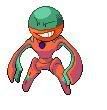
EDIT2: I made another! It is of Deoxys and Electrode.

DeoxysandElectrodesplice.jpg


EDIT3: Another!!! Practice makes perfect!

TripleVoltorbandDodriosplice.jpg


F***!!! I saved those as JEPG... I guess I'll just leave them, and that will be my lesson...


I'm new to splicing, so I will gladly take any advice.
 
Last edited:
hizi7.png

I made a Shaymin in Taur Forme, which I plan to add green stuff to later. How do I shade it better?
 
Last edited:
Okay... I re-did the last 3 splices and saved them as PNG.

Mew and Arceus splice
MewArceussplice.png


Electrode and Deoxys splice
ElectrodeDeoxyssplice.png


Triple Voltorb and Dodrio splice
TripleVoltorbandDodriosplice-1.png


These look a lot better. =) I still will gladly accept any advice.
 
Why is the head to my left larger than all the rest? Is it closer or what?
byels2.png

I updated my sprite. Now I need something green on it.
 
Last edited:
Okay... I re-did the last 3 splices and saved them as PNG.

Mew and Arceus splice
MewArceussplice.png


Electrode and Deoxys splice
ElectrodeDeoxyssplice.png


Triple Voltorb and Dodrio splice
TripleVoltorbandDodriosplice-1.png


These look a lot better. =) I still will gladly accept any advice.

They do look a lot better.
Advice? If the pallet you're using doesn't look right, edit it accordingly. Also, when splicing, be very careful about the pose and positioning of certain body parts. Take this Umbrew, for example. The pose of the Umbreon's right (veiwer's left) ear is just wrong when put on the Mew, so I just used the left ear twice. Yes, it's considered cheating by some, but it looks better.
Umbrew.png
Umbreon.png


Or this Espew. (Sorry, I'm just using images from the top of my Photobucket album because I'm lazy).
Espew.png
Using Espeon's ears wouldn't have looked right at all, so I forgot about them.

Also, when splicing, don't be afraid to scratch. If the tail's just too short, make it longer. Of course, if it's too long, the opposite applies.

I know I've hardly told you anything, but I'm not going to write a seventeen-page guide on spriting. Do you want an specific advice?
 
Well, I'm using Paint. If I was going to use a part twice, I would have to copy and paste 2 of those sprites, but it would be worth it. If you know any shortcuts in Paint, I will gladly accept them. Also, is there a free program better than Paint that lets you do a bunch of fancy things?
 
I'm using Photobucket. I've never sprited in Paint, so I can't help you there. Sorry.
 
Status
Not open for further replies.
Back
Top Bottom