-
Welcome to The Cave of Dragonflies forums, where the smallest bugs live alongside the strongest dragons.
Guests are not able to post messages or even read certain areas of the forums. Now, that's boring, don't you think? Registration, on the other hand, is simple, completely free of charge, and does not require you to give out any personal information at all. As soon as you register, you can take part in some of the happy fun things at the forums such as posting messages, voting in polls, sending private messages to people and being told that this is where we drink tea and eat cod.
Of course I'm not forcing you to do anything if you don't want to, but seriously, what have you got to lose? Five seconds of your life?
You are using an out of date browser. It may not display this or other websites correctly.
You should upgrade or use an alternative browser.
You should upgrade or use an alternative browser.
Suggestions Wave goodbye to your secret crap, dumbass!
- Thread starter Coloursfall
- Start date
Slartibartfast
The word 'Nerd' is a compliment.
Re: [ICONS!] A Life-Changing Seminar on Empowerment, Leadership, and Boobs.
o_O For the first two pictures, I didn't notice anything was strange. Then I read the text and realized that Neopets and Pokémon are very mixed up in my mind. Mainly because I spend all my free time on both of them.
I voted for all three of yours; they're the best Neopets pictures I've seen in a while.
wolftamer9
So if anybody asks you, you belong to Man on Earth
Coloursfall
THIS IS HOW WE BLEED
Coloursfall
THIS IS HOW WE BLEED
Coloursfall
THIS IS HOW WE BLEED
surskitty
「にがいのは いやだ」って…
- Pronoun
- they
Re: [ICONS!] A Life-Changing Seminar on Empowerment, Leadership, and Boobs.
Your colouring's pretty but your anatomy isn't. :( Eyes usually line up with ears, and that doesn't seem to be the case with your latest few things: the eyes tilt down too much. Also, you don't seem to give jawbones any love.
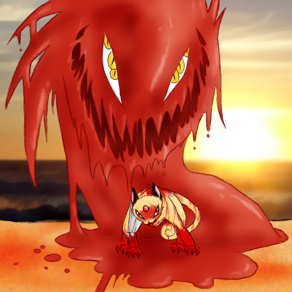
I can't tell where the Persian's spine and legs are supposed to be pointing. For that kind of thing, you might want to draw a quick bird's-eye wireframe before the actual sketch so you know what goes where. :/ As far as I can tell, it just skidded on the creepy goo and stopped wrong on one of its back legs.
... you do colour things well, though
Coloursfall
THIS IS HOW WE BLEED
Coloursfall
THIS IS HOW WE BLEED
Coloursfall
THIS IS HOW WE BLEED
Coloursfall
THIS IS HOW WE BLEED
Coloursfall
THIS IS HOW WE BLEED
Zora of Termina
forget your high society
- Pronoun
- fucking guess
Re: Atomic Tangerine
THIS SO DAMN MUCH
THISYou want a Suggestion? I'll give you one!
Make the fluffyest, mushyest, most cracked out picture of Halan, Ed, and Shelia on Christmas. I don't care if you spike the egg nog or not, just do it.
THIS SO DAMN MUCH
Phoenixsong
beep beep coming through
- Pronoun
- she/they/any
Re: Atomic Tangerine
Well, well, well. It's been ages, hasn't it? Let's see.
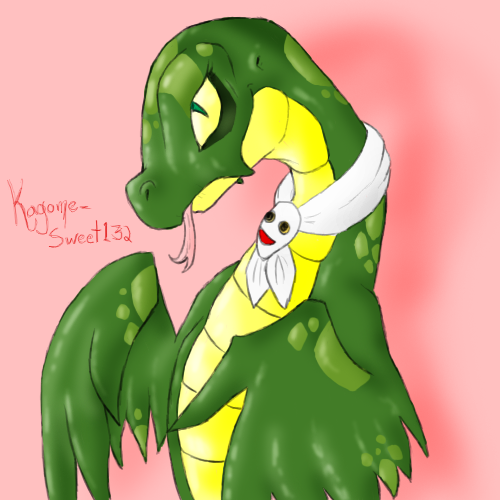
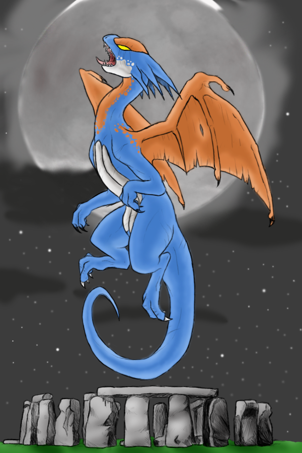
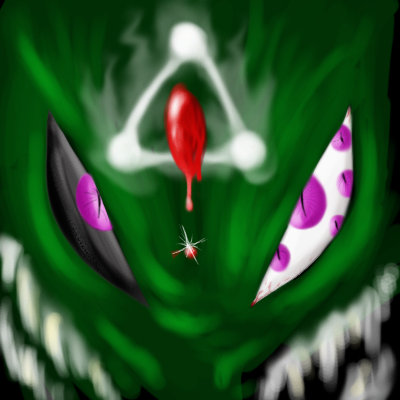
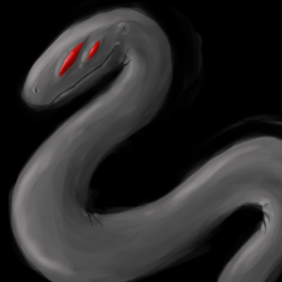
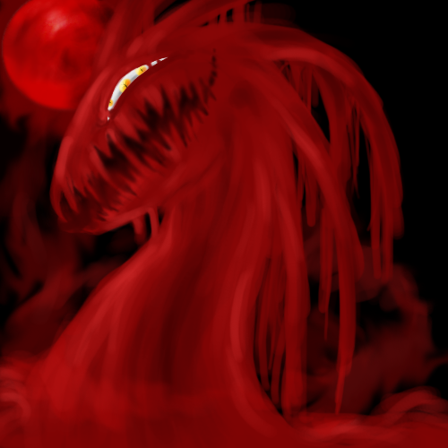
Everything looks very nice, and your coloring and shading have come quite a ways since I've last looked at your work. I really like the rough, paint-like style you use on those dragon pictures. It's vibrant and intense and looks really cool. There are still quite a few anatomical issues, though. The Darigan Bruce, for example--her (is it a she?) legs are sweeping back behind her in a fluid curve like a fish hook, and a penguin-like creature's limbs wouldn't be structured that way. I think it's that they're following the curve of her spine too closely. The legs should probably be shorter and straighter. The two Xweetok look very nice, but the sketched one's hind legs are far, far too long for its body, and would, quite frankly, look a little ridiculous if they were extended instead of bent. You've got the general shape right, but scale the size down--the bottom of the knee should be just about in line with bottom of the belly, and the lower leg should be shorter and angled downward instead of upward the way it is. The fire Xweetok's thighs are a bit too thick, and you should probably see a bit of its body instead of just sticking the hind legs directly behind the forelegs. I doubt that foreshortening would completely obscure its belly, even with a frontal angle like that.
The portrait of the girl is phenomenal. You did an excellent job with the shading and the shape of the features, and I really like her eyes in particular. The only gripe I have is that you seem to be looking down at the head at an angle, but what you can see of the body looks more frontal--it gives the head the appearance of being a bit too large and leaning forward at an awkward tilt. Pushing the neck and shoulders back so that they match the angle of the head, and possibly also making them just a hair larger, would fix that.
Overall it looks like you've been turning out some pretty nice work since ArtMo started, and prior to that as well--too lazy to go back and look at everything, but I like what I see. Do more of that hazy, wild coloring. I like that. :)
Thorne
It's feeding time
Re: Atomic Tangerine
You're just saying that because everyone loves you. c:
On other notes, I like the day 14 picture. It looks cute.
On second note, day 17 freaks me out. ;_;
Noooooboooody loves meee~ :c
You're just saying that because everyone loves you. c:
On other notes, I like the day 14 picture. It looks cute.
On second note, day 17 freaks me out. ;_;
Coloursfall
THIS IS HOW WE BLEED
Re: Atomic Tangerine
hello art thread I let die again.
Anyway. Thanks for the comments guys! Especially you, Kratos. I've been trying to fix my anatomy and realism and stuff, thanks for your big comment :3~
I'm gunna wait until all my ArtMo stuff is scanned before I post it, just to make it easier. Blerg. x__x
But I have other stuff for now!
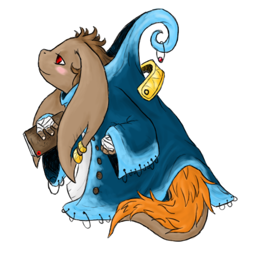
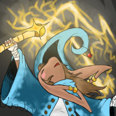
Thalia, my Nu Mou chara
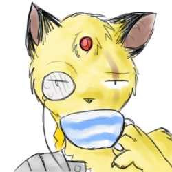
This is totally Dwagie's fault :V
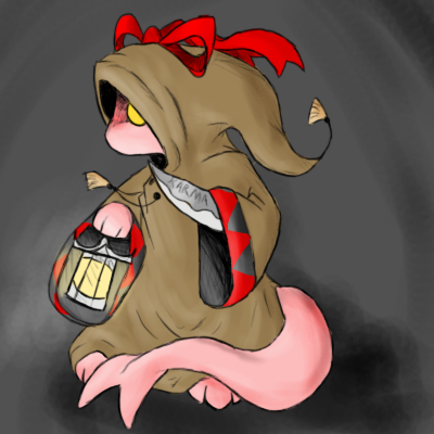
Tonny the pink Tonberry. wooo.
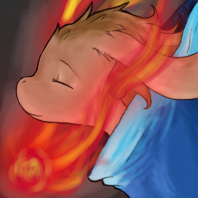
I like this one. :V was practicing shading/colouring and stuff.
hello art thread I let die again.
Anyway. Thanks for the comments guys! Especially you, Kratos. I've been trying to fix my anatomy and realism and stuff, thanks for your big comment :3~
I'm gunna wait until all my ArtMo stuff is scanned before I post it, just to make it easier. Blerg. x__x
But I have other stuff for now!

Thalia, my Nu Mou chara

This is totally Dwagie's fault :V

Tonny the pink Tonberry. wooo.

I like this one. :V was practicing shading/colouring and stuff.
Thorne
It's feeding time
Re: Atomic Tangerine
Eeh, I think Tonberries are cool fellows.
Okay really, it looks pretty badass, despite being pink, or maybe that's why it looks badass.

Tonny the pink Tonberry. wooo.
Eeh, I think Tonberries are cool fellows.
Okay really, it looks pretty badass, despite being pink, or maybe that's why it looks badass.


