• Welcome to The Cave of Dragonflies forums, where the smallest bugs live alongside the strongest dragons.

    Guests are not able to post messages or even read certain areas of the forums. Now, that's boring, don't you think? Registration, on the other hand, is simple, completely free of charge, and does not require you to give out any personal information at all. As soon as you register, you can take part in some of the happy fun things at the forums such as posting messages, voting in polls, sending private messages to people and being told that this is where we drink tea and eat cod.

    Of course I'm not forcing you to do anything if you don't want to, but seriously, what have you got to lose? Five seconds of your life?

Suggestions Fakemon Starter Suggestions?

DarkAura

loves terra "brain cells? idk her" kingdomhearts
So, I've been trying to create a whole region of fake Pokemon, starting with these three starters. I could not come up with a good name for the grass type, so i'm open of suggestions. So how is this?


Twigmunk, the Grass type Pokemon

It's tail and ears are covered with leaves. The blue belly stores water, which some of it goes through its legs, into the soil. When out of water, it's belly becomes a dark purple.

Bunnaden, the Fire type Pokemon

It's tail reaches temperatures up to 800 Degrees! When angered, its ears stand straight up and it goes into a frenzy, where its eye's glow a bright red.

Purapole, the Water type Pokemon.

This Pokemon was only discovered 20 years ago! A baby Purapole has been known to travel 78 miles per hour, while an adult was known to go a faster distance than a Linnoone!

So, what do you think? I'm open to critisism and suggestions.

Edit:do you think Purapole's tail's are a little...off? It sort of bugs me, but i want to see what you guys think.
 
Last edited:
Twigmunk is a chipmunk that is green and has leaves on its tail.

Bunnaden is basically a bunny that is yellow and on fire.

This is a terrible way to go about designing fakemon.

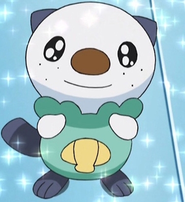
Oshawott-pokemon-19105403-376-410.jpg


Take a look at Oshawott. Oshawott is based on an otter that is also a samurai; the shell is a war fan; this is a clever concept that is elaborated upon with the evolutions.

Your water starter is a blue fish of indeterminable origin. There is no concept behind this fake other than blue fish. There's nothing wrong with this if you have the expertise necessary to pull this off; the problem is that you don't. (No offense.)

So, in short: you need to make fakes with stronger concepts behind them.
 
This is a terrible way to go about designing fakemon.

I must politely disagree. Charmander is a lizard that stands on two legs with a flame on its tail; Squirtle is a blue turtle that stands on its hind legs; Zubat is a purple and blue bat with no eyes and weird legs. That doesn't make them any less Pokémon than Oshawott, and doesn't make Oshawott any less Pokémon. A Pokémon can have a very interesting, complex concept like Oshawott, or it can have a very simple, clean concept like Charmander. There is no one right way to do it, in my opinion.

I like the Pokémon you've thought of, especially the descriptions that you've come up with for them. It gives them a little more personality, makes up for the simple concepts, and makes them seem more like Pokémon. I'm a little confused about Twigmunk's description, though; wouldn't it make more sense for a Grass Pokémon to draw water up from the ground, not drip water into the ground?

Before you start modifying concepts or anything (because Karkat brings up a good point - Pokémon's evolutions are usually more complex than their pre-evolutions), I think you could improve your sprites a little bit. Let's start with your outlines. I'll use Bunnaden as an example:

20hkn0i.png


I put next to it an official sprite of Chikorita for comparison. See how Chikorita's outlines are very smooth and are only one pixel thick, no matter where you look? And then see how Bunnaden's outlines have lots of corners and places where the outline is thicker? Try removing some of the extra pixels so the outline looks smoother. Spriting concepts are always easier drawn out than explained in words, so I fixed a little bit of it in Bunnaden's sprite so you can see what I mean; look where the blue circle is.

154k5zo.png
rlhxr6.png


See how it looks smoother and more like an official sprite? I recommend that you start by improving your outlines in that way. =) Once you have the hang of that, I think your next step would be to study the official sprites and try and mimic the way that official sprites use shading and colors, but just take things one step at a time for now. =)
 
I actually tried to get rid of the corners, and there were still alot.

I have finished Bunnaden and Purapole's whole evo-line, and will show all once i get twigmunk.

I'll try to get out the corners of the sprites a little more, =P

Oh, and do you think twigmunk's name could be better? ( i think so)
 
Hey, new Pokemons! Three to be exact!

These Pokemon are slugs based off of the pH scale- Green being Neutral, Blue being Acid, and Red being Base. The green is the pre evolution, and evolves into one of the two by using a sun stone for Acid, or Moon stone for base.

But I'll put the pic on here when i can figure out the names. Any suggestions for slugs that are acidic, basic, and neutral?
 
I've been making a few new Pokemon...ok, one that actually looked somewhat good. Bu it has many various colours, all depending on the type!


Now, this Fakemon, Karachiis, is, well, colours. I know the shiny form is irritating to the eyes, but I couldn't think of a shiny form that would work for them all. Note how every shiny colour can be one of the seven types, and the antenna orb's colour will tell what the type is. Yes, they are ALL part flying, since they have some wings. ^v^
 
The tail and mouth look a little awkward; try smoothing them out.
The eyes' highlights seem to imply the light source comes from the top centre; making both eyes look like the right one would fix that.
The entire sprite is too symmetrical; it kind of looks like you drew half of it, copy-flipped it, and then stuck on that antenna. The sprite would be facing more towards the left, and the wings and feet should probably look somewhat different from one another.
The entire shiny sprite makes pretty much no sense, in game terms. The only difference between a normal and shiny sprite is a simple color-replace; it doesn't store a seperate sprite for anything like adding rainbow stripes. What would make more sense would be to change the wings, or the feet/antenna, since they remain constant between types.
 
Last edited:
There is no tail. Perhaps you are referring to the antenna? I have smoothed the mouthes out, and you're right, the mouth looks better like that.

There are two white specks in every single eye. The larger speck is the pupil itself, so I won't change it. (It looking that way makes it cute, and I want it to be cute. ^v^) The smaller speck is what you must be reffering to, so I changed it so that they're both facing the same dirrection.

I didn't copy and paste it then flip the entire thing...I use the circle tool for the body and copy and pasted for the wings and feet...Pathetic, I know. But I'm not all that good to make it complicated. =|

I don't really like the shiny sprite myself. I just couldn't think of anything. But I did replace the horrible rainbow colours and added grey to the feet and light green to the wings.

I'll add the new pic in a minute.
 
Thanks ILS, but I want to do this region myself so I can prove to myself that I'm good enough to make an entire region myself. Thanks anyway ILS.

Any other critisism for the Karachiis? I'd like final critisism so I can finish improvising it.
 
Yes. You know how a Spinda's pattern changes every time you encounter one? Well, Karachiis change their colours depending on their type, and all of their forms can be found naturally in the wild. A great way to hae a diverse team with the same kind of Pokemon!

So their colour is based off of their type, which is shown above. (only seven types at the moment) They all have a secondary type of Flying, since they have wings.
 
Your outlining has improved a lot! Keep up the improvements!

My next recommendation would be to add shading to the wings, feet, and antenna; you have shading on the body, which is good, but your sprite would look even better if you had shading on the rest of the Pokémon, too. =)
 
Ok, I'll add the shading for the rest. =D

Oh, And I made something else!


This has no name right now. It's basiclly an orange bat with an unamused expression.
 
Last edited:
That one is totally LOL and the shading is good. But the outline is all one colour, which = not good.
 
No, it is good. A bad outline would be one that is black and has many rough edges. My sprite only has one colour, orange. So a dark orange outline is the only kind of outline that's on it. Of course, I'm taking things one step at a time. (I actually like the bat I mad, X3)


Almost finished improvising the Karachiis. Fun fact! Kara means Colors in Japanese. Given the fact that Karachiis are all about colours, it's a very appropriate name. ^v^
 
Back
Top Bottom