• Welcome to The Cave of Dragonflies forums, where the smallest bugs live alongside the strongest dragons.

    Guests are not able to post messages or even read certain areas of the forums. Now, that's boring, don't you think? Registration, on the other hand, is simple, completely free of charge, and does not require you to give out any personal information at all. As soon as you register, you can take part in some of the happy fun things at the forums such as posting messages, voting in polls, sending private messages to people and being told that this is where we drink tea and eat cod.

    Of course I'm not forcing you to do anything if you don't want to, but seriously, what have you got to lose? Five seconds of your life?

The Spriter's Showcase!

Status
Not open for further replies.
myfavteammk4.gif

It's... been GIF-raped.
It's fine otherwise, though.
 
Keep it up, good sprite.

I assume that you meant that the magmar parts are scratched.
 
I need some help with a new [fake] form of Rotom of mine.
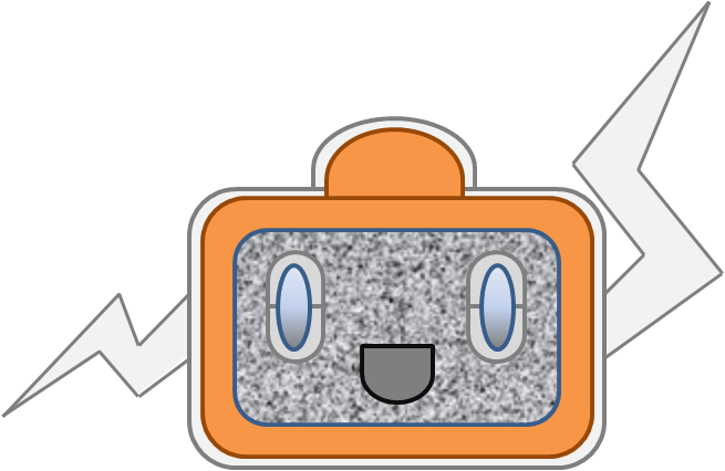
TellyRotom.png

This is my first design. I've tried spriting it, and that is what I have so far.
picture.php

Yeah, I need help with spriting the arms and the screen. Also, I'd like some C+C on the sprite, please.
 
I like it.

The tail... the color just doesn't fit with the leg that it's right next to. (talking about the base of the tail)
I need some help with a new [fake] form of Rotom of mine.
TellyRotom.png

This is my first design. I've tried spriting it, and that is what I have so far.
picture.php
Try to make it evident that there's a rounded screen by adding some glare. And put some rabbit-ear antennae on it. But that looks really nice so far!
 
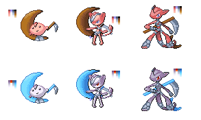
Full Metal Cookies: They look alright, but the 1st one in the evo chain looks a bit weird. Its face needs a bit more detail and looks a bit out of place while the scythe doesn't look like it's being held. You might want to fix the shading a bit and reduce the dithering too.
 
any crits on these?:

Myrid.png

tsukiline.png


Designs not mine, btw. They belong to moon-panther.

On the first one the head is a little bumpy and not nice and round. As said before on the small guy, it dosen't look like he's holding the weapon and his feet look like a part of the moon. On the second on the head if facing left and the body rightish and that looks strange. On the last one, it's standing on it's tail? I don't get it. But the ear on my left is shaded a bit too much and is too dark for me. But they are really good sprites overall.

From ES
 
OK, I have some stuff that I'd like crit on.
picture.php

PW style Kyle Hyde. Butterfree's helping me to complete this. God, recolouring the shirt was hell. Hey look, double blasphemy!
picture.php

Fwee! Ubercute Power!!! Splice of Pikachu + Clefairy. Both sprites from Platinum.
picture.php

And I wonder who this is...
 
...Stop polluting the topic with inflated praises, you two, and go look at some real pixelart for a change. << Oh, don't get me wrong, it's a good sprite. But nothing is "too epicwin for comments." Please, be more rational.

chimeraspriteor5.png

Now, as for this sprite. It's pretty good, with solid basics. However, there are a few things about it that bug me. First: the lack of contrast. There's shading there, but it's spread out over many shades with very little difference between them. I'd advise you to reduce the number of shades (because pixelart originates from making use of less colors and less space and still creating art) and increase the contrast, so that it seems brighter.

Also, the anatomy. The filename says it's a "chimera," but I don't know if that's a fakemon or just the mythological animal (...wasn't that a lion with an extra goat's head and a snake tail? Never mind). But, thing is, I can't tell what animal it's based on. There's hintings at a lion, but a lion's muzzle looks nothing like that, and lion's heads are much lower down and more surrounded by mane. It also looks somewhat like a fox, but the body and legs are much too thick for it to be one. So I don't know. o_O I'm also not going to critique the leg and wing anatomy, but um. There's a lot to improve on here.
 
Status
Not open for further replies.
Back
Top Bottom