• Welcome to The Cave of Dragonflies forums, where the smallest bugs live alongside the strongest dragons.

    Guests are not able to post messages or even read certain areas of the forums. Now, that's boring, don't you think? Registration, on the other hand, is simple, completely free of charge, and does not require you to give out any personal information at all. As soon as you register, you can take part in some of the happy fun things at the forums such as posting messages, voting in polls, sending private messages to people and being told that this is where we drink tea and eat cod.

    Of course I'm not forcing you to do anything if you don't want to, but seriously, what have you got to lose? Five seconds of your life?

The Spriter's Showcase!

Status
Not open for further replies.
kiwiscratchqg9.png

Crit on a kiwi bird I scratched for White Wolf. One of my first scratches. Thanks.

That's really nice for your first scratch. :D However, like Adnan pointed out, the anatomy's kinda borked in places (particularly the legs and feet), the beak's squashed up, and the head's a little shaky.

I believe advance sprites can be up to 64x64, so just add a little more width to the canvas to give yourself more beak-room. For the legs, you should maybe look at actual kiwi/bird pictures. I'm not an expert by any means, but it should be vaguely like this.

The shading... well, it looks too flat. Here's a quick (and probably badly-made) example.

severedheads.png


The Charmander on the left's pretty much what you did, while the Charmander on the right is how I'd fix it. Basically, don't just shade around the edges, and make it curve around the body.

Also like Adnan said, try to make it more Pokémony. Kiwis look like they have spiky feathers and a spiky beak, so maybe you could transform that into actual spikes, and maybe make it a steel type? Heck, you could even combine it with a Kiwi fruit, even if it's just a pattern on it somewhere. Be creative!

I also love your Pokésona, Neo. :D yaaaay stereotypically British things.
 
These are my (Copyrighted) Specialty. I call them mirrormon
mirrormonexeggcutor.jpg
mirrormondusknoir.jpg
mirrormondrifblim.jpg
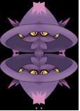
And also these are called tessalationmon
tessalationmismagius.jpg
invertedtessalationabsol.jpg
Opinions?
 
Uhh, those aren't copywrited, they are called siamese, and I've seen them around for years. The tesselmon too, those are double siamese.
See?
siameseSceptile31062.PNG

Also, you don't want to save as .jpg, try to save as .PNG.

Anyways, can I have some crits on my newest sprite?
Centipede4774140544-iaza.gif
 
It's good. and i've been doing them for years. my friend started it though. I never saw them anywhere untill he started doing them.
 
Last edited:
you have not made a new spriting style, be it siamese, inferno, rotomization, tesselation or even splicing everything with altaria. someone else has most probably done it before you.

edit: and neither has your friend
 
@ Mewtwo: It's a cosplayer right? What you must do is remove the costume and scratch a costume which is sorta like a disguise. So you'll need a bare sprite (try Spriters Resource). Try to refrain from painting their faces with the Pokemon's color. The legs are fine, because Pokemon usually have markings there, but the face should remain that same oriental color. See how the whole thing is messed up by the yellow? And to make it look even better, scratch the Pokemon's parts on (ears, tail etc).

Sorry I couldn't really crit that, since I don't often make trainers but I've seen some tuts and good examples on them.

Can anyone rate this?
devamp-1.png

Skuntank de-vamped in R/G/B colors. I shrunk it down to 60x60 to make it look like a R/G/B sprite.
 
Adnan;161292Can anyone rate this? [IMG said:
http://i240.photobucket.com/albums/ff213/cwg16/devamp-1.png[/IMG]
Skuntank de-vamped in R/G/B colors. I shrunk it down to 60x60 to make it look like a R/G/B sprite.

Hmm, all I see is that RBY sprites only had four colors-black, white, and two colors of the same palatte. Other thn that, it looks ok.

Anyways, can I have some crits on my newest sprite?
Centipede4774140544-iaza.gif
:/
 
Ribeka.png
Guess who hates the shading and thinks she did a crappy job with it? The over simplified Slash Goggles are okay, though.

It's based off of my persona. I say "based" because the glasses screwed it up. CC is love, fokes!
 
Ribeka.png
Guess who hates the shading and thinks she did a crappy job with it?

Ooh Ooh Pick Me! I know!

It's pretty good, but you have a few shape problems.

The hips are perfectly straight, yet she's bending over. The hips should be slighly bent too. Also, the leg... *shiver* Well, let's just say, the foot and ankle need some work. Nice face, torso, arms, and palette though! The shading looks OK to me!


I'm going to keep posting this at the end of my post until someone crits it...

Centipede4774140544-iaza.gif
 
That's actually me not know how the heck to work with the original sprite. But thanks for the crit, I'll look out for that next time!
 
Anyways, can I have some crits on my newest sprite?
Centipede4774140544-iaza.gif

It's really good. Is it a scratch?

Anyway, the antennae on the left looks like a line going through its head. Maybe if you positioned it different, it'd look more like an antannae?
Also, the tail coming out of the left side. It'd look a little better if it was on the right side, so the centipede would be balanced instead of falling over.
That's pretty much all I can tell that's wrong with it. It's incredible otherwise.
 
veeskitty2bv5.png


veeskitty. :3 crits?

I suppose I will put Obamasnow here also.
obamasnow2eo0.png

Chaaaaaange!
 
I didn't recolor all of eevee on purpose.
It looks better with eevee's fluff colors. I debated whether or not to leave it that way.

Also.
[:<
 
14t7ksz.png

I'm not really sure if I did the shading right, could someone say if I did or not?

You did the shading right. However, Giratina's mask looks a little off with the Gyarados sprite. I guess it couldn't really have been helped considering the heads are designed differently, but this is where scratch spriting comes in.
 
Status
Not open for further replies.
Back
Top Bottom