• Welcome to The Cave of Dragonflies forums, where the smallest bugs live alongside the strongest dragons.

    Guests are not able to post messages or even read certain areas of the forums. Now, that's boring, don't you think? Registration, on the other hand, is simple, completely free of charge, and does not require you to give out any personal information at all. As soon as you register, you can take part in some of the happy fun things at the forums such as posting messages, voting in polls, sending private messages to people and being told that this is where we drink tea and eat cod.

    Of course I'm not forcing you to do anything if you don't want to, but seriously, what have you got to lose? Five seconds of your life?
Suggestions Wave goodbye to your secret crap, dumbass!

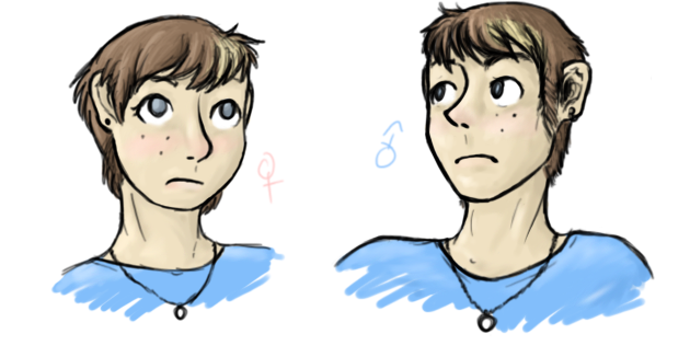
comaprason.png

a sort of...study I guess? I drew myself as both male and female, to compare. I is a fugly :c

What are you talking about you're adorable :>

And your colouring is still pretty~
 
Fffff that black dragon is so badass I could cry.

And that Clefable! Adorable. The fluffy shading on him is wonderbar.

And I particularly love the female/male self-study (shut up you, you're adorable) - the subtle things like the jawline and the rounded nose make a real difference.
 
These are some great drawings. The Umbreon is shaded nicely, and I like the glowy effect on the rings. (I need to learn to do that...) And the expression, especially the eye, is adorable how it stares up at the moon, which is also done nicely. I'm no expert on sitting animals specifically, but I think that the body should be a little less vertical when sitting.

Now I'm looking at the kitten-type thing, which is also adorable. You have a good style with cats and dogs... *looking at Umbreon earlier* This one probably looks adorable because of its huge and curious-looking eyes. It looks very fluffy and I like the position, too; that also makes it look curious. The front legs look really flimsy, though... if it's a fake Pokemon, though, it kind of makes sense because a lot of Pokemon are physically impossible. xD

I can't really comment on the humans much, though... since I'm no good at people. :P
 
:3c Thank you~ The kitty up there is supposed to be a pretty stylized sort of supernatural thing, hence the skinny legs. But I love the crits, thanks so much~

And now, a picture that I have been meaning to finish for aaaages.
everytime-we-touch.png
 
Oh, that one is funny. XD Static electricity? I don't really see anything that could improve about it, but I do like the way the hands are drawn, and their position. You seem to be pretty good at hands... I don't know if I already said this, but I actually used one of your drawings as a reference because I couldn't get the hands right on one of mine. :P

(When I was at camp, my cabin lip-synced to that song, and I did too, even though I don't really know the words...)
 
Emil/Jacob holding hands

I don't think I need to tell you again how much I adore this piece, but I'll say it again. Lovely, subtle shading, the folds on the clothes are amazingly done, especially on Emil's, the filter that makes it look like a comic book page which is an amazing touch. And of course, the subject matter, that even now makes me squeal like a five year-old. I'd love to give you some kind of constructive criticism of this but honestly...I can't see anything /to/ crit that you didn't already fix in the chat....well, maybe one little bitty thing. Emil's glove is a wee bit too form-fitting. It's drawn more like a fabric glove than a heavy rubber one, buuut seeing as this picture centers around both character's hands, the contrast and connection between them, I can see why you did that, so the artistic license is understandable.

Your new fursona

Also a lovely piece. I love how strong she looks, what with those big paws and claws. I also adore her expression, a sort of playful look that at the same time says "heheheh...I can totally kick your ass, you know..." One tiny bit of crit, though: The contrast between the fluffiness of the top of her tail (the bit that follows the ridge along her back) and the flat line of the base make the other side look a little, well, bald. It's really not that big of a deal, though. It's very, very cute and I love it. :3
 
I sure hope you don't mind some cc, because I'm about to give you some :U
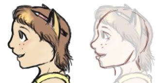
You seem to like drawing side profiles and most of them have the same problem: the forehead protrudes a bit too far to the front whereas the chin goes a bit too far back (as does the neck).
Here's a little sketchy pic to explain this in a clearer way:
fghak.jpg

(flipped because profiles are easier for me to draw that way and I forgot to flip it back durr)

Don't get me wrong; you're a pretty good artist. I can definitely see the improvement when I compare the first pages of this thread to these newer ones.
Plus I really like those creepy kitten things with those sticky little limbs for some reason. Maybe it's the funky style, I don't exactly know. P:
 
HNNG DEELISHUS CRIT

Thank you <3 I've actually been trying to work on that since i saw your post (I...just didn't reply for some reason? derp.) but don't have much to show for it since most of my stuff isn't done, or is animals lately...xD But yes~ again, thank you~


...AND NOW, FAKEMON.
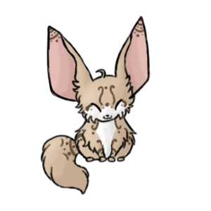
hennic.png
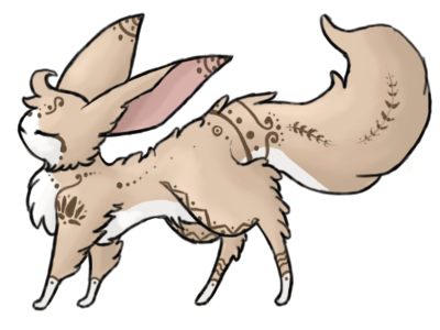
Hennox.png

Hennic and Hennox, Normal/Ground types, Henna Pokemon.
>:3c you guys may see me going to get these into ASB...I just need sprites now...hmmm...
 
Ooh, Henna Pokemon? Like the tattoo? I got one last weekend that says "Wrath," but in Japanese... anyway, on topic. The first one is absolutely adorable and reminds me of a fennec fox, with its huge ears and little body. I love its expression, and the fur is done very well too. There's a little break in the line near the back foot on our right, which makes it look strange if I look closely, as if it's not sitting like it is on the other foot. But that's a more minor one... I'm no good at the really small details. XD

Its evolved form is also awesome... I like the stance and the way the patterns reflect the shape of the body.. it makes it look very graceful. :D Its little feet, its stance and its large ears kind of remind me of an Espeon... the chest seems to go forward a little far, but it could just be because it's so fluffy. Excellent ideas. :)
 
Wow, I like the candle. I drew one of them in my science notebook a few days ago for some reason...

It's hard to explain what I like about it. Probably just about... everything. The colors are very good, and I like how the brightness is expressed. Whenever I stare at the flame of a candle, I think that it would be hard to capture the exact colors in a drawing, but you did a very good job.

The only problem is that I'm in Axe-Murderer style right now, so it's kind of hard to see. XD It feels cool, though, because I'm looking at the candle on a dark background...
 
Ooo, awesome #w^ the second one looks... evil... or its just coughing up a hairball ;<.<

Yeah.. sorry i cant give you much critique... i just cant seem to find anything wrong with it XD so yeah #~^;;
 
Back
Top Bottom