• Welcome to The Cave of Dragonflies forums, where the smallest bugs live alongside the strongest dragons.

    Guests are not able to post messages or even read certain areas of the forums. Now, that's boring, don't you think? Registration, on the other hand, is simple, completely free of charge, and does not require you to give out any personal information at all. As soon as you register, you can take part in some of the happy fun things at the forums such as posting messages, voting in polls, sending private messages to people and being told that this is where we drink tea and eat cod.

    Of course I'm not forcing you to do anything if you don't want to, but seriously, what have you got to lose? Five seconds of your life?

Suggestions Butterfree's Pixel Art

Butterfree

Still loves Joltik, though!
Staff member
Heartache staff
Pronoun
she/her
Yay. :D

So uh. I still like this thing:
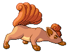
vulpixelover.png

Pixel-over of a Vulpix that I drew myself.

edgey.png
phoenix.png
godot.png

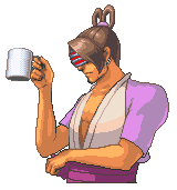
Edgey, Phoenix and Godot from the Phoenix Wright games as Pokémon with lame name puns. :D Yes, I am insane.

metamewsprite.png

A guy called MetaMew from the Serebii.net forums somehow got me to agree to retouch this, and I ended up making a new one from scratch because the original had too many problems for it to be really possible to work with it. (No, do not attempt to get me to do the same for you; I'm not quite sure what possessed me to do this, but you're not likely to evoke it again if you try.) It's obviously based on MetaMew's design and is in roughly the same pose, but the actual sprite was completely redrawn and shaded from scratch. I kind of like how it came out.

Aaand that's pretty much all my real recent stuff.
 
Always admired your admiration towards your lovable sprites of admiration. Especially that Seedot Phoenix Wright character edit.
 
Wow 'Free. Those new ones (Godot, and the Fakemon thing) are incredible. Especially the fake. You really ought to sprite your own fakes (or those of others) more often. If only we had you working for Amber.

You're also improving. A lot. :D I'm not sure you noticed, but your anatomy is far superior to what it was a couple of months ago, as is evident in the fakemon and the Vulpix.
 
I bring you one of the scariest sprites in the world, Pearl!Godot:

pearlgodot2.png

i.e. what Pearl would look like if she were channeling Godot. It is highly disturbing, as you can see. And took a craaaazy amount of work. @_@ I had to remake all the clothes from scratch and scratch his arms and chest (which fail because I fail at human anatomy). But it's amusing.
 
BUMPITYBUMP!

thunderyuscratch.png


D/P sprite of Thunderyu. The other dragons will follow when I get around to them.

It is made from scratch, but the pose is inspired by the old sprite, which in turn was made from a heavily edited R/S Aerodactyl base and some Charizard parts:

thunderyunew.png


I like the new one, except that the wings don't look as big in comparison to the body as I'd have liked. D:
 
Oh, it has some wondrous shading, though Thunderyu's underbelly seems like it'd look better if had a layer of darker shading. The limbs (excluding the tail), and the head, especially, seem a bit small, in comparision to the body. The jewels are done nicely and have the awesome sparkly jewel feel to them, though the second jewel from our left seems slightly un-orb-like. The stucture of the wings is also done nicely, though I don't believe that wings are that attached to the body. Oh, and possibly he'd have some fangs showing. I'm fond of his neck, too <3 Maybe you should add a bit more colour to his eyes.
 
Last edited:
Wow, that's great for a scratch. The only crit I could give that hasn't been already said is that his eyes need a bit more definition on both sprites - because he's yellowy, his eyes seem to fade in with the rest of his face.
Can't wait to see Polaryu and Volcaryu. (:
 
I like how you made the yellows look like different colors even though you used the same shades.

The left wing looks like it is bent oddly. The old sprite has the half away from the body bigger than the one near it. Maybe making it that way would make it look less weird.
 
Thanks for all the lovely crit. :3

Spoon: Hmm, I tried putting on another layer of shading on the underbelly, but it really didn't look good. Yesterday I shrunk the body a little bit, but the limbs are intended to be rather small (its primary method of getting around is flying). I edited the jewel you mentioned, but fangs made it look very strange.

ultraviolet: Added a couple of pixels near the eyes.

ArtificialFlavor: I'm not sure precisely what you mean by the half away from the body being bigger than the one near it. o.O Clarify a bit? (Part of that is because I'm not sure which wing you're referring to, since it could be your left or Thunderyu's left.)

alonsyalonso (who tagged this with "crap scratch", and yes, I can see it was you): Uh, mind elaborating? Because right now, honestly, based on what I've seen of you so far, I can't help thinking you just did that out of spite because I criticized your sprite contest or something. :/ If you want this to be corrected, you have to get back here and give some useful criticism to convince me you actually know what you're talking about.

I also edited the left leg (i.e. the one farther away) a bit.

EDIT: I also redrew the ear and curls on that Vulpix that's in the first post.
 
Last edited:
Nice job on the Thunderyu! The only thing I can see that you can fix is the base of the right (its right) wing. It looks a little weird because it expands outward where it connects to the body. Maybe you could make it stay straight or even go a little inward before connecting.
 
Ah, I've come a long way from Thunderyu's "too Charizard-y", too bad most of my suggestions didn't work out. I know that sprites are difficult to edit, because of the size of sprites D: I hope everything's turning out well, and I also hope to see the edits soon on both Thunderyu, and Vulpix.
 
BUMPITYBUMP!

thunderyuscratch.png


D/P sprite of Thunderyu. The other dragons will follow when I get around to them.

It is made from scratch, but the pose is inspired by the old sprite, which in turn was made from a heavily edited R/S Aerodactyl base and some Charizard parts:

thunderyunew.png


I like the new one, except that the wings don't look as big in comparison to the body as I'd have liked. D:
:D

I'm just wondering where the teeth are, and did it's head shrink? I bet that's just something you did to make it look better, but still...

I like it a lot better than the original, especially since you scratched it :] Something about the head bugs me, though, but I can't put my finger on it... The gems, maybe? I dunno, but something makes it not look right...

Still, wonderful work, as always :D

EDIT: Didn't see the other posts with critizm, hurr...
 
Here's Volcaryu.

volcaryuscratch.png

I don't like it as much as Thunderyu, but hey. It fixes some issues I had with the design in the previous sprite, which looked like this:

volcaryunew.png
 
Back
Top Bottom