

-
Welcome to The Cave of Dragonflies forums, where the smallest bugs live alongside the strongest dragons.
Guests are not able to post messages or even read certain areas of the forums. Now, that's boring, don't you think? Registration, on the other hand, is simple, completely free of charge, and does not require you to give out any personal information at all. As soon as you register, you can take part in some of the happy fun things at the forums such as posting messages, voting in polls, sending private messages to people and being told that this is where we drink tea and eat cod.
Of course I'm not forcing you to do anything if you don't want to, but seriously, what have you got to lose? Five seconds of your life?
You are using an out of date browser. It may not display this or other websites correctly.
You should upgrade or use an alternative browser.
You should upgrade or use an alternative browser.
Candy-stripe a cancer ward
- Thread starter shy ♡
- Start date

Phoenixsong
beep beep coming through
- Pronoun
- she/they/any


Equinoxe
has a BONE to pick with you
The fakemons are looking pretty interesting, but since the sprites are most likely pixel-over-ish, they don't quite have the "pokemon feel".
I'd suggest making the sprites separately as they usually have different kinds of poses (usually the 'mons are facing front) and they should be a bit more... cartoonified (?), meaning the body parts should be a bit more rounded and tight-packed than they are now.
Uh but since this is not in the pixel art section, I'll shut up about the sprites already P:
The arts for the fakemons have pretty fancy shading (I especially like Thorike's claws or whatever they're called). Minize's head looks a tad flat though, unless it's meant to be like that.
I suck at drawing horses BUT I ride and thus have seen many horses and so I can pretty safely say that your Zeburaika looks swell.
I think the biggest problem there is that the head is too big and the neck a tad too thin. Zebras also usually have more rounded ears and their body shape is a bit more pony-like than horse-like. The muzzle also needs a bit work, so here's some shabby redlining for you:
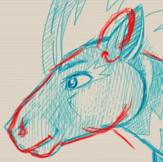
It's a very good drawing nevertheless (bonus: I actually thought it was scanned or something at first glance fft).
I really hope this block of text can help you somehow C:
EDIT: oh and I really love the shading on Pendoraa, it's so lively and organic. P:
I'd suggest making the sprites separately as they usually have different kinds of poses (usually the 'mons are facing front) and they should be a bit more... cartoonified (?), meaning the body parts should be a bit more rounded and tight-packed than they are now.
Uh but since this is not in the pixel art section, I'll shut up about the sprites already P:
The arts for the fakemons have pretty fancy shading (I especially like Thorike's claws or whatever they're called). Minize's head looks a tad flat though, unless it's meant to be like that.
I suck at drawing horses BUT I ride and thus have seen many horses and so I can pretty safely say that your Zeburaika looks swell.
I think the biggest problem there is that the head is too big and the neck a tad too thin. Zebras also usually have more rounded ears and their body shape is a bit more pony-like than horse-like. The muzzle also needs a bit work, so here's some shabby redlining for you:
It's a very good drawing nevertheless (bonus: I actually thought it was scanned or something at first glance fft).
I really hope this block of text can help you somehow C:
EDIT: oh and I really love the shading on Pendoraa, it's so lively and organic. P:
shy ♡
whispers in gay
Yeah the sprites are just an add-on because I have to have them in order to get approval on some forum I go to blahblahblah. :v I'm improving slowly butttt it's not really my main 'goal'. (Let alone mimicking the pokemon style - heh.) EDIT: I will keep in mind what you said though because I hate the thought of knowing I can get better and not doing so. So thanks for the crit here too.
Minize's head does look sort of flat-ish but I'm not sure how to fix it... hrm... I'll play around with it until it doesn't bother me.
(I ride horses too :D Well I haven't for a while now because of suck but!) Thank youuu for the redlines/crit! Horsie faces are so hard. Haha corel painter is so easy to get a natural, handdrawn look with. If I added a texture to it you'd never know~ Anyhow thanks again for crits <3
Last edited:


Phoenixsong
beep beep coming through
- Pronoun
- she/they/any
What/who is Pentimento fighting there, out of curiosity? You're right that the gore isn't terribly realistic, but I guess that's because the gashes look deep enough to have gone well beyond the skin and muscle and yet you don't see any guts, etc.. It's still <3, though, it doesn't need the guts to be all bloody and get the point across~
Sketches are beautiful, yupyup. I think the feraligatr's hind leg might be too far back based on where you have the tail starting, but it's so pretty and the rapidash is guuuuh. I can't draw horses at all, so. Envy.
(uugggh work kratos work finish the goddamn proposal stop doing art stuff)
also I fixed the motor drive thing you pointed out, it'll work properly next release~
shy ♡
whispers in gay
Mentos is fighting Anthony, the crossdressing raccoon boy from before. :D There's really no canonical reason for them to fight (or know eachother) but it was fun to draw so yup. And yeahhh I don't think guts are really my thing. I mean they're nice inside your body but outside they're just rather unpleasant. I guess I should learn to draw them but uhhh :| ew.
Horses are hard and I'm not sure how I learned how to do them, I think I just kept drawing them occasionally and it sort stuck in my brain. BUT you can draw humans so you're meaner. AND uh it's very likely gatr's leg is too far back, though I can't see it because I'm not a pro with uh, reptile anatomy. I'll work on it though! Hr. Oh actually I do see it, I should add a thigh to make it less awkward. If I ever finish that... yeah.
(yay motor drive :D)


shy ♡
whispers in gay
Guuuyyss I know it's annoying whining about comments but like I'm now quadruple-posting so do you mind just, like, posting something in between my pictures, I don't know, just say 'your crap is crap' so that I'm not spamming so much. :| K.

Nibite and

Varanom. Overhauls of my very first fakemons yayyy brought on by the fact that I've lost all info I had on them that wasn't stored in my brain (meaning pretty much everything). Uhh they have a third stage which has lines done but I am lazy! :[ I'm not satisfied with these pics at all; I hate attempting to mimic the Sugimori style. Mimicking other styles just bugs the hell out of me, it stunts me and... always ends up screwing me over. But, for some reason, I do it anyhow. Why? ... Because self-improvement is masturbation. :[
Nibite and
Varanom. Overhauls of my very first fakemons yayyy brought on by the fact that I've lost all info I had on them that wasn't stored in my brain (meaning pretty much everything). Uhh they have a third stage which has lines done but I am lazy! :[ I'm not satisfied with these pics at all; I hate attempting to mimic the Sugimori style. Mimicking other styles just bugs the hell out of me, it stunts me and... always ends up screwing me over. But, for some reason, I do it anyhow. Why? ... Because self-improvement is masturbation. :[
Littlestream
The reflection of the moon
shy ♡
whispers in gay
:D Thankyous. Actually on the pics that are lineless, the entire image is lineless; I'm working on, you know, not needing lines, since they mostly hinder art. It's slow... learning how to do it well though. Because it's hard. :[
Anyhowww since this is an art thread, here's a work-in-progress. Currently it's just a quick gesture sketch and a background because I got uhh spontaneous inspiration, and you know how that happens, you have to get it down really fast or else it'll disappear. So I got down the pose real quick and moved onto the background and yeah.

Backgrounds are so much fun in corel painter. Seriously, I could just do backgrounds with no characters in them. Anyhow that's Anthony, or it will be. Anddd I don't know where he is. Somewhere sparkly.
Anyhowww since this is an art thread, here's a work-in-progress. Currently it's just a quick gesture sketch and a background because I got uhh spontaneous inspiration, and you know how that happens, you have to get it down really fast or else it'll disappear. So I got down the pose real quick and moved onto the background and yeah.
Backgrounds are so much fun in corel painter. Seriously, I could just do backgrounds with no characters in them. Anyhow that's Anthony, or it will be. Anddd I don't know where he is. Somewhere sparkly.
Phoenixsong
beep beep coming through
- Pronoun
- she/they/any
One thing that would help improve the attempts at Sugi-style is slightly thicker lines, and perhaps simplifying the shading--he doesn't really use more than two layers of light and shadow in most, so the more gradated look you've got is kind of overshaded for him. Then it's just a matter of the eyes being in an entirely different style (again, generally simpler), but, well, I like your style better and if emulating that style annoys you then pick a less annoying one? idk.
That background is amazing and gorgeous and stop that right now. >|
That background is amazing and gorgeous and stop that right now. >|