• Welcome to The Cave of Dragonflies forums, where the smallest bugs live alongside the strongest dragons.

    Guests are not able to post messages or even read certain areas of the forums. Now, that's boring, don't you think? Registration, on the other hand, is simple, completely free of charge, and does not require you to give out any personal information at all. As soon as you register, you can take part in some of the happy fun things at the forums such as posting messages, voting in polls, sending private messages to people and being told that this is where we drink tea and eat cod.

    Of course I'm not forcing you to do anything if you don't want to, but seriously, what have you got to lose? Five seconds of your life?

The Spriter's Showcase!

Status
Not open for further replies.
Anyone want to rate these?

Aiden.png
--- I know this one totally fails, but I wanted to put it up for critique anyway.

Pokeself.png
--- An awesomesauce recolor of Dawn.

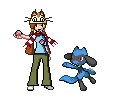
RioluCosplay.png
--- Yes, this one fails too. But ah well.

pokesona2.png
--- Still no one's rated my pokesona...

stantlerprevo.png
--- Yay! First scratch ever! I know it's not the greatest, but I think it's pretty good for my first one. It's a Stantler Prevo, no name as of now.

chocostrawberrymewtwo.png
--- Check out the chocolate-strawberry Mewtwo!

girafarigrevamp.png
--- My first revamp! Silver sprite on the left, fr/lg sprite on the right.
 
Last edited:
They are just simple recolors, not much to critique on besides the lack of dark outlines, but I'm guessing thats because they are made of snow/ice, right?

Edit: Oh, it says spirit...still, point still stands.
 
Your color choice seems a bit random. From what I can see, the shading could use some work, and there should be better transition into the new colors. I suggest you work on it a little more.

2rh730h.png


Now maybe I should explain this. I saw on the weirdest sprite thread that this had bad shading, so I decide to reshade some parts. The black I used the shadow of Scizor and the shadow of Darkrai to create a darker shade, the red highlight I removed in some areas, and changed in other areas. Then I changed it to a darker shade of red, which wasn't as dark as Scizor's red, that I borrowed from Nidoking. Lastly I made some minor changes in shading to round it out some more. Comments?

Someone care to comment on it?
 
vaporeonrevamp89615.PNG
arbokrevamp51862.PNG
mewtworevamp84980.PNG

Please rate my (not very good) revamps.

EDIT: Oh, I think the scizor's shading is good, but the sprite in general looks too dark. There are no light spots at all.
 
For the most part, you did okay. The shading looks a tad too blocky. I would round it out.

There are light spots on Scizor, but they aren't as bright as on the official sprite. I darkened the highlights a bit because the Scizor looked dark already and I wanted to add to the effect. I also rounded out the shading because it looked bad. I left a tiny bit of blockyness in there, but I don't remember the reasoning behind that.

There is one problem with it being dark: older moniters don't have as bright of a display, so some of the darker shades will look black.

EDIT: Basically, I wanted the dark look.
 
Thank you all 4 rating my sprites and i got more! I only have 2 at the mo...
15eiwlt.png
Treecko arms torchic hair bulba eye recoulor and tail.
im8fsy.png

Its Toon Link! But there are sooooo many pkmn I cant remember em all!

EDIT: DON'T WRITE SOMETHING HORRIBLE BOUT TOON LINK! IT TOOK ME BOUT 2 HOURS 2 MAKE!
 
Last edited:
Thank you all 4 rating my sprites and i got more! I only have 2 at the mo...
15eiwlt.png
Treecko arms torchic hair bulba eye recoulor and tail.
im8fsy.png

Its Toon Link! But there are sooooo many pkmn I cant remember em all!
What the fuck are those?

Toon Link needs some MASSIVE renovations to it. The light source is everywhere and nowhere all at once, the eyes are pretty much cock-eyed and misplaced and I don't even wanna start on the outline. Outlines are always just 1 pixel wide. Always. The alignment is really terrifying; look in the mirror and copy how your eyes and your mouth are aligned with each other and with your hairline. Also, Toon Link doesn't have an egg for a head. He still has a bit of a chin.

While your splice isn't half bad, the lighting is still fucked. A bit of aligning with the head feather/hair/crownthing and you're making progress.
 
sts.png
sammy the squirrel. I think he looks way too much like a raving rabbid, which isn't a good thing.

C+CC?
 
68120266tu2.png

I know I haven't shaded the flippers yet, but I think there's something wrong with their outline. I'm not sure what, though.
 
The left(our right) looks too blocky, which is a problem that plauges almost every scratch sprite. Just a quick fix should do it.
 
Status
Not open for further replies.
Back
Top Bottom