

-
Welcome to The Cave of Dragonflies forums, where the smallest bugs live alongside the strongest dragons.
Guests are not able to post messages or even read certain areas of the forums. Now, that's boring, don't you think? Registration, on the other hand, is simple, completely free of charge, and does not require you to give out any personal information at all. As soon as you register, you can take part in some of the happy fun things at the forums such as posting messages, voting in polls, sending private messages to people and being told that this is where we drink tea and eat cod.
Of course I'm not forcing you to do anything if you don't want to, but seriously, what have you got to lose? Five seconds of your life?
You are using an out of date browser. It may not display this or other websites correctly.
You should upgrade or use an alternative browser.
You should upgrade or use an alternative browser.
The Spriter's Showcase!
- Thread starter Valerunner
- Start date
- Status
- Not open for further replies.


Starly
New member
Can't find anything to crit on!!!!
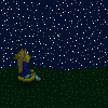
Zoroark back sprite based on prerelease images.
It looks good but the colors and shading would look better if not like: dark dot, light dot, dark dot, light dot, and diagonal from each other if you know what I mean, and would look better solid like the HGSS sprite of it.


Bellossom Pokemon Puzzle Challenge revamp
It looks good but the colors and shading would look better if not like: dark dot, light dot, dark dot, light dot, and diagonal from each other if you know what I mean, and would look better solid like the HGSS sprite of it.
... you mean dithering? Dithering is a neat effect if used well.
Karkat Vantas
Virile God-Snake Tower of Masculinity
blazheirio889
Banned
- Pronoun
- she
I tend to dither a lot. :v It just looks weird without it - to me, at least. It probably originates from using smooth, blendable media a lot before I got into pixel art.
I thought the dark shade on the neck looked weird, but the super-shading lover in me wouldn't shut up about how it looked too flat without it. But you're right; I'll remove it and edit my previous post when I have.
Just a general question: is dithering really that bad? :v I myself quite like it, but it seems that most of the criticism I get is about dithering.
Yarnchu
Yarn is comfy and easy to wear
I tend to dither a lot. :v It just looks weird without it - to me, at least. It probably originates from using smooth, blendable media a lot before I got into pixel art.
I thought the dark shade on the neck looked weird, but the super-shading lover in me wouldn't shut up about how it looked too flat without it. But you're right; I'll remove it and edit my previous post when I have.
Just a general question: is dithering really that bad? :v I myself quite like it, but it seems that most of the criticism I get is about dithering.
In my opinion, dithering when done correctly can add depth to a sprite. The only problem is that most of the Pokemon spriting styles do not use heavy dithering. The only one that I can think of that uses heavy dithering is the G/S/C sprites, and that is due to a limited pallete. If you are going to sprite in the D/P/Pt style, most people do not expect to see a lot of dithering- hence the criticism.
Dunno whether or not I'll actually use any criticism on this; it was a spur-of-the moment decision to make it based on pseudo-depression and drama going on in my life and I'm not actively looking to improve it.
If you have a suggestion that would actively make it look better I'd take it, but hey.
Last edited:


Yarnchu
Yarn is comfy and easy to wear
Aisling
Super Moderator

Arcanine WIP. Just wanted to get some general critique on the outline. On that note, all of the light and dark parts were there so I could have an easier time doing the outline(meaning that it is definitely not how it will be shaded). The pose is the Gold version pose.
I would get rid of the bottom couple of tufts from the tip of the tail, but otherwise this is looking pretty fantastic. :D
hopeandjoy
yan ya yan ya yaa iii yaaa
Medical Meccanica
Banned
We're back!
Copied from dA:
Pocket Spriter 3! Now with a snazzy subtitle!
7:00 EST TONIGHT (Saturday, May 1st). Discussions/"Panels" planned should/will include: (times are give or take, sprites may take longer to complete)
Medical Meccanica/Seika - 7-11
It's Evolving! How to successfully design fakemon evolutions (7:00-8:00)
Cliches in Fakemon - How to break the tropes (8:00-9:00)
Happy Hour/Anything Goes (9:00-10:00)
The Late Show with Seika - Sketching for Spriting (10:00-11:00)
Guests are to be decided, but Shira is pretty much confirmed for the Happy Hour.
Have a suggestion for a Pocket Spriter panel? Comment or send me a note!

Involuntary Twitch
I want the earth to spin in the opposite direction
We're back!
Copied from dA:
Pocket Spriter 3! Now with a snazzy subtitle!
7:00 EST TONIGHT (Saturday, May 1st). Discussions/"Panels" planned should/will include: (times are give or take, sprites may take longer to complete)
Medical Meccanica/Seika - 7-11
It's Evolving! How to successfully design fakemon evolutions (7:00-8:00)
Cliches in Fakemon - How to break the tropes (8:00-9:00)
Happy Hour/Anything Goes (9:00-10:00)
The Late Show with Seika - Sketching for Spriting (10:00-11:00)
Guests are to be decided, but Shira is pretty much confirmed for the Happy Hour.
Have a suggestion for a Pocket Spriter panel? Comment or send me a note!
Somebody forgot to put the link up xD
It's here. Be there, you guys!


Blastoise Fortooate
Geographical!

- Status
- Not open for further replies.