-
Welcome to The Cave of Dragonflies forums, where the smallest bugs live alongside the strongest dragons.
Guests are not able to post messages or even read certain areas of the forums. Now, that's boring, don't you think? Registration, on the other hand, is simple, completely free of charge, and does not require you to give out any personal information at all. As soon as you register, you can take part in some of the happy fun things at the forums such as posting messages, voting in polls, sending private messages to people and being told that this is where we drink tea and eat cod.
Of course I'm not forcing you to do anything if you don't want to, but seriously, what have you got to lose? Five seconds of your life?
You are using an out of date browser. It may not display this or other websites correctly.
You should upgrade or use an alternative browser.
You should upgrade or use an alternative browser.
The Spriter's Club Reborn
- Thread starter eeveeskitty
- Start date
JolteonShock
A very inactive person
Blastoise Fortooate
Geographical!
Blastoise: Looks pretty good, though I'd say it's a little small. The shading seems right, though.
Well, it is a Baby Pokémon, after all.
Also, that repose looks good, especially since it's between such different pokémon.
JolteonShock
A very inactive person
eeveeskitty
...
- Pronoun
- they
The Darksmith Legacy
Sorry I was gone, I got lost in the vortex again..
Kai Lucifer
A traveller on the winds of time
Is the official DPPt shiny sprite;
Valerunner
fka Grimdour, for the curious
- Pronoun
- She/her
Not bad, but it's a recolor. Nothing else.Oh yeah. Sorry, I had it in my storage.
What about this?

I highly suggest experimenting.
Beautiful Chaos
Count your Days.....
eeveeskitty
...
- Pronoun
- they
Beautiful Chaos
Count your Days.....
Involuntary Twitch
I want the earth to spin in the opposite direction
This is my new best sprite. Finished about... a few hours ago. >:3

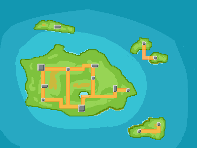
First map. I think I like it... *squints*
Maps are tricky, and since it's your first I can understand how you've got some stuff wrong. But eh, here goes:
My main problem with this is the lack of logical geography. You seemed to have thrown the routes, mountains, and islands any old where. See, the thing about designing a region is that you've gotta make it interesting. Take into account the hypothetical player's experience. You'd want varied terrain: coastal areas, rugged mountain passes, lush forests... and well-placed cities, on rivers and suchlike. It definitely helps to sketch out your region on paper first, and think about major landmarks: what makes your region special?
The other issue is the spriting mechanics. Regions are tricky-- they've got a lot of minutiae that's very hard to convey in text like this. And don't ask me to go over your map with a fine-toothed comb; I read a tutorial when I did mine. Basically, though: you've gotta use the brown for the coast (as you've done for the southeast of the main island) on the entire south side of all the islands. And the light blue border only on the edge of that coast, not randomly dotted around the islands any which way.
Third is a simple, silly thing: you freehanded the blue for the ocean, right? Don't. Use the oval tool; if it's nice and even, nobody will know.
Follow up or at least regard my crit or I will be sad. :<
JolteonShock
A very inactive person
Dragon
disaster pigeon
- Pronoun
- she
My main problem with this is the lack of logical geography. You seemed to have thrown the routes, mountains, and islands any old where. See, the thing about designing a region is that you've gotta make it interesting. Take into account the hypothetical player's experience. You'd want varied terrain: coastal areas, rugged mountain passes, lush forests... and well-placed cities, on rivers and suchlike. It definitely helps to sketch out your region on paper first, and think about major landmarks: what makes your region special?
The other issue is the spriting mechanics. Regions are tricky-- they've got a lot of minutiae that's very hard to convey in text like this. And don't ask me to go over your map with a fine-toothed comb; I read a tutorial when I did mine. Basically, though: you've gotta use the brown for the coast (as you've done for the southeast of the main island) on the entire south side of all the islands. And the light blue border only on the edge of that coast, not randomly dotted around the islands any which way.
Third is a simple, silly thing: you freehanded the blue for the ocean, right? Don't. Use the oval tool; if it's nice and even, nobody will know.
Follow up or at least regard my crit or I will be sad. :<
*thumbs up* I will, yes. =3


