-
Welcome to The Cave of Dragonflies forums, where the smallest bugs live alongside the strongest dragons.
Guests are not able to post messages or even read certain areas of the forums. Now, that's boring, don't you think? Registration, on the other hand, is simple, completely free of charge, and does not require you to give out any personal information at all. As soon as you register, you can take part in some of the happy fun things at the forums such as posting messages, voting in polls, sending private messages to people and being told that this is where we drink tea and eat cod.
Of course I'm not forcing you to do anything if you don't want to, but seriously, what have you got to lose? Five seconds of your life?
You are using an out of date browser. It may not display this or other websites correctly.
You should upgrade or use an alternative browser.
You should upgrade or use an alternative browser.
The Spriter's Club Reborn
- Thread starter eeveeskitty
- Start date
Valerunner
fka Grimdour, for the curious
- Pronoun
- She/her
Crit is criticism. Not a compliment. You need to point out the mistakes or the specific details on why it's awesome, and how said person could improve.^Awesome.
My crit is done.
Yarnchu
Yarn is comfy and easy to wear
^Awesome.
My crit is done.
That....wasn't even critizing.
Well, it is definately a great sprite, and one of the best scratches I have seen on here. However, I can point some things out. The shirt's shading doesn't seem to be that consistent from side to side, unless that is how it is suppossed to look, the neck looks too long and fat(well, maybe just too long.), and the outline is too bright. Luckily the sprite isn't plagued by blockiness like most scratches, though there is one spot right by the wings that I can see.
eeveeskitty
...
- Pronoun
- they
Noctowl
Everyone call me elf monster.
You wouldn't believe the number of newbies that save pictures in JPEG...
I know, it really grinds my gears. That's why I try and tell as many people on da that they shouldn't save it like that. Half the time I am ignored or snapped at, but I feel it is worth it.
Kai Lucifer
A traveller on the winds of time
Kai Lucifer
A traveller on the winds of time
The eyes seem rather comic, being in a semicircle shape and being black dots. As for the shading, You need to move the lighter area of his face upwards, and the shirt + right side of the jacket need to get gradually darker, rather than lighter.
Also, don't be afraid to use more black where needed.
Also, don't be afraid to use more black where needed.
Valerunner
fka Grimdour, for the curious
- Pronoun
- She/her
I don't know what you're trying to achieve here.Can I have some crit on this?

and my first lineless. Am I doing it right?

^Oh, please. It's not the end of the world if I say something wrong.
NOW ON TOPIC:

I love revamping bird Pokémon.
Outlines. And for God's sake people put shading on the eyes! Adding an extra pixel to the eyes gives it a better sense of "realism", per se. Also, black is an acceptable outline for when you've reached the darkest area.Plus the talons. Where the hell did you get the idea? You ran a filter through this, I'm guessing. Replace color, was it?
What you have to understand is that revamping is updating the style. Not replacing the colors with more vibrant ones.

Yeah, I think I finished it. Any criticism is greatly appreciated~
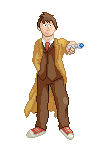
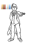
A bit of contrast might help. Unless it's the style you're aiming for, the physics is off with this. The angled shoe is too high. It's like he's tiptoeing with one foot. Also, the tie. I see no fold. It's just a collar from this end. Plus the hair needs to be thicker.
Guys, as I keep saying, the little shading in the eyes makes the sprite that much better.
Noctowl
Everyone call me elf monster.
Terry, I don't care if some spriter on youtube says its good...revamps are not recolours. You have to change the shading yourself to fit with the newer style. I used to revamp like that. But now I know its bad. If you want to get better at revamps, look up butterfree's guide. That's how I got better.
Valerunner
fka Grimdour, for the curious
- Pronoun
- She/her
Alright, alright.^Ratings, awesome ratings, basically.
By the way, everything's right on the revamp. I got DarkBlade723, Youtube's current best spriter (voted) to give the crit ands he said it was right. (And he rules at all kinds of sprites)
If you're right, then why does this look any better? I followed Butterfree's rules of revamping to an extent and it took me about 2 minutes max.
Yarnchu
Yarn is comfy and easy to wear
^Ratings, awesome ratings, basically.
By the way, everything's right on the revamp. I got DarkBlade723, Youtube's current best spriter (voted) to give the crit ands he said it was right. (And he rules at all kinds of sprites)
http://www.youtube.com/watch?v=CAukuqgROZI&feature=channel_page
If he is Youtube's best spriter, then I shed tears of sorrow for Youtube. He made a major mistake: he copied-flipped the tail WITHOUT reshading. He proceded to mess up Pika's shading a little and made the outlines all black, which is another no-no in spriting. I won't post this on youtube though because I know how ravenous Youtubers can be.


