

-
Welcome to The Cave of Dragonflies forums, where the smallest bugs live alongside the strongest dragons.
Guests are not able to post messages or even read certain areas of the forums. Now, that's boring, don't you think? Registration, on the other hand, is simple, completely free of charge, and does not require you to give out any personal information at all. As soon as you register, you can take part in some of the happy fun things at the forums such as posting messages, voting in polls, sending private messages to people and being told that this is where we drink tea and eat cod.
Of course I'm not forcing you to do anything if you don't want to, but seriously, what have you got to lose? Five seconds of your life?
You are using an out of date browser. It may not display this or other websites correctly.
You should upgrade or use an alternative browser.
You should upgrade or use an alternative browser.
The Spriter's Showcase!
- Thread starter Valerunner
- Start date
- Status
- Not open for further replies.
Medical Meccanica
Banned

Aisling
Super Moderator
Got bored and decided to create my first sprite in... several months, a Blue Mewtwo revamp. Because I think this sprite of Mewtwo is one of the few good ones.

I think that's the JP Red/Green one... but the Blue Mewtwo is cool, I like how its arms dangle down. That one and the Silver would be my favorite.
The one reason I haven't attempted a Mewtwo revamp myself is because these days, with the sprites being bigger and having more space for Mewtwo's proportions to be done properly, I wouldn't be happy with it unless I completely redid almost the entire sprite. So understanding why you left the outlines alone I'll just poke at the shading for now.
It looks like you took away from the shading on his left (our right) hand... And it makes that hand look really odd. I'd put the shading back on like it looked in the original sprite. Otherwise the shading looks very much like it's done now in the games and I don't really see any other problem areas.
Last edited:
I think that's the JP Red/Green one... but the Blue Mewtwo is cool, I like how its arms dangle down. That one and the Silver would be my favorite.
Veekun says it's Blue, maybe that means Japanese Blue?
It looks like you took away from the shading on his left (our right) hand... And it makes that hand look really odd. I'd put the shading back on like it looked in the original sprite. Otherwise the shading looks very much like it's down now in the games and I don't really see any other problem areas.
Yeah, I'll try that, thanks. (And Character of the Day, I'll use your comments too, but I didn't quote you. xD) Might re-post when I have more time later.
Aisling
Super Moderator
Veekun says it's Blue, maybe that means Japanese Blue?
I noticed that too and had Vixie ask Eevee on IRC yesterday- it should read "Red/Green", "Red/Blue", then "Yellow" and he just hasn't gotten around to fixing it.
Japan had Red and Green first, then Blue was a special edition in Japan, which had new sprites. The English Red and Blue got the JP Blue's sprites since those looked better for the most part. Then the JP and English Yellow had the same sprites. At least, that's if I remember right.

ZuZu
Ssh, I'm stealing Blastoise's awesome hats.

My very own creation, a "Flower" Pokemon. I'm sure someone's come up with the idea before me, but from all I know I came up with the idea xD.
Violet & Daffodil Wigglytuff.
EDIT: HAHAHAHAHHA! THIS IS SO FUNNY!!! It's a mint and milk chocolate Pikachu with caramel and... HE'S ON A STICK!!! BWAHAHAHAH!!

Last edited:
A scratch houndoom sprite that used custom colors and isn't based off of any particular sprite style. I couldn't figure out how to make a decent eye, so I settled on a lame excuse for one.
I tried to mimic the offical style with this scratch, and I used the HG/SS colors of Pichu. I don't like how the tail turned out, but I can't figure out how to fix it. D:
Last edited:
Starly
New member
http://silversail.deviantart.com/art/Silver-Chikorita-Revamp-158612996
revamps, and this one is sucky
revamps, and this one is sucky


Sandstone-Shadow
A chickadee in love with the sky
- Pronoun
- she/her
Aww, cute. =3 The muzzle's outlines aren't very different from the main color, though; try darkening the outlines there and emphasizing the highlights. The base of the tail could start thicker, too.
As for the eye, try looking at an official Houndoom sprite; mostly when I draw eyes, I attempt to mimic the Pokémon's official eyes. (Official eyes. Ha, that sounds kinda funny.)
I think the tail needs to be bigger; if you make it bigger you can make its flag-like shape more obvious, and Pichu's tail is bigger in proportion to its body anyway. Also, on its right (our left) side, there is a straight line going down from its head to its body; see if you can take a pixel out of that (like at the top of its arm) to break up that straight line. Looks pretty good otherwise. =D
Pretty nice revamp. I think mostly what you can work on here is smoothing out the colors of the shading; for example, the line in the middle of the leaf is all the same dark shade of green. I think it would look better if that line was lighter in places where the leaf would have a highlight (and I don't see any highlight on the leaf, either; that would help.) Also, for such a light Pokémon, there's quite a bit of black outline. Maybe that's personal preference, but I think you could make some of those outlines green.
Hmm. For the highlights, I think your best bet is to continue the white dithering across the belly. I don't think it would interfere with being able to tell apart the colors that much; maybe try it and see how it looks? Sorry, I don't have much else to say since I'm not so good at devamps.
On the Celebi revamp, it bugs me how the antenna have the same shades for the outline both on the top and the bottom; it makes it look a little 2D. I think you could get away with making the tops a tiny bit lighter so you can tell the difference and the antenna look more rounded. Also, there's hardly any shadows on the green parts of Celebi's body so you might want to add some.Still no crit on these:

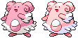

The Blissey looks great. =) One very nitpicky thing: on its left (our right) ear tuft things, there's a spot where the outlines overlap some; can you change one pixel of the black to a pixel of the dark pink so it doesn't look like they're overlapping like that, maybe?
I don't have much to say for the Sunkern, either; the only thing that I can really see is there are some places (such as the top of the leaves and the top of the yellow spikes) that I think you could get away with having a lighter outline to highlight it. Looks good though. =)
I don't have a whole lot to say about the devamp; I'm not very good at them and it looks good to me. =D
The right (our left) antenna doesn't look connected in your splice; there's some shadows there that make it look disconnected. There should be at least a little strip of the same color connecting the antenna to the head (if that makes sense, let me know if it doesn't). The mustache on the nose is hard to see, as well; can either the mustache or the muzzle behind it be made a little lighter? Also, maybe you could make one pair of feet Kricketune's feet to add more of Kricketune.
Watch the outlines on your recolors; don't just use the Paint eraser trick to change all of the colors and then leave it. Some of the outlines are too dark or too light for where they are placed. For example, Persian has a lot of outlines that are too light, and then the black outlines stand out too much because the other outlines are so different. Try darkening the outlines on those. Heracross shares this problem; there is too great a contrast between the black outlines and the green ones. Careful on the "primal" sprites; the Charmander's outlines have become almost indistinguishable from the main color. I really like the primal Bulbasaur, though. It's adorable. <3I made this for the Pe2k forums. Any comments?

Yarnchu
Yarn is comfy and easy to wear

blazheirio889
Banned
- Pronoun
- she
Ah, pixel-overs. I missed you.

Sprite-sized version of a Meganium. I have mixed feelings about it. The head and feet seem to be about the right size (I've always imagined Meganium more like a giraffe, with smaller feet and heads than depicted in the official sprites), but it was difficult to work detail into such small areas. The antennae don't seem to fit in that well, and this may be a nitpick on my part, but I keep thinking the outlines seem too black.
Sprite-sized version of a Meganium. I have mixed feelings about it. The head and feet seem to be about the right size (I've always imagined Meganium more like a giraffe, with smaller feet and heads than depicted in the official sprites), but it was difficult to work detail into such small areas. The antennae don't seem to fit in that well, and this may be a nitpick on my part, but I keep thinking the outlines seem too black.
Last edited:
- Status
- Not open for further replies.