

-
Welcome to The Cave of Dragonflies forums, where the smallest bugs live alongside the strongest dragons.
Guests are not able to post messages or even read certain areas of the forums. Now, that's boring, don't you think? Registration, on the other hand, is simple, completely free of charge, and does not require you to give out any personal information at all. As soon as you register, you can take part in some of the happy fun things at the forums such as posting messages, voting in polls, sending private messages to people and being told that this is where we drink tea and eat cod.
Of course I'm not forcing you to do anything if you don't want to, but seriously, what have you got to lose? Five seconds of your life?
You are using an out of date browser. It may not display this or other websites correctly.
You should upgrade or use an alternative browser.
You should upgrade or use an alternative browser.
Suggestions Wave goodbye to your secret crap, dumbass!
- Thread starter Coloursfall
- Start date
Coloursfall
THIS IS HOW WE BLEED
Coloursfall
THIS IS HOW WE BLEED
Darksong
Back in action!
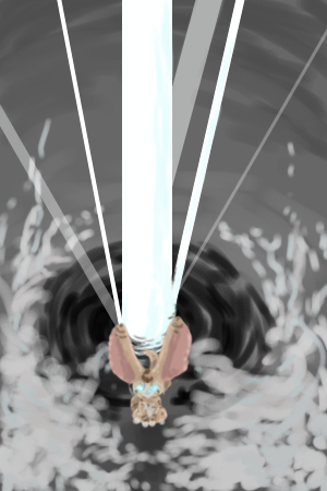
I like how the drawing of Zora fades into the background so well, it makes it look... magical. xD And you've definitely improved on human profiles, since I was looking back at your art thread a little. I especially like the expression, and the hair is shaded nicely as well.
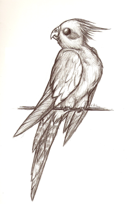
I really like that drawing of a bird; I'm definitely a bird person~ The eye is shaded very well in my opinion... it somehow makes it look a whole lot cuter. I also like the crosshatching technique that you used on the primary feathers of the wings and tail; it makes them look very realistic. I think the dark shading on the top of the neck makes the head look a little detached, though... but birds might just do that, I have two of them in my room right now xD
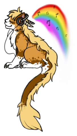
That one of the creature listening to music is epic cuteness, too; I like how the paws and the mane are drawn. I don't know exactly what this thing is, so I'm not sure whether the horns are supposed to be able to fold back like that, but I could be wrong.
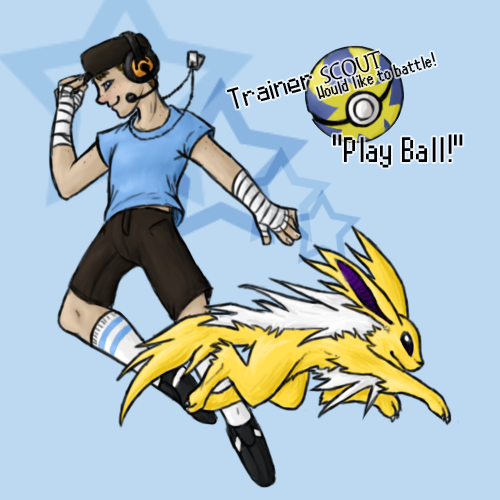
On the Trainer Scout one, I like the way the picture shows movement; I find it more exciting to draw things like that. I've played Battle Revolution before, so I can really imagine the text actually being said in my mind. I think it was the font that went with it. My favorite part, though, is the general way the Jolteon was drawn. The long mane and tail are a nice twist, and I also like how realistically the back leg closer to us was drawn. But depending on the way the person's right (our left) leg is facing, his kneecap might be facing a little more away from us.. it's kind of hard to tell.
I really like that drawing of a bird; I'm definitely a bird person~ The eye is shaded very well in my opinion... it somehow makes it look a whole lot cuter. I also like the crosshatching technique that you used on the primary feathers of the wings and tail; it makes them look very realistic. I think the dark shading on the top of the neck makes the head look a little detached, though... but birds might just do that, I have two of them in my room right now xD
That one of the creature listening to music is epic cuteness, too; I like how the paws and the mane are drawn. I don't know exactly what this thing is, so I'm not sure whether the horns are supposed to be able to fold back like that, but I could be wrong.
On the Trainer Scout one, I like the way the picture shows movement; I find it more exciting to draw things like that. I've played Battle Revolution before, so I can really imagine the text actually being said in my mind. I think it was the font that went with it. My favorite part, though, is the general way the Jolteon was drawn. The long mane and tail are a nice twist, and I also like how realistically the back leg closer to us was drawn. But depending on the way the person's right (our left) leg is facing, his kneecap might be facing a little more away from us.. it's kind of hard to tell.
Coloursfall
THIS IS HOW WE BLEED
[LATE TO THE PARTY]
Thank you for the lovely crits/comments! <3 I love when you post here~
Sorry I'm not doing requests right now :c but I'll keep it in mind for when i'm done all the stuff i need to be doing but am putting off >___>;
AND NOW, MORE STUFF.
Ed what are you doing get out of here
...my RP group made me do this
herp.
And this is ginormous so i'm linking it
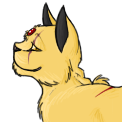
She's my fursona; a combination of a cat (of the ragdoll breed) and an oriental dragon (sort of like this one) :3I don't know exactly what this thing is, so I'm not sure whether the horns are supposed to be able to fold back like that, but I could be wrong
Thank you for the lovely crits/comments! <3 I love when you post here~
They are awesome. Could you drawed me Alakzam looking all awesome with a 'Pssshyeah I'm awesom!" expression?
Sorry I'm not doing requests right now :c but I'll keep it in mind for when i'm done all the stuff i need to be doing but am putting off >___>;
AND NOW, MORE STUFF.
Ed what are you doing get out of here
...my RP group made me do this
herp.
And this is ginormous so i'm linking it
Coloursfall
THIS IS HOW WE BLEED
Coloursfall
THIS IS HOW WE BLEED
Darksong
Back in action!
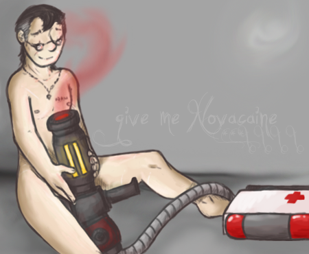
I'm not really that good with humans (surprisingly), but I can say I like the picture above because I like the way his hands and his knees are drawn. I can never get those right, and it's kind of fun looking at the drawings of someone who always can.
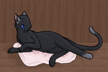
As for the cat... I might be better with this one. XD I like the way you illustrated the front legs and the curve of the spine. The back leg on top looks like it doesn't bend at all, though, and maybe there should be more of a joint. The face also looks like the nose doesn't go far enough into the face... I think a better way to say it is that there seems to be not enough of a dent in front of the eyes where the nose. (Hard to explain, sorry.) The eyes might also be a little low... but it might just be the angle of the head.
And can't forget the ears. The way you draw cat ears is awesome.
shy ♡
whispers in gay
Okay, redlines and crits.
Redline with alternative of the head to show what I meant by the er, thing. (I should be writing this ahh tired.) Okay.
Anatomy really isn't that important, overall, but because of the style you're using, which is very minimalistic and relying on lines and limited shading, the anatomy draws a lot of attention. So you need to make sure it isn't distracting.
Now, to improve the picture overall, try taking colours from the background and/or foreground and using them elsewhere. The picture really doesn't look like it works as a whole; the cat looks pasted on. It needs some... brown in it from the wall, some white from the carpet, to show that it's part of the background, and the wall could use some black from the cat. Not as a reflection - none of those things are reflective objects - just to make it soothing and cohesive as a drawing. (Same goes for all your drawings, I'm just using this as an example because it's easier to work with one image as a critique than all of them in general.)
Er, right. Shading could be improved, but it isn't as important as bringing the image together. But, for images where you don't have a background, you should either work on the lines to make them thicker and more interesting (think vector art) or on the shading. Er, I'm assuming you know how to shade better than you are and simply choose not to - but if you want tips I can give you some.
This image could work really well if the lines were made more interesting, given depth, etc.
Okay. I hope that made sense. I'm going to sleep. :[