• Welcome to The Cave of Dragonflies forums, where the smallest bugs live alongside the strongest dragons.

    Guests are not able to post messages or even read certain areas of the forums. Now, that's boring, don't you think? Registration, on the other hand, is simple, completely free of charge, and does not require you to give out any personal information at all. As soon as you register, you can take part in some of the happy fun things at the forums such as posting messages, voting in polls, sending private messages to people and being told that this is where we drink tea and eat cod.

    Of course I'm not forcing you to do anything if you don't want to, but seriously, what have you got to lose? Five seconds of your life?

ArtMo/DraMo 2009

Hey, guys.

Unfortunately my froggy didn't make it. :( Expect in memoriam drawing tomorrow.

I apologize for the BSed-ness of December 2nd and December 3rd. The former is a random Pokemon trainer character, my first attempt at Paint.NET and I hate the colors I used like burning (+ GODAWFUL HORRIBLE LINEART DAMMIT PAINT.NET GET MORE BRUSH OPTIONS); the latter is something I did in like 5 minutes from a published photograph (naughty naughty :o). I liked the way it was turning out, but it's really incomplete.

I also promise I'll try to get a character ref up someday. Once I can find a style I like. :|

SO I THINK I'LL TALK ABOUT OTHER PEOPLE'S STUFF.

Darksong: There's a lot of expressiveness in the Dragoon dude's pose, and that's cool. I'd look a bit more into proportions, especially with the arms and legs. :v

VPLJ: lol, I love the turtle.

Ice the Frosty Cat: (Dec 3) The eyes are the main issue that I see; generally you're only going to see a person's entire iris if they're making psycho-creepyface or they're really horrified. Other than that, you're able to give a good idea of how the characters are feeling, and that's an important thing to be able to do.

RaiCH: Haha, Norway :D! I'm considering doing some Hetalia fanart myself, but I dunno if it'll happen any day soon. Crit-wise, I really can't figure out if he's leaning over a bit too much or if he's standing up really straight, but something stands out as odd there. :v;

FMC: You make Neopets look really cool. D:

Sorry if I missed yours, if you're that heartbroken you can poke me.
 
Last edited:
RaiCH: Haha, Norway :D! I'm considering doing some Hetalia fanart myself, but I dunno if it'll happen any day soon. Crit-wise, I really can't figure out if he's leaning over a bit too much or if he's standing up really straight, but something stands out as odd there. :v;

He was meant to be just standing straight, but I messed up the collar, which lead me to drawing everything else slightly to the left to try and fix it, which is probably why it looks kinda off.

I'll have today's art up hopefully later tonight. I have an idea on what I'm going to draw, but knowing me I won't like it halfway through sketching it and just draw some halfassed thing again.
 
My camera's charging, so you'll have to take my word for it that I drew an asian guy sitting on a sickle.
 
I can't scan today's pic right now (finally got to actually draw something in a sketchbook!), but it'll be up by tomorrow, I promise.
 
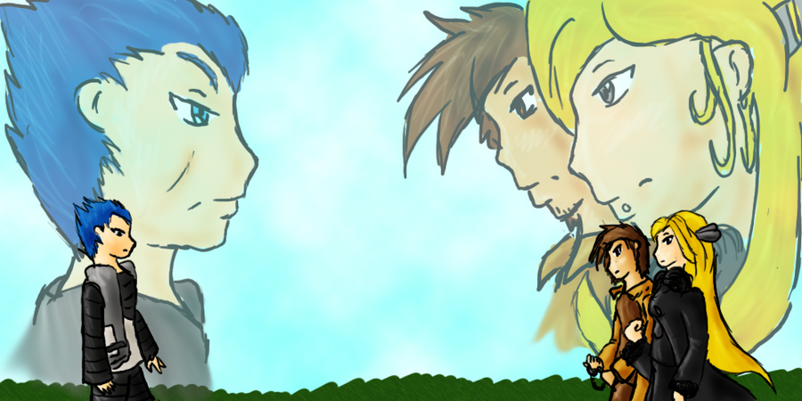
Here is my Day 3~

_Secret_Santa__The_Stare_Down_by_Moon_Panther.png
 
Did a really good pic of the cat that belonged to one of the girls at a party I was at today; gave it to her, but she said she'd email it to me. Gunna have to wait a while to show it :C

Also thank you everyone for crits and comments on my stuff~
 
December 4 done. When I get frustrated with my art, I draw badly-drawn gory stuff. Yay? :D

WARNING: (Badly drawn) Blood & Gore

Click the preview~
 
Oh wow, everyone's posting such high-quality art and all I have are a bunch of doodles of some Obsessive scribblers. Ah well, I wonder how many I can do over the month.

Yeah, no scanner yet, but this is what I've done;
1st) A toy gun being firing, the word "ArtMo" on a flag that's being fired.
2nd) Myself
3rd) Typh
4th) A flipnote of a Lucario.
 
Last edited:
Okay, day 2 was a pencil Dialga because I drew it at a silly time, and day 3 is a sort of fuzzy Ultimate Chimera because the paper tends to make the pen colours leak.
 
I should totally do a flipnote. But I have issues with the DSi's touchscreen....oh well. I shall conquer them!
 
Woah, the flipnote is a DSi thing? How does one obtain this flipnote? Is it one of those things you need an R4 for like Colors?

I'm asking for a DSi for Christmas and I'd like it if it had at least one worthwhile feature that the Lite doesn't. I always feel bad asking for new systems when my old one works just fine.
 
Uhh, still strapped for time so I'll just do some quick criticism and be on my way.


For a Machoke, those are some very small muscles. I'm not an expert on muscle anatomy, but Machoke is a very beefy Pokemon, and should have much bigger muscles. The colour is nice though.

Ice the Frosty Cat: (Dec 3) The eyes are the main issue that I see; generally you're only going to see a person's entire iris if they're making psycho-creepyface or they're really horrified. Other than that, you're able to give a good idea of how the characters are feeling, and that's an important thing to be able to do.

Well that's true I suppose, but it's sort of become a style thing for me. I'll see what I can do though in the future.

I must say that I'm really liking the scythe. The pose is well drawn and the clothing folds are good too. Only problem I can see is that the shape of the top of the head is a little weird, but aside from that, very nice.

Here is my Day 3~

_Secret_Santa__The_Stare_Down_by_Moon_Panther.png

The anatomy seems to be off somewhat, and I'm not fond of the expressions, but the overall picture has a nice impact to it and these faults are only really seen when you take a good look at it.

December 4 done. When I get frustrated with my art, I draw badly-drawn gory stuff. Yay? :D

WARNING: (Badly drawn) Blood & Gore

Click the preview~
Now, I don't pretend to be any good with blood myself, and for the most part it looks good, but the way it's laid out seems really unnatural. You need to think about how the blood gets onto the person in the first place, which should make it easier to figure out where to put it. As it stands currently, it looks like the character's been splashed from all directions, and yet somehow managed to keep each splash seperate from the others.
Still, it looks nice.

And just before I head off, here my entry for day four
Eccentricity
 
Back
Top Bottom